9.2 Solutions
Make sure you have the necessary packages loaded.
library(texreg)
library(tidyverse)
9.2.0.1 Exercise 1
Pretend that you are writing a research paper. Select one dependent variable that you want to explain with a statistical model. You might want to consult the QoG codebook on the website. Run a simple regression (with one explanatory variable) on that dependent variable and justify your choice of explanatory variable. This will require you to think about the outcome that you are trying to explain, and what you think will be a good predictor for that outcome.
A common argument put forward by some radical right political parties is that higher levels of immigration lead to economic decline. We are going to assess this claim by looking at net migration and economic decline variables.
# load data, subset and rename
world_data <- read.csv("https://raw.githubusercontent.com/QMUL-SPIR/Public_files/master/datasets/qog_20.csv") %>%
  select(decline = ffp_eco,
         migration = wdi_migration)

# plot - optional but can be interesting
p_e1 <- ggplot(world_data, aes(migration, decline)) +
  geom_point()

p_e1
Warning: Removed 17 rows containing missing values (geom_point).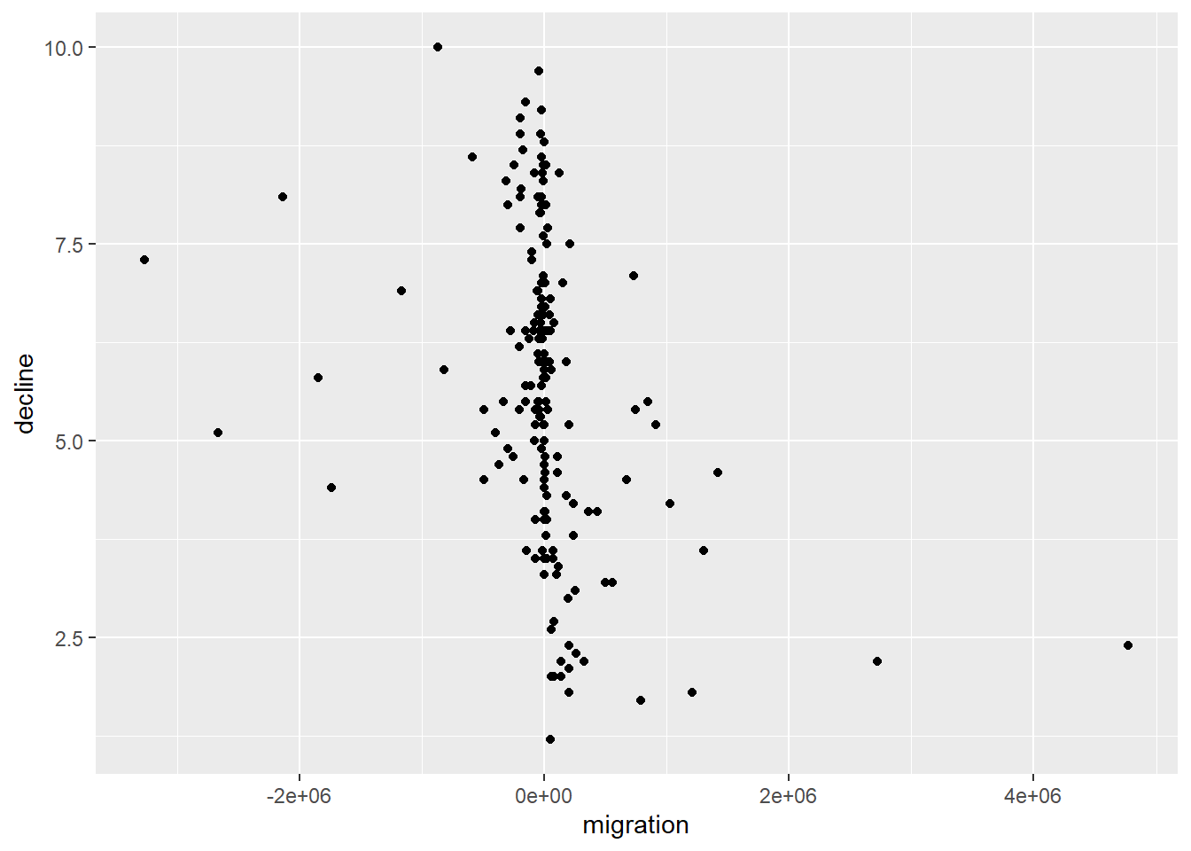
# this looks like a negative relationship, and lots of the net migration figures are clustered around 0
# this is because people emigrate and people immigrate

# regression model
migrant_mod <- lm(decline ~ migration, data = world_data)

screenreg(migrant_mod)
=======================
             Model 1
-----------------------
(Intercept)    5.69 ***
              (0.14)
migration     -0.00 ***
              (0.00)
-----------------------
R^2            0.10
Adj. R^2       0.10
Num. obs.    177
=======================
*** p < 0.001; ** p < 0.01; * p < 0.05summary(migrant_mod)
Call:
lm(formula = decline ~ migration, data = world_data)

Residuals:
    Min      1Q  Median      3Q     Max
-4.4415 -1.2911  0.1268  1.2049  3.9734

Coefficients:
              Estimate Std. Error t value Pr(>|t|)
(Intercept)  5.687e+00  1.389e-01  40.957  < 2e-16 ***
migration   -9.410e-07  2.123e-07  -4.432 1.64e-05 ***
---
Signif. codes:  0 '***' 0.001 '**' 0.01 '*' 0.05 '.' 0.1 ' ' 1

Residual standard error: 1.847 on 175 degrees of freedom
  (17 observations deleted due to missingness)
Multiple R-squared:  0.1009,    Adjusted R-squared:  0.09578
F-statistic: 19.64 on 1 and 175 DF,  p-value: 1.643e-05
So, it looks like net migration is actually negatively associated with economic decline. Countries with the balance tipped towards immigration, rather than emigration, appear to be less likely to face eonomic decline. The coefficient for this effect is very very small, but highly statistically significant. This is because the coefficient is expressed in the units of the variables. Net migration is measured in very large positive and negative numbers. A one unit change represents a one immigrant increase. The effect of this is therefore understandable tiny in substantive terms, but it is systematic in our data.
To get this more into terms we can understand, we can rescale our migration predictor. Perhaps we could make it range from -10 to 10, where those with -10 have the most negative net migration and those with 10 have the most positive net migration. This can be done using rescale() from the scales package.
install.packages(scales)library(scales)
world_data$migration <- rescale(world_data$migration, to = c(-10, 10))We can then rerun the regression and see how the coefficient changes. The effect size hasn’t actually increased, it is just expressed in different terms.
migrant_mod_2 <- lm(decline ~ migration, data = world_data)

screenreg(migrant_mod_2)
=======================
             Model 1
-----------------------
(Intercept)    4.98 ***
              (0.21)
migration     -0.38 ***
              (0.09)
-----------------------
R^2            0.10
Adj. R^2       0.10
Num. obs.    177
=======================
*** p < 0.001; ** p < 0.01; * p < 0.05
In any case, it doesn’t look like higher net migration - that is, more immigration than emigration - leads to economic decline. We have observed a statistically significant relationship in the opposite direction. Perhaps greater immigration is beneficial for economic performance.
9.2.0.2 Exercise 2
Add an additional explanatory variable to your model and justify the choice again. See how the results change. Carry out the F-test to check whether the new model explains significantly more variance than the old model.
We have not talked about this in the lecture before and it will not be a hurdle in the midterm. However, it is important that you keep an eye on sample size. If the sample size becomes too small it is unlikely that you can make meaningful statements about the world. We, therefore, selected variables with an eye on the missing values and their theoretical importance. If you see studies that are based on small samples, be suspicious.
Here we add in a measure of political rights to our model. This variable indicates whether or not citizens are able to participate freely in politics, including voting and competing for office. It could be that net migration is higher in those countries where political rights are more guaranteed, because people want to live in these countries, and it is these political rights which bring about more economic prosperity (and thereby less decline).
We reload the data including the new explanatory variable, and fit a new model. Political rights are measured from least free (1) to most free (7), so we would expect a positive relationship with economic decline, given the above theory.
# load data, subset and rename
world_data <- read.csv("https://raw.githubusercontent.com/QMUL-SPIR/Public_files/master/datasets/qog_20.csv") %>%
  select(decline = ffp_eco,
         migration = wdi_migration,
         rights = fh_pr)

# rescale migration again
world_data$migration <- rescale(world_data$migration, to = c(-10, 10))

# fit model
rights_mod <- lm(decline ~ migration + rights, data = world_data)

# view output
screenreg(rights_mod)
=======================
             Model 1
-----------------------
(Intercept)    3.88 ***
              (0.26)
migration     -0.27 ***
              (0.08)
rights         0.36 ***
              (0.06)
-----------------------
R^2            0.26
Adj. R^2       0.25
Num. obs.    177
=======================
*** p < 0.001; ** p < 0.01; * p < 0.05
It seems like political rights are relevant as they are highly statistically significantly associated with economic decline. Importantly, however, migration is still negatively associated with economic decline, even when controlling for this alternative explanation. The coefficient is smaller, so we might have eliminated some bias from the effect introduced by confounding, but it is still a large and highly significant association.
Our variance explained has also increased, but is this a significant increase? An F-test tells us this.
# f-test
anova(migrant_mod, rights_mod)
Analysis of Variance Table
Model 1: decline ~ migration
Model 2: decline ~ migration + rights
Res.Df RSS Df Sum of Sq F Pr(>F)
1 175 597.27
2 174 492.52 1 104.75 37.004 7.287e-09 ***
---
Signif. codes: 0 '***' 0.001 '**' 0.01 '*' 0.05 '.' 0.1 ' ' 1As we saw by comparing R^2, the bigger model explains a lot more variance in economic decline. The f-test shows that this difference is not due to chance. The p value is smaller than 0.05, hence, we reject the null hypothesis that the small model and the larger model really explain the same.
9.2.0.3 Exercise 3
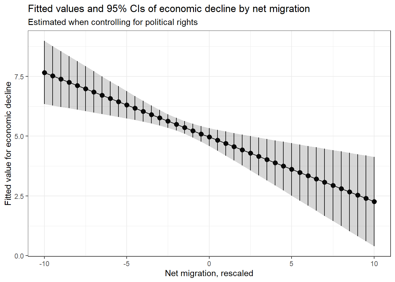
Calculate fitted values for your dependent variable whilst varying at least one of your continuous explanatory variables, and plot the result.
First, we need to create new data on which to fit the values. The dataset should include variables with the same names as both of our predictors. We are going to allow migration to vary from -10 to 10, like the rescaled version we used to fit the model, while fixing political rights at its median value. We vary migration in 0.5 increments rather than increments of 1 to get a more fine-grained output.
# set the values for the explanatory variables
df_fv <- data.frame(
  migration = seq(from = -10, to = 10, by = 0.5),
  rights = median(world_data$rights)
  )

head(df_fv)
migration rights
1 -10.0 3
2 -9.5 3
3 -9.0 3
4 -8.5 3
5 -8.0 3
6 -7.5 3We then use this data to fit values of economic decline, and plot these.
# calculate the fitted values
fv <- predict(rights_mod,
              df_fv,
              interval = 'confidence')

# attach the fitted values and their confidence intervals to the dataset
df_fv <- cbind(df_fv, fv)

# plot
p_e3 <- ggplot(df_fv,
             aes(x = migration,
                 y = fit)) + # set up plot axes
  geom_pointrange(aes(ymin = lwr,
                      ymax = upr)) + # add estimate and intervals for each level of free_exp
  geom_line() + # add line through all fitted values
  geom_ribbon(aes(ymin = lwr,
                  ymax = upr),
                  alpha = 0.2) + # add shaded area to highlight confidence interval
  labs(x =  "Net migration, rescaled", y = "Fitted value for economic decline") +
  theme_bw() +
  ggtitle('Fitted values and 95% CIs of economic decline by net migration',
          subtitle = 'Estimated when controlling for political rights')

p_e3