Chapter 4 Sampling, Distributions and the tidyverse
4.1 Seminar
Today, we introduce a few tricks which make data management easier in R, from the tidyverse. We also look at some of the things you have covered in lectures about sampling and distributions, continuing to use ggplot2.
This seminar is quite long, so you likely won’t get through it all in class!
4.1.1 Data management, tidyverse and dplyr
One of the most time-consuming parts of using R, and data analysis in general, is managing, tidying and ‘wrangling’ your data. Often, we start with data in a format that is not particularly useful for analysis. We might come across a dataset, for example, with far too many columns, covering lots of variables we are not interested in.
Let’s load the London Borough population dataset we have been working with in other weeks on the course.
#Load a dataset in a csv file
pop <- read.csv("https://raw.githubusercontent.com/QMUL-SPIR/Public_files/master/datasets/census-historic-population-borough.csv")
We have already discussed, in past weeks, the idea of ‘subsetting’ datasets. R has several ways of doing this, but the tidyverse makes it very simple.
# Make sure tidyverse is available to use
library(tidyverse)
Subsetting means that we access a specific part of the dataset or vector. We can use select() to tell R which variables in our pop object we want to keep. Let’s say we are only interested in the populations of London boroughs in the 21st century (dates since 2000). We still want to be able to identify these boroughs by their codes and names. All we have to do is give select() our dataset and the names of these variables. We don’t even need to quote (with "") the names of the variables! It will produce a new dataframe with the variables in the order in which we specified them.
#Subset dataset only to have years since 2000

pop_21 <- select(pop, Area.Code, Area.Name, Persons.2001, Persons.2011)
Now this dataset is much easier for us to work on and explore, assuming we are only interested in populations in the 21st century. We can also reassign names to our variables (columns) when subsetting a dataset in this way, and reorder them.
#Subset dataset only to have years since 2000, with 'snake case' names

pop_21 <- select(
  pop,
  area_name = Area.Name,
  area_code = Area.Code,
  persons_2001 = Persons.2001,
  persons_2011 = Persons.2011
  )
In this version of pop_21, the borough names appear before their codes. The names of the variables are also now all in ‘snake case’, which is just a way of formatting text that some people prefer to use.
Datasets can also be subsetted by rows rather than by columns. That is, we can tell R only to keep certain columns. We usually want to keep certain rows based on whether their values meet certain criteria. For example, in our new pop_21 dataset, we might only want to consider areas with over 200,000 residents in 2011.
# subset dataset only to have boroughs with over 200,000 population

pop_21_200k <- filter(
  pop_21,
  persons_2011 >= 200000 # greater than or equal to 200,000
  )
We can use mutate() to create new variables based on variables we currently have, to make our datasets more useful to us. For example, we could create a column containing the difference between each 2011 and 2001 population.
# create variable of difference between 2011 and 2001 populations

pop_21 <- mutate(
  pop_21,
  persons_diff = persons_2011-persons_2001
  )
4.1.2 Piping
The select(), filter() and mutate() functions are simple, effective ways to rearrange and subset data. However, they become even more useful when we introduce ‘piping’ into our code. Piping uses the ‘pipe’ operator %>% to allow you to write code in a very logical, linear way, in which you start with an object and continually do things to it until you have achieved a desired result.
This becomes clearer with examples. Above, we did multiple things to pop. We subsetted pop only to contain four variables, we created a new variable and we removed several rows. We could do this all in one ‘pipe’, if we wanted to end up with a new dataset in which all these changes have been made.
# Apply all changes to dataset using pipe

pop_21_200k <- pop %>% # call the dataset
  select( # keep only the variables we want, renaming them
    area_name = Area.Name,
    area_code = Area.Code,
    persons_2001 = Persons.2001,
    persons_2011 = Persons.2011) %>%
  filter( # keep only rows with 200,000+ population
    persons_2011 >= 200000) %>%
  mutate( # create new variable of difference between 2011 and 2001
    persons_diff = persons_2011-persons_2001
  )

# take a look at the new data
head(pop_21_200k)
area_name area_code persons_2001 persons_2011 persons_diff
1 Barnet 00AC 314565 356386 41821
2 Bexley 00AD 218301 231997 13696
3 Brent 00AE 263466 311215 47749
4 Bromley 00AF 295535 309392 13857
5 Camden 00AG 198022 220338 22316
6 Croydon 00AH 330584 363378 32794This code allows you to call the object to which you are applying changes only once. Then, each time you add a function, it takes the object, applies the changes, and passes it through the ‘pipe’ to the next function. So, each function is working on the object churned out by the previous function. Because you are using the pipe, you therefore do not need to specify an object as the first argument of each of these functions. They know automatically what they are working on.
We can try another example of piping on a different dataset. Let’s load the BSAS ‘perceptions of foreigners’ data we have used in previous seminars.
# load perception of non-western foreigners data
load(url("https://github.com/QMUL-SPIR/Public_files/raw/master/datasets/BSAS_manip.RData"))

# look at the first six rows of the dataset
head(data2)
IMMBRIT over.estimate RSex RAge Househld Cons Lab SNP Ukip BNP GP party.other
1 1 0 1 50 2 0 1 0 0 0 0 0
2 50 1 2 18 3 0 0 0 0 0 0 1
3 50 1 2 60 1 0 0 0 0 0 0 1
4 15 1 2 77 2 0 0 0 0 0 0 1
5 20 1 2 67 1 0 0 0 0 0 0 1
6 30 1 1 30 4 0 0 0 0 0 0 1
paper WWWhourspW religious employMonths urban health.good HHInc
1 0 1 0 72 4 1 13
2 0 4 0 72 4 2 3
3 0 1 0 456 3 3 9
4 1 2 1 72 1 3 8
5 0 1 1 72 3 3 9
6 1 14 0 72 1 2 9We want to subset the data only to contain people who overestimated the number of immigrants. We want to assess the proportions of people in this group who identify with each party, which might be easier if we create a single indicator of partisanship rather than having several variables. We also reorganise this data slightly such that the first few columns contain demographic information, followed by our new single indicator of partisanship, followed by the outcome variable IMMBRIT. We don’t think IMMBRIT is a clear enough name, and don’t like how are variable names are formatted inconsistently, so we want to give our variables clearer names and all in snake case.
# create dataset of people who overestimated immigration levels, with reformatting
over_estimators <- data2 %>% # call the original dataframe
  filter( # only keep people who overestimated immigration
    over.estimate == 1
  ) %>%
  mutate( # create single partisanship indicator
    party_id =
      case_when( # function creating variable depending on other variable values
        Cons == 1 ~ "con", # if 'Cons' value is 1, party_id value should be 'con'
        Lab == 1 ~ "lab",
        SNP == 1 ~ "snp",
        Ukip == 1 ~ "ukip",
        BNP == 1 ~ "bnp",
        GP == 1 ~ "green",
        party.other == 1 ~ "other",
        TRUE ~ "none"
        )
  ) %>%
  select( # subset variables (columns)
    sex = RSex,
    age = RAge,
    household = Househld,
    party_id,
    perceived_immigrants = IMMBRIT
  )

# take a look at the new data
head(over_estimators)
sex age household party_id perceived_immigrants
1 2 18 3 other 50
2 2 60 1 other 50
3 2 77 2 other 15
4 2 67 1 other 20
5 1 30 4 other 30
6 2 56 2 snp 60You can see how, if we were only interested in those who overestimate immigration levels, and in certain characteristics of theirs, the over_estimators dataframe would be easier for us to work with. With the %>% pipe, we were able to go from a much larger, less refined dataset, do several clever things to it, and create something more usable and clear, all in one go.
You might be wondering how the case_when() section of this code works. case_when() is a very clever tidyverse function which works like a series of if statements. It is used to create new variables, based on the values of other variables. In each case, it is saying ‘if that variable takes that value, give my the new variable this value’. The ‘if’ statement is expressed before a tilde, ~, with the command (if the statement is true) following the tilde. Finally, TRUE ~ "none" means ‘if none of these things are true, give the new variable the value “none”’. Find out more about case_when() in its documentation.
4.1.3 Missing Values
When we are tidying and managing our data, we need to pay attention to missing values. These occur when we don’t have data on a certain variable for a certain case. Perhaps someone didn’t want to tell us which party they support, or how old they are. Perhaps there is no publicly available information on a certain demographic variable in a given state or country. It is, generally, a good idea to know how much of this ‘missingness’ there is in your data.
R has a useful package called naniar which helps you manage missingness. We install and load this package, along with some data from the Quality of Government Institute.
# install and load naniar
install.packages('naniar', repos = "http://cran.us.r-project.org")library(naniar)
# load in quality of government data
qog <- read.csv("https://raw.githubusercontent.com/QMUL-SPIR/Public_files/master/datasets/QoG2012.csv")The variables in this dataset are as follows.
| Variable | Description |
|---|---|
| h_j | 1 if Free Judiciary |
| wdi_gdpc | Per capita wealth in US dollars |
| undp_hdi | Human development index (higher values = higher quality of life) |
| wbgi_cce | Control of corruption index (higher values = more control of corruption) |
| wbgi_pse | Political stability index (higher values = more stable) |
| former_col | 1 = country was a colony once |
| lp_lat_abst | Latitude of country’s captial divided by 90 |
Let’s inspect the variable h_j. It is categorical, where 1 indicates that a country has a free judiciary. We use the table() function to find the frequency in each category.
table(qog$h_j)
  0   1
105  64
We now know that 64 countries have a free judiciary and 105 countries do not.
You will notice that these numbers do not add up to 194, the number of observations in our dataset. This is because there are missing values. We can see how many there are very easily using naniar.
n_miss(qog$h_j)[1] 25And hey presto, 64 plus 105 plus 25 equals 194, which is the number of observations in our dataset. We can also work out how much data we do have on a given variable by simply counting the number of valid entries using n_complete(). This and the number of missings can also be expressed as proportions/percentages.
n_complete(qog$h_j)[1] 169pct_miss(qog$h_j)[1] 12.8866pct_complete(qog$h_j)[1] 87.1134There are different ways of dealing with NAs. We will always delete missing values. Our dataset must maintain its rectangular structure. Hence, when we delete a missing value from one variable, we delete it for the entire row of the dataset. Consider the following example.
| Row | Variable1 | Variable2 | Variable3 | Variable4 |
|---|---|---|---|---|
| 1 | 15 | 22 | 100 | 65 |
| 2 | NA | 17 | 26 | 75 |
| 3 | 27 | NA | 58 | 88 |
| 4 | NA | NA | 4 | NA |
| 5 | 75 | 45 | 71 | 18 |
| 6 | 18 | 16 | 99 | 91 |
If we delete missing values from Variable1, our dataset will look like this:
| Row | Variable1 | Variable2 | Variable3 | Variable4 |
|---|---|---|---|---|
| 1 | 15 | 22 | 100 | 65 |
| 3 | 27 | NA | 58 | 88 |
| 5 | 75 | 45 | 71 | 18 |
| 6 | 18 | 16 | 99 | 91 |
The new dataset is smaller than the original one. Rows 2 and 4 have been deleted. When we drop missing values from one variable in our dataset, we lose information on other variables as well. Therefore, you only want to drop missing values on variables that you are interested in. Let’s drop the missing values on our variable h_j. We can do this very easily (and this really is much easier than it used to be!) using tidyr.
# make sure tidyr loaded
library(tidyr)

# remove NAs from h_j
qog <- drop_na(qog, h_j)

# alternatively, we could have piped this!

# qog <- qog %>% drop_na(h_j)
The drop_na() function from tidyr, in one line of code, removes all the rows from our dataset which have an NA value in h_j. It is no coincidence, then, that the total number of observations in our dataset, 169, is now equal to the number of valid entries in h_j.
Note that we have overwritten the original dataset. It is no longer in our working environment. We have to reload the dataset if we want to go back to square one. This is done in the same way as we did it originally:
qog <- read.csv("https://raw.githubusercontent.com/QMUL-SPIR/Public_files/master/datasets/QoG2012.csv")We now have all observations back. This is important. Let’s say we need to drop missings on a variable. If a later analysis does not involve that variable, we want all the observations back. Otherwise we would have thrown away valuable information. The smaller our dataset, the less information it contains. Less information will make it harder for us to detect systematic correlations. We have two options. Either we reload the original dataset or we create a copy of the original with a different name that we could use later on. Let’s do this.
full_dataset <- qogLet’s drop missings on h_j in the qog dataset, with the code piped this time.
qog <- qog %>% drop_na(h_j) Now, if we want the full dataset back, we can overwrite qog with full_dataset. The code would be the following:
qog <- full_datasetThis data manipulation may seem boring but it is really important that you know how to do this. Most work in data science is not running statistical models but data manipulation. Most of the datasets you will work with in your jobs, as a research assistant or on your dissertation won’t be cleaned for you. You will have to do that work. It takes time and is sometimes frustrating. That’s unfortunately the same for all of us.
4.1.4 Distributions
A marginal distribution is the distribution of a variable by itself. Let’s look at the summary statistics of the United Nations Development Index undp_hdi using the summary() function.
summary(qog$undp_hdi) Min. 1st Qu. Median Mean 3rd Qu. Max. NA's
0.2730 0.5390 0.7510 0.6982 0.8335 0.9560 19 We see the range (minimum to maximum), the interquartile range (1st quartile to 3rd quartile), the mean and median. Notice that we also see the number of NAs.
We have 19 missings on this variable. Let’s drop these and rename the variable to hdi, using the pipe to do this all in one go.
qog <- qog %>% # call dataset
  drop_na(undp_hdi) %>% # drop NAs
  rename(hdi = undp_hdi) # rename() works like select() but keeps all other variables
Let’s take the mean of hdi.
hdi_mean <- mean(qog$hdi)

hdi_mean
[1] 0.69824hdi_mean is the mean in the sample. We would like the mean of hdi in the population. Remember that sampling variability causes us to estimate a different mean every time we take a new sample.
We learned that the means follow a distribution if we take the mean repeatedly in different samples. In expectation the population mean is the sample mean. How certain are we about the mean? Well, we need to know what the sampling distribution looks like.
To find out we estimate the standard error of the mean. The standard error is the standard deviation of the sampling distribution. The name is not standard deviation but standard error to indicate that we are talking about the distribution of a statistic (the mean) and not a random variable.
The formula for the standard error of the mean is:
\[ s_{\bar{x}} = \frac{ \sigma }{ \sqrt(n) } \]
The \(\sigma\) is the real population standard deviation of the random variable hdi which is unknown to us. We replace the population standard deviation with our sample estimate of it.
\[ s_{\bar{x}} = \frac{ s }{ \sqrt(n) } \]
The standard error of the mean estimate is then
se_hdi <- sd(qog$hdi) / sqrt(nrow(qog))

se_hdi
[1] 0.01362411Okay, so the mean is 0.69824 and the standard error of the mean is 0.0136241.
We know that the sampling distribution is approximately normal. That means that 95 percent of all observations are within 1.96 standard deviations (standard errors) of the mean.
\[ \bar{x} \pm 1.96 \times s_{\bar{x}} \]
So what is that in our case?
lower_bound <- hdi_mean - 1.96 * se_hdi
lower_bound
[1] 0.6715367upper_bound <- hdi_mean + 1.96 * se_hdi
upper_bound[1] 0.7249432That now means the following. Were we to take samples of hdi again and again and again, then 95 percent of the time, the mean would be in the range from 0.6715367 to 0.7249432.
Now, let’s visualise our sampling distribution. We haven’t actually taken many samples, so how could we visualise the sampling distribution? We know the sampling distribution looks normal. We know that the mean is our mean estimate in the sample. And finally, we know that the standard deviation is the standard error of the mean.
We can randomly draw values from a normal distribution with mean 0.69824 and standard deviation 0.0136241. We do this with the rnorm() function. Its first argument is the number of values to draw at random from the normal distribution. The second argument is the mean and the third is the standard deviation.
Recall that a normal distribution has two parameters that characterise it completely: the mean and the standard deviation. So with those two we can draw the distribution.
hdi_mean_draws <- rnorm(1000, # 1000 random numbers
                        mean = hdi_mean, # numbers should have same mean as hdi
                        sd = se_hdi) # numebrs should have same sd as hdi
We have just drawn 1000 mean values at random from the distribution that looks like our sampling distribution. We can plot this as a histogram. We are going to add the theme_minimal() argument here to get rid of that ugly grey background that ggplot2 produces by default. Let’s also make the plot clearer by using labs() to change the axis labels.
p1 <- ggplot(mapping = aes(hdi_mean_draws)) +
  geom_histogram() +
  ggtitle("Sampling Distribution of HDI means") + # add title
  theme_minimal() + # change plot 'theme'
  labs(x = "Plausible mean HDI levels", # change x axis label
       y = "Frequency") # change y axis label
p1
`stat_bin()` using `bins = 30`. Pick better value with `binwidth`.
Let’s add the 95 percent confidence interval around our mean estimate. The confidence interval quantifies our uncertainty. We said 95 percent of the time the mean would be in the interval from 0.6715367 to 0.7249432."
p1 <- p1 +
  geom_vline( # add vertical line at lower_bound
    xintercept = lower_bound,
    linetype = "dashed") +
  geom_vline( # add vertical line at upper_bound
    xintercept = upper_bound,
    linetype = "dashed")

p1
`stat_bin()` using `bins = 30`. Pick better value with `binwidth`.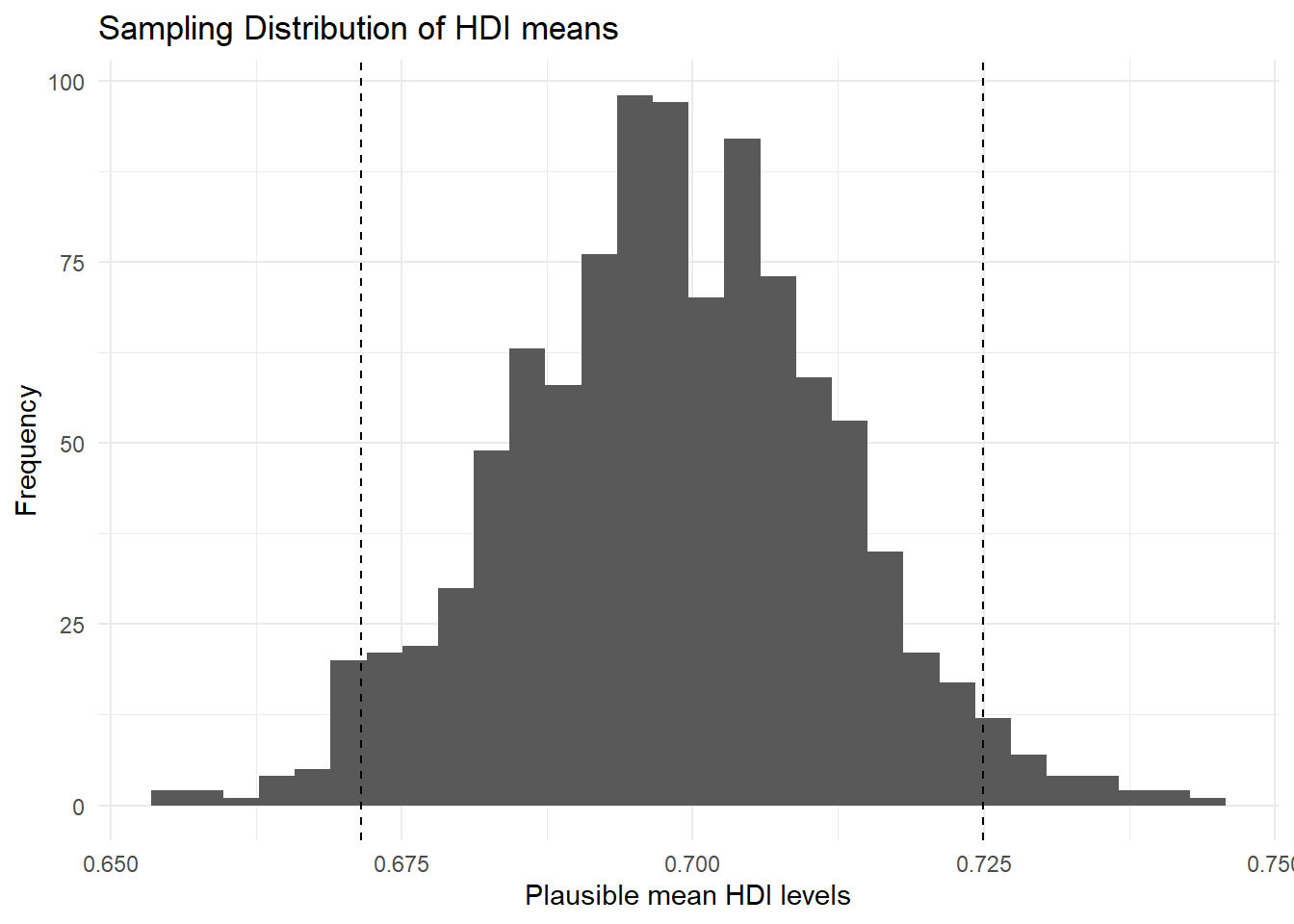
You do not need to run the ggplot function again. You can just add to the plot. Check the help function of geom_vline to see what its arguments refer to.
You can see that values below and above our confidence interval are quite unlikely. Those values in the tails should not occur often, but they are not impossible.
Let’s say that we wish to know the probability that we take a sample and our estimate of the mean is greater or equal 0.74. We would need to integrate over the distribution from \(-\inf\) to 0.74. Fortunately R has a function that does that for us. We need the pnorm(). It calculates the probability of a value that is smaller or equal to the value we specify.
As the first argument pnorm() wants the value. This is 0.74 in our case. The second and third arguments are the mean and the standard deviation that characterise the normal distribution.
pnorm(0.74,
      mean = hdi_mean,
      sd = se_hdi)
[1] 0.9989122This value might seem surprisingly large, but it is the cumulative probability of drawing a value that is equal to or smaller than 0.74. All probabilities sum to 1. So if we want to know the probability of drawing a value that is greater than 0.74, we subtract the probability, we just calculated, from 1.
1 - pnorm(0.74,
          mean = hdi_mean,
          sd = se_hdi)
[1] 0.001087785So the probability of getting a mean of 0.69824 or greater in a sample is 0.1 percent.
4.1.5 Conditional Distributions
Let’s look at hdi by former_col. The variable former_col is 1 if a country is a former colony and 0 otherwise. The variable hdi is continuous. Before we start, we plot the marginal distribution of hdi.
p2 <- ggplot(qog, aes(hdi)) +
  geom_density() +
  ggtitle("Marginal Distribution of HDI") +
  theme_minimal()
p2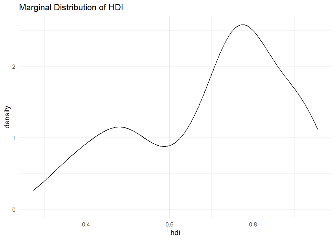
The distribution looks bimodal. There is one peak at the higher development end and one peak at the lower development end. Could it be that these two peaks are conditional on whether a country was colonised or not? Let’s plot the conditional distributions. We use theme_minimal() again.
p3 <- ggplot(qog, aes(hdi, group = former_col)) +
  geom_density(aes(colour = factor(former_col))) +
  ggtitle("Distribution of HDI conditional on former colony status") +
  theme_minimal()

p3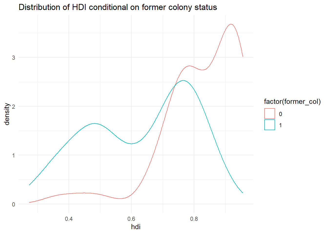
There are a few problems with this plot. What do the axis labels mean? What does the legend (key) on the right mean? Let’s make these things much clearer using labs() and scale_colour_discrete() to overwrite the name of the legend (key) and its labels for each colour. Both of these things make the plot much clearer and easier to understand.
p3 <- p3 +
  labs(x = "Human Development Index (HDI)", # clearer x axis label
       y = "Density") + # clearer y axis label
  scale_color_discrete(name = "Former colony", # change legend title
                       labels = c("Never colonised", # change legend labels
                                  "Colonised"))

p3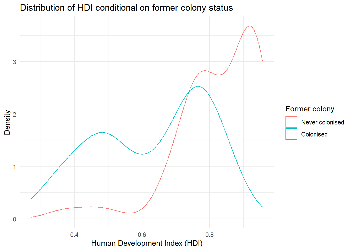
It’s not quite like we expected. The distribution of human development of not colonised countries is shifted to right of the distribution of colonised countries and it is clearly narrower. Interestingly though, the distribution of former colonies has a greater variance. Evidently, some former colonies are doing very well and some are doing very poorly. It seems like knowing whether a country was colonised or not tells us something about its likely development but not enough. We cannot, for example, say colonisation is the reason why countries do poorly. Probably, there are differences among types of colonial institutions that were set up by the colonisers.
Let’s move on and examine the probability that a country has .8 or more on hdi given that it is a former colony.
We can get the cumulative probability with the ecdf() function. It returns the empirical cumulative distribution, i.e., the cumulative distribution of our data. We can run this on hdi for only former colonies, by first creating a vector of these using piped code.
hdi_col <- qog %>% # get all data
  filter(former_col == 1) %>% # only keep former colonies
  pull(hdi) # extract hdi as vector

cumulative_p <- ecdf(hdi_col) # run ecdf on former colonies' hdi

1 - cumulative_p(.8)
[1] 0.1666667The probability that a former colony has .8 or larger on the hdi is 16.7 percent. Go ahead figure out the probability for non-former colonies on your own.
4.1.6 Factor Variables
Categorical/nominal variables can be stored as numeric variables in R. However, the values do not imply an ordering or relative importance. We often store nominal variables as factor variables in R. A factor variable is a nominal data type. The advantage of turning a variable into a factor type is that we can assign labels to the categories and that R will not calculate with the values assigned to the categories.
The function factor() lets us turn the variable into a nominal data type. The first argument is the variable itself. The second are the category labels and the third are the levels associated with the categories. To know how those correspond, we have to scroll up and look at the codebook.
We also overwrite the original numeric variable h_j with our nominal copy indicated by the assignment arrow <-.
# factorize judiciary variable
qog$h_j <- factor(qog$h_j,
                  labels = c("controlled", "free"),
                  levels = c(0,1))

# frequency table of judiciary variable
table(qog$h_j)
controlled       free
        97         63
4.1.7 Exercises
Like last week, the exercises this week might be challenging, but all the tools you need to complete them are explained above. Give them a go, don’t worry if you struggle, and check the solutions on Monday!
- Load the quality of government dataset.
qog <- read.csv("https://raw.githubusercontent.com/QMUL-SPIR/Public_files/master/datasets/QoG2012.csv")- Rename the variable
wdi_gdpctogdpcusingrename()from thetidyverse. - Delete all rows with missing values on
gdpc. - Inspect
former_coland delete rows with missing values on it. - Turn
former_colinto a factor variable with appropriate labels. - Subset the dataset so that it only has the
gdpc,undp_hdi, andformer_colvariables and sort the dataset byhdiusingarrange(), all in one ‘pipe’. - Plot the distribution of
gdpcconditional on former colony status, usingtheme_minimal(),labs()andscale_colour_discrete()to make sure your plot is clear and easy to understand. - Compute the probability that a country is richer than 55,000 per capita.
- Compute the conditional expectation of wealth for a country that is not a former colony.
- What is the probability that a former colony is 2 standard deviations below the mean wealth level?
- Compute the probability that any country is in the wealth interval from 20,000 to 50,000.