Chapter 7 Studying relationships between two categorical variables or two continuous variables
7.1 Seminar
T-tests, the subject of the last seminar, are useful when we want to study the relationship between a categorical variable and a continuous variable. Today we look at what we can do to study relationships between two categorical variables, or between two continuous variables.
7.1.1 Producing cross tabulations - two categorical variables
Cross tabulations, also called contingency tables, are essentially crossed frequency distributions, where you consider the frequency distributions of more than one variable simultaneously. We have already seen how frequency distributions are a useful way of exploring categorical variables that do not have too many categories, to study their dispersion. By extension, cross tabulations are a useful way of exploring relationships between two categorical variables that do not have too many levels or categories. For example, we could cross-tabulate party identification (Con/Lab) and turnout (intend to vote/do not intend to vote).
As we learned during the first few practicals, we can get results from R in a variety of ways. You can produce basic tables with some of the core functions in R. However, we can produce tables more flexibly, and in a way that is more consistent with the tidyverse approach we have been encouraging you to use, by using the tabyl() function from the janitor package. As always, we should also load the tidyverse itself!
install.packages("janitor", repos = 'http://cran.us.r-project.org')package 'janitor' successfully unpacked and MD5 sums checked
The downloaded binary packages are in
C:\Users\Javier\AppData\Local\Temp\RtmpIXALHq\downloaded_packageslibrary(janitor)
library(tidyverse)We will begin the session by loading the ‘BCS0708’ data from the British Crime Survey 2007-2008. We will start by producing a cross tabulation of victimisation (bcsvictim), a categorical unordered variable, by whether the presence of rubbish in the streets is perceived to be a problem in the area of residence (rubbcomm), another categorical unordered variable. ‘Broken windows theory’ would argue we should see a relationship.
First, let’s load the data.
# read the data in the csv file into an object called BCS0708
bcs <- read.csv("https://raw.githubusercontent.com/QMUL-SPIR/Public_files/master/datasets/BCS0708.csv")
Let’s look at the frequencies for the two variables we are interested in.
table(bcs$rubbcomm)
    fairly common not at all common   not very common       very common
1244 5463 4154 204 table(bcs$bcsvictim)
not a victim of crime       victim of crime
                 9318                  2358
Now we’re going to make some presentation changes. These are not strictly neccesary but they may make some of the tables easier to read and save time later if you have to write up your results. We will start by reordering the responses to “rubbish in the area” so that it is ordered from most negative to most positive. It is also good practice, if there is an order to the levels of the factor, to tell R this directly by using the ordered() function.
bcs <- bcs %>%
  mutate(rubbcomm = ordered(
    fct_relevel(rubbcomm, # fct_relevel() from 'forcats' in tidyverse
                "not at all common",
                "not very common",
                "fairly common",
                "very common"))) # reorder levels
Next we will improve how we label the response categories. Here, we are only making a superficial change but if working with a variable where the labels do not make sense, it is useful to change them to something easy to interpret.
bcs <- bcs %>%
  mutate(rubbcomm = fct_recode(rubbcomm, # fct_recode() from 'forcats' in tidyverse
                               "Not at all" = "not at all common",
                               "Not very" = "not very common",
                               "Fairly" = "fairly common",
                               "Very" = "very common")) # rename levels
Let’s look at our changes.
table(bcs$rubbcomm)
Not at all   Not very     Fairly       Very
      5463       4154       1244        204
So far, we have looked at the frequency of litter in different areas. We can also present the proportions of each response category.
rubbish.table <- table(bcs$rubbcomm)

prop.table(rubbish.table) # shows the proportions in each response category
Not at all   Not very     Fairly       Very
0.49371893 0.37541798 0.11242657 0.01843651
With tabyl() we can make nicer tables, with both proportions and frequencies, in tidyverse-style code.
t1 <- bcs %>%
  tabyl(rubbcomm)

t1
rubbcomm n percent valid_percent
Not at all 5463 0.46788284 0.49371893
Not very 4154 0.35577252 0.37541798
Fairly 1244 0.10654334 0.11242657
Very 204 0.01747174 0.01843651
<NA> 611 0.05232956 NANow we will produce a cross tabulation of victimisation (bcsvictim) by whether the presence of rubbish in the streets is a problem in the area of residence (rubbcomm).
tabyl() is meant to be very flexible, so it is designed with minimal assumptions. However, this means that we need to tell it exactly how we want our table to look. We do this by adding adorn functions for each thing we want the table to include. Here, we ask for the frequencies in each cell, plus the percentage of the row found in that cell, rounded to two decimal places. We also might find it useful to have information on the row totals.
t2 <- bcs %>%
  tabyl(rubbcomm, # rows of the table
        bcsvictim) %>% # columns of the table
  adorn_totals("row") %>% # show row totals
  adorn_percentages("row") %>% # show percentages of each row in each cell
  adorn_pct_formatting(digits = 2) %>% # round these to 2 decimal places
  adorn_ns() # show frquencies


t2
rubbcomm not a victim of crime victim of crime
Not at all 84.46% (4614) 15.54% (849)
Not very 76.38% (3173) 23.62% (981)
Fairly 70.42% (876) 29.58% (368)
Very 69.12% (141) 30.88% (63)
<NA> 84.12% (514) 15.88% (97)
Total 79.80% (9318) 20.20% (2358)So the table tells us that we have, for example, 63 people in the category “rubbish is very common” that were victims of a crime, which represents 30.88% of all the people in the “rubbish is very common” category (your row percent). You are only interested in the proportions or percentages, which allow you to make meaningful comparisons. Although you can do crosstabs for variables in which a priori you don’t think of one of them as the one doing the explaining (your independent variable) and another to be explained (your dependent variable); most often you will already be thinking of them in this way. Here we think of victimisation as the dependent variables we want to explain and “rubbish in the area” as the factor that may help us to explain variation in victimisation. This reflects broken windows theory.
If you have a dependent variable, you need to request only the percentages that allow you to make comparisons across your independent variable (how common rubbish is) for the outcome of interest (victimisation). In this case, with our outcome (victimisation) defining the columns, we would request and compare the row percentages only. That’s why we asked tabyl to give us these using adorn_percentages("row"). On the other hand, if our outcome were the variable defining the rows we would be interested instead in the column percentages. Pay very close attention to this. It is a very common mistake to interpret a cross tab the wrong way if you don’t do as explained here.
To reiterate then, there are two rules to producing and reading cross tabs the right way. The first rule for reading cross tabulations is that if your dependent variable is defining the rows then you ask for the column percentages. If, on the other hand, you decided that you preferred to have your dependent variable defining the columns (as seen here), then, you would need to ask for the row percentages. Make sure you remember this.
So, if we switched our rows and columns, we would want to use column percentages here instead. This is easily done:
t3 <- bcs %>%
  tabyl(bcsvictim, # rows of the table
        rubbcomm) %>% # columns of the table
  adorn_totals(c("row", "col")) %>% # show row totals
  adorn_percentages("col") %>% # show percentages of each row in each cell
  adorn_pct_formatting(digits = 2) %>% # round these to 2 decimal places
  adorn_ns() # show frquencies


t3
bcsvictim Not at all Not very Fairly
not a victim of crime 84.46% (4614) 76.38% (3173) 70.42% (876)
victim of crime 15.54% (849) 23.62% (981) 29.58% (368)
Total 100.00% (5463) 100.00% (4154) 100.00% (1244)
Very NA_ Total
69.12% (141) 84.12% (514) 79.80% (9318)
30.88% (63) 15.88% (97) 20.20% (2358)
100.00% (204) 100.00% (611) 100.00% (11676)Marginal frequencies appear along the right and the bottom. Row marginals show the total number of cases in each row: 204 people living in areas where rubbish is very common, 1244 live in areas where rubbish is fairly common, etc. Column marginals indicate the total number of cases in each column: 9318 non-victims and 2358 victims. Note that this includes people who are NA on the rubbcomm variable. We can change this by setting show_na = FALSE in the tabyl() call. In this case, 8804 people are non-victims and 2261 are victims, as you will see in t4.
t4 <- bcs %>%
  tabyl(bcsvictim, # rows of the table
        rubbcomm, # columns of the table
        show_na = FALSE) %>% # remove NAs from count
  adorn_totals(c("row", "col")) %>% # show row and column totals
  adorn_percentages("col") %>% # show percentages of each column in each cell
  adorn_pct_formatting(digits = 2) %>% # round these to 2 decimal places
  adorn_ns() # show frquencies


t4
bcsvictim Not at all Not very Fairly
not a victim of crime 84.46% (4614) 76.38% (3173) 70.42% (876)
victim of crime 15.54% (849) 23.62% (981) 29.58% (368)
Total 100.00% (5463) 100.00% (4154) 100.00% (1244)
Very Total
69.12% (141) 79.57% (8804)
30.88% (63) 20.43% (2261)
100.00% (204) 100.00% (11065)63 people who live in areas where rubbish is very common and are a victim of a crime represent 30.88% of all people in that row (n = 204), as we saw before. If we had asked for the column percentages, the 63 people who live in areas where rubbish is very common and are victims would be divided by the 2358 victims (or 2261, without NA) in the study. Changing the denominator when computing the percentage changes the meaning of the percentage. This can sound a bit confusing now. But as long as you remember the first rule we gave you before you should be fine: if your dependent defines the rows ask for the column percentages, if your dependent defines the columns ask for the row percentages.
The second rule for reading cross tabulations the right way is this: you make the comparisons across the right percentages (see first rule) in the direction where they do not add up to a hundred. Another way of saying this is that you compare the percentages for each level of your dependent variable across the levels of your independent variable. We focus in the second column here (being victim of a crime) because typically that’s what we want to study, this is our outcome of interest (e.g., victimisation). We can see rubbish seems to matter a bit. For example, 30.88% of people who live in areas where rubbish is very common have been victimised. By contrast only 15.54% of people who live in areas where rubbish is not at all common have been victimised in the previous year.
If this is confusing you may enjoy this online tutorial on cross-tabulations looking at cause of mortality for music stars. Cross tabs are very commonly used, so it is important you understand well how they work.
7.1.2 Expected frequencies and Chi-Square - two categorical variables
So far, we are only describing our sample. Can we infer that these differences that we observe in this sample can be generalised to the population from which this sample was drawn? Every time you draw a sample from the same population the results will be slightly different, we will have a different combination of people in these cells.
In order to assess that possibility, we carry out a test of statistical significance, the Chi Square. A Chi Square test allow us to examine the null hypothesis that in the population from which this sample was drawn victimisation and how common rubbish is in your area are independent events, that is, they are not related to each other. You should know what this test does is to contrast the squared average difference between the observed frequencies and the expected frequencies (divided by the expected frequencies).
We can do this very easily by passing a table to chisq.test(). However, we need to make sure our facotr variables have numeric labels rather than character ones, otherwise chisq.test() won’t work.
numbered_data <- bcs %>% # new dataset with only vars of interest, recoded to have numeric labels
  transmute(rubbcomm = factor(rubbcomm, labels = c(1,2,3,4)),
            bcsvictim = factor(bcsvictim, labels = c(1,2)))

t_num <- numbered_data %>% # crosstab of rubbcomm and bcsvictim
  tabyl(rubbcomm,
        bcsvictim,
        show_na = FALSE) # make sure to get rid of NAs!

# chi square test
num_chi <- janitor::chisq.test(t_num, tabyl_results = TRUE) # use janitor:: to clarify we want the function from the janitor package, otherwise R might get confused

num_chi
    Pearson's Chi-squared test

data:  t_num
X-squared = 184.04, df = 3, p-value < 2.2e-16
We can see the ‘expected frequencies’ for each cell by accessing the expected part of the num_chi object.
num_chi$expected rubbcomm 1 2
1 4346.7015 1116.29851
2 3305.1799 848.82006
3 989.8035 254.19648
4 162.3150 41.68495This is because the num_chi object is actually a list which prints as a simple chi square output when it’s called, but which actually contains much more information. We can also see a basic cross-tab of the original observed frequencies, like the ones we produced above.
num_chi$observed rubbcomm 1 2
1 4614 849
2 3173 981
3 876 368
4 141 63So, you can see, for example, that although 63 people lived in areas where rubbish was very common and experienced a victimisation in the past year (from the observed frequencies), under the null hypothesis of no relationship we should expect this value to be 41.69 (from the expected frequencies). There are more people in this cell than we would expect under the null hypothesis. The Chi Square test (1) compares these expected frequencies with the ones we actually observe in each of the cells; (2) then averages the differences across the cells; and (3) produces a standardised value that (4) we look at in a Chi Square distribution to see how probable/improbable it is. If this absolute value is large, it will have a small p value associated with and we will be in a position to reject the null hypothesis. We would conclude then that observing such a large chi square is improbable if the null hypothesis is true. In practice, we don’t actually do any of this. We just run the Chi Square in our software and look at the p value in much the same way we have done for other tests. But it is helpful to know what the test is actually doing.
Having easy access to the expected frequencies and observed frequencies is an additional benefit of using the tabyl approach, but the need to have numbered factor labels makes writing this code a bit cumbersome. A quicker approach, which gets the same main results but does not provide this extra information, is to make a simple table and pass this to chisq.test(). A good approach might be to use tabyl for the purpose of building and presenting cross-tabulations alone, but as soon as you want to run formal tests quickly and efficiently on these, go back to base R.
# make base R table
t5 <- table(bcs$rubbcomm, bcs$bcsvictim)

# run chi square test
chisq.test(t5)
    Pearson's Chi-squared test

data:  t5
X-squared = 184.04, df = 3, p-value < 2.2e-16
In both versions of this test, we get a Chi Square of 184.04, with 3 degrees of freedom. The probability associated with this particular value is nearly zero. That is considerably lower than the standard alpha level of .05. So, these results would lead us to conclude that there is a statistically significant relationship between these two variables. We are able to reject the null hypothesis that these two variables are independent in the population from which this sample was drawn. In other words, this significant Chi Square test means that we can assume that there was indeed a relationship between our indicator of ‘broken windows’ and victimisation in the population of England and Wales in 2007/2008.
The Chi-squared test assumes the cell counts are sufficiently large. Precisely what constitutes ‘sufficiently large’ is a matter of some debate. One rule of thumb is that all expected cell counts should be above 5. If they aren’t, one alternative is to rely on the Fisher’s Exact Test rather than in the Chi Square. We don’t have to request it here. But if we needed, we could obtain the Fisher’s Exact Test. For tables larger than 2 × 2 the method can be computationally intensive (or can fail) if the frequencies are not small. To avoid this, you can increase the size of the workspace for the calculation and using a hybrid approximation of the exact probabilities.
fisher.test(bcs$rubbcomm, # independent variable
            bcs$bcsvictim, # dependent variable
            workspace = 2e+07, # increase size of 'workspace'
            hybrid = TRUE) # use hybrid approximation
    Fisher's Exact Test for Count Data hybrid using asym.chisq. iff
    (exp=5, perc=80, Emin=1)

data:  bcs$rubbcomm and bcs$bcsvictim
p-value < 2.2e-16
alternative hypothesis: two.sided
# we can also do it using the output of the tabyl approach above
janitor::fisher.test(t_num,
workspace = 2e+07, # increase size of 'workspace'
hybrid = TRUE) # use hybrid approximation
    Fisher's Exact Test for Count Data hybrid using asym.chisq. iff
    (exp=5, perc=80, Emin=1)

data:  t_num
p-value < 2.2e-16
alternative hypothesis: two.sided
The p value is still considerably lower than our alpha level of .05. So, we can still reach the conclusion that the relationship we observe can be generalised to the population.
Remember that we didn’t really need the Fisher test in this case. But there may be occasions when you need it as suggested above.
7.1.3 Cramer’s V - two categorical variables
Is this relationship strong? There are a variety of statistical measures of strength of association for contingency tables. With a large sample size, even a small degree of association can show a significant Chi Square. The assocstats function in the vcd package calculates the Pearson chi-squared test, the Likelihood Ratio chi-squared test, the phi coefficient, the contingency coefficient and Cramer’s V. We will concentrate on Cramer’s V, which gives us a better idea of the strength of the association/relationship.
We first create a table because the function we use to compute Cramer’s V needs an object of that nature. If any levels contain zeros you need to redefine the variable as a factor (e.g. bcs$rubbcomm<-factor(bcs$rubbcomm)). Otherwise, the Cramer’s V test will report NaN because it tries to use these zeros in its computation.
# install and load vcd
install.packages("vcd", repos='http://cran.us.r-project.org')
package 'vcd' successfully unpacked and MD5 sums checked
The downloaded binary packages are in
C:\Users\Javier\AppData\Local\Temp\RtmpIXALHq\downloaded_packageslibrary(vcd)Warning: package 'vcd' was built under R version 4.0.5# run assocstats, includes Cramer's V
assocstats(t5) X^2 df P(> X^2)
Likelihood Ratio 181.54 3 0
Pearson 184.04 3 0
Phi-Coefficient : NA
Contingency Coeff.: 0.128
Cramer's V : 0.129 Cramer’s V falls between 0 and 1 (where 0 indicates no association and 1 would indicate a ‘perfect’ association). There are no fixed rules on interpreting the value of the level of association, but here’s a guide: weak (0 to 0.2); moderate (0.2 to 0.3); strong (0.3 to 0.5); redundant (0.5 to 0.99 - the two variables are probably measuring the same concept); perfect (1). The Cramer’s V value is 0.129. Using these standards, we might say that the association between being a victim of crime and rubbish in the area is weak.
7.1.4 Scatterplots and correlations - two continuous variables
For this exercise we are going to use the Quality of Government data from previous weeks.
world.data <- read.csv("https://raw.githubusercontent.com/QMUL-SPIR/Public_files/master/datasets/QoG2012.csv")When we want to get an idea about how two continuous variables change together, the best way is to plot the relationship in a scatterplot. A scatterplot means that we plot one continuous variable on the x-axis and the other on the y-axis. Here, we illustrate the relationship between the human development index undp_hdi and control of corruption wbgi_cce using a scatterplot
p1 <- ggplot(world.data, aes(wbgi_cce, undp_hdi)) +
  geom_point() +
  ggtitle("Relationship b/w Quality of Institutions and Quality of Life") +
  labs(x = "World Bank Control of Corruption Index", y="UNDP Human Development Index") +
  theme_minimal()


p1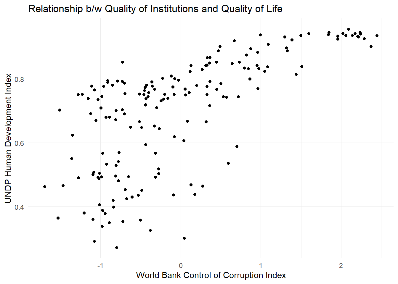
Sometimes people will report the correlation coefficient which is a measure of linear association and ranges from -1 to +1. Where -1 means perfect negative relation, 0 means no relation and +1 means perfect positive relation. The correlation coefficient is commonly used as as summary statistic. It’s disadvantage is that you cannot see the non-linear relations which can using a scatterplot.
We take the correlation coefficient like so:
cor(y = world.data$undp_hdi,
    x = world.data$wbgi_cce,
    use = "complete.obs")
[1] 0.6821114| Argument | Description |
|---|---|
x |
The x variable that you want to correlate. |
y |
The y variable that you want to correlate. |
use |
How R should handle missing values. use="complete.obs" will use only those rows where neither x nor y is missing. |
We can then test the statistical significance of the correlation using the cor.test() function:
cor.test(y = world.data$undp_hdi,
         x = world.data$wbgi_cce)
    Pearson's product-moment correlation

data:  x and y
t = 12.269, df = 173, p-value < 2.2e-16
alternative hypothesis: true correlation is not equal to 0
95 percent confidence interval:
 0.5938588 0.7541452
sample estimates:
      cor
0.6821114
It looks like this is statistically significant!
7.1.5 Exercises
We will continue to use the British Crime Survey 2007-2008 data for this week’s additional activities. You can find the user guide to bcs here).
Begin by examining summary statistics of the variables
age,yrsarea,rural2,walkdarkandtcarea. Report these in a table and describe their distribution. Given the summary statistics, would it be wise to run a cross tabulation onrural2andtcarea? Why or why not?Create a cross tabulation of the type of area where a person lives (i.e. urban or rural) and how safe they feel when walking alone after dark. Be sure to include row percentages. Which is the dependent variable and which is the independent variable in this case? How would you interpret this table?
Produce a chi-squared statistic for this cross-tabulation. Note that this will be easier if you reproduce a basic version of the table using
table(). State a null hypothesis and research hypothesis. Can you reject the null hypothesis? Why or why not? Report the Chi Square, degrees of freedom and p-value. Interpret your results.Test the strength of the relationship using Cramer’s V. Report and interpret the statistic. What can you infer about the relationship between rurality of an area and perceived safety after dark?
Subset your data to only include people aged 90 or over (remember the filter() function from previous weeks!) and rerun your cross tabulation and a test of statistical significance. (Are your expected counts large enough in each cell to use a Chi Square test?) Report and interpret your results.
Now we will go back to the QoG dataset to look at correlations:
- Create a scatter plot with latitude on the x-axis and political stability on the y-axis.
- What is the correlation coefficient of political stability and latitude? Is it statistically significant?
- If we move away from the equator, how does political stability change?
- Does it matter whether we go north or south from the equator?