Chapter 5 Multiple linear regression models (I)
5.1 Seminar – in class exercises
Today we will again be using texreg, so if you haven’t installed it, make sure you do so! Otherwise, let’s load that and, of course, the tidyverse.
install.packages("texreg") # install only once
library(texreg) # load in the beginning of every R session
library(tidyverse) # also load tidyverse!
To get a deeper understanding of what the tidyverse has to offer, see the information in Going further with the tidyverse: dplyr, magrittr and ggplot2.
5.1.1 Loading, Understanding and Cleaning our Data
Today, we load the full standard (cross-sectional) dataset from the Quality of Government Institute (this is a newer version than the one we have used previously). This is a great data source for comparative political science research. The codebook is available from their main website. You can also find time-series datasets on this page.
The dataset is saved on the Queen Mary GitHub account, so let’s load it from there:
# load dataset
world_data <- read.csv("https://raw.githubusercontent.com/QMUL-SPIR/Public_files/master/datasets/qog_20.csv")

# check the dimensions of the dataset
dim(world_data)
[1] 194 1758The dataset contains many variables. We will select a subset of variables that we want to work with. We are interested in political stability. Specifically, we want to find out what predicts the level of political stability. Therefore, political_stability is our dependent variable (also called response variable, left-hand-side variable, explained/predicted variable). We will also select a variable that identifies each row (observation) in the dataset uniquely: cname which is the name of the country. Potential predictors (independent variables, right-hand-side variables, covariates) are:
lp_lat_abstis the distance to the equator which we rename intolatitudeti_cpiis Transparency International’s Corruptions Perceptions Index, renamed toinstitutions_quality(larger values mean better quality institutions, i.e. less corruption)bti_dsis a score out of 10 for ‘democracy status’ – i.e. the extent to which democratic norms are followed in the country’s political system, renamed todemocracy(larger values mean more democratic)
Our dependent variable:
wbgi_pvewhich we rename intopolitical_stability(larger values mean more stability)
We know from previous weeks that there are multiple ways to subset datasets. Here we use select(), to subset and rename the columns.
world_data <- select(
  world_data, # dataset
  country = cname, # keep these variables but change their names
  political_stability = wbgi_pve,
  latitude = lp_lat_abst,
  democracy = bti_ds,
  institutions_quality = ti_cpi
  )

head(world_data)
country political_stability latitude democracy
1 Afghanistan -2.6710539 0.3666667 3.016667
2 Albania 0.3446447 0.4555556 7.050000
3 Algeria -1.0975257 0.3111111 4.750000
4 Andorra 1.4134194 0.4700000 NA
5 Angola -0.3158988 0.1366667 4.200000
6 Antigua and Barbuda 0.8786072 NA NA
institutions_quality
1 15
2 39
3 34
4 NA
5 18
6 NAThese two steps could have been combined in one ‘pipe’ – to see how, take a look at Going further with the tidyverse: dplyr, magrittr and ggplot2.
The function summary() lets you summarize data sets. We will look at the dataset now. When the dataset is small in the sense that you have few variables (columns) then this is a very good way to get a good overview. It gives you an idea about the level of measurement of the variables and the scale. country, for example, is a character variable as opposed to a number. Countries do not have any order, so the level of measurement is categorical.
If you think about the next variable, political stability, and how one could measure it you know there is an order implicit in the measurement: more or less stability. From there, what you need to know is whether the more or less is ordinal or interval scaled. Checking political_stability you see a range from roughly -3 to 1.5. The variable is numerical and has decimal places. This tells you that the variable is at least interval scaled. You will not see ordinally scaled variables with decimal places. Examine the summaries of the other variables and determine their level of measurement.
   country          political_stability    latitude        democracy
 Length:194         Min.   :-2.916323   Min.   :0.0000   Min.   :1.433
 Class :character   1st Qu.:-0.642414   1st Qu.:0.1111   1st Qu.:3.725
 Mode  :character   Median :-0.003028   Median :0.2222   Median :5.700
                    Mean   :-0.068998   Mean   :0.2572   Mean   :5.551
                    3rd Qu.: 0.730046   3rd Qu.:0.3778   3rd Qu.:7.112
                    Max.   : 1.519183   Max.   :0.7222   Max.   :9.950
                                        NA's   :41       NA's   :58
 institutions_quality
 Min.   :10.00
 1st Qu.:29.00
 Median :38.00
 Mean   :42.72
 3rd Qu.:56.75
 Max.   :90.00
 NA's   :16
The variables latitude, institutions_quality, and democracy have 41, 16 and 58 missing values respectively, each marked as NA. Missing values could cause trouble because operations including an NA will produce NA as a result (e.g.: 1 + NA = NA). We will drop these missing values from our data set using the drop_na() function we have used before.
Generally, we want to make sure we drop missing values only from variables that we care about. Here, because there are only missing data on the variables that we care about, we can run drop_na() on the whole dataset and achieve what we want. However, we could also target the specific variables, as below.
If we summarise the data, we can now see that we have no NAs.
   country          political_stability    latitude        democracy
 Length:106         Min.   :-2.9163     Min.   :0.0000   Min.   :1.433
 Class :character   1st Qu.:-0.9013     1st Qu.:0.1111   1st Qu.:3.788
 Mode  :character   Median :-0.3855     Median :0.1944   Median :5.492
                    Mean   :-0.4505     Mean   :0.2110   Mean   :5.476
                    3rd Qu.: 0.1426     3rd Qu.:0.3092   3rd Qu.:6.862
                    Max.   : 1.4958     Max.   :0.5778   Max.   :9.950
 institutions_quality
 Min.   :10.00
 1st Qu.:27.00
 Median :34.50
 Mean   :35.49
 3rd Qu.:41.00
 Max.   :84.00
The range of the variable latitude is between 0 and 1 (it’s actually 0 to 0.5777778 here but it could be up to 1). The codebook clarifies that the latitude of a country’s capital has been divided by 90 to get a variable that ranges from 0 to 1. This would make interpretation difficult. When interpreting the effect of such a variable a unit change (a change of 1) covers the entire range or put differently, it is a change from a country at the equator to a country at one of the poles.
We therefore multiply by 90 again. This will turn the units of the latitude variable into degrees again which makes interpretation easier.
5.1.2 Estimating a Bivariate Regression
Is there a correlation between the distance of a country to the equator and the level of political stability? Both political stability (dependent variable) and distance to the equator (independent variable) are continuous. Therefore, we will get an idea about the relationship using a scatter plot.
p1 <- ggplot(data = world_data, # dataset to work from
             mapping = aes(x = latitude, # x axis
                           y = political_stability)) + # y axis
  geom_point() + # make it a scatterplot
  labs(x = 'Latitude', # x axis label
       y = 'Political stability') + # y axis label
  theme_bw() # clean background

p1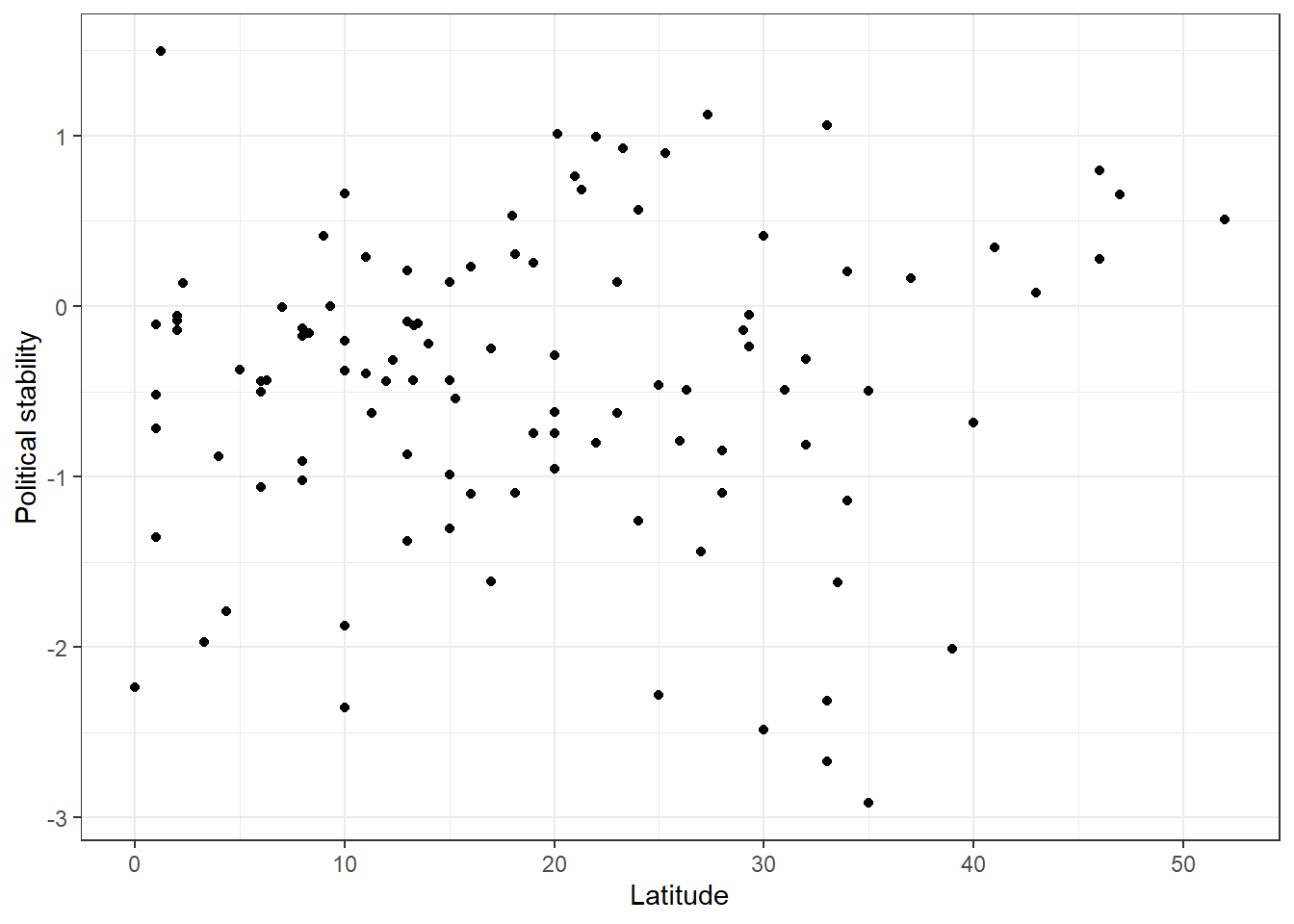
Looking at the cloud of points suggests that there might be a positive relationship: increases in our independent variable latitude appear to be associated with increases in the dependent variable political_stability (the further from the equator, the more stable).
We can fit a line of best fit through the points. To do this we can simply ask ggplot() to add a ‘smooth’ line which is estimated through the linear model of interest (y ~ x, or political_stability ~ latitude).
# add the line
p1 <- p1 +
  geom_smooth(method = "lm", # 'lm' = 'linear model' - it automatically used your x and y values
              se = FALSE) # don't show confidence interval around the line

p1
`geom_smooth()` using formula = 'y ~ x'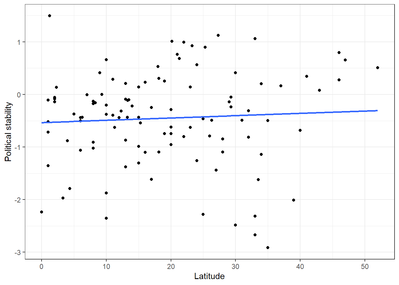
The blue line represents the ‘line of best fit’ or regression line. It is the line that minimises the squared distance of all the points from the line itself - the ‘least squares’ line. It looks like this line shows a very slight positive association between latitude and political stability. The further away from the equator a country is, the higher its level of political stability. But is this actually a systematic relationship? Is there a statistically significant association?
We can assess this by running a regression model (the same one R is running behind the scenes to fit the line above) and looking at its output. We fit such a model, like last week, using lm() and how its output using screenreg().
# bivariate model
latitude_model <- lm(political_stability ~ latitude, data = world_data)

screenreg(latitude_model)
======================
             Model 1
----------------------
(Intercept)   -0.53 **
              (0.16)
latitude       0.00
              (0.01)
----------------------
R^2            0.00
Adj. R^2      -0.01
Num. obs.    106
======================
*** p < 0.001; ** p < 0.01; * p < 0.05
Thinking back to last week, how can we interpret this regression ouput?
- The coefficient for the variable
latitude(\(\beta_1\)) indicates that a one-unit increase in a country’s latitude is associated with approximately0.00increase in the measure of political stability, on average. - The coefficient for the
(intercept)term (\(\beta_0\)) indicates that the average level of political stability for a country with a latitude of 0 is \(-0.53\) (wherelatitude = 0is a country positioned at the equator) - The \(R^2\) of the model is approximately 0.00. This implies that none of the variation in the dependent variable (political stability) is explained by the independent variable (latitude) in the model.
So… we don’t seem to have done a very good job of predicting political stability here. Latitude seems to have very little to do with it. That’s OK! Failing to reject the null hypothesis of no relationship between our variables is not actually a failure. It’s always good to remember that finding no relationship can be as informative as finding one, and lots of the best social science research is work that demonstrates there is likely to be no relationship between a predictor and an outcome.
But, remember, we removed a lot of cases with missing values earlier. There might be a lot of cases we removed that actually have no missing data on the latitude variable. What if, when looking at all the data, there actually is a significant association?
world_data_2 <- read.csv("https://raw.githubusercontent.com/QMUL-SPIR/Public_files/master/datasets/qog_20.csv")


world_data_2 <-
  select(world_data_2,
         country = cname,
         political_stability = wbgi_pve,
         latitude = lp_lat_abst,
         democracy = bti_ds,
         institutions_quality = ti_cpi)


world_data_2 <- drop_na(world_data_2, latitude) # only drop missings on predictor of interest


world_data_2 <- mutate(world_data_2, latitude = latitude*90) # put latitude on correct scale again

latitude_model_2 <- lm(political_stability ~ latitude, data = world_data_2)

screenreg(latitude_model_2)
=======================
             Model 1
-----------------------
(Intercept)   -0.48 ***
              (0.13)
latitude       0.02 ***
              (0.00)
-----------------------
R^2            0.09
Adj. R^2       0.08
Num. obs.    153
=======================
*** p < 0.001; ** p < 0.01; * p < 0.05
Now, we see that there does appear to be a highly statistically significant association here. Each one unit increase in latitude increases political stability by about 0.02, a relationship which is statistically significant at the .001 level. This shows you the importance of making sure you remove NAs in an appropriate way for your analysis. Because we are only working with a bivariate relationship here, we only need our independent and dependent variables to be free of missing data. When we start running multiple regression models, though, we need to make sure all of the predictors are free from missing data. Or at least, we need to know how much missingness there is.
5.1.3 Multivariate Regression
The regression above suggests that there is a significant association between these variables. We might be able to see why this is the case, but we probably don’t think that it tells a complete picture. At the least, it is unlikely that there is a simple causal link between being further away from the equator and having higher political stability. We could therefore consider other variables to include in our model.
Perhaps it’s not that hypothetically moving further away from the equator would bring a country more political stability, but instead that those countries closer to the equator happen to tend to be less democratic, and this lower level of democracy makes them less politically stable. We can therefore ask if latitude is still associated with political stability while ‘controlling’ for level of democracy. That is, once we know how democratic a country is, does knowing about its latitude tell us any more about its political stability?
We can assess this using a multivariate, or multiple, regression model. To specify a multiple linear regression model, the only thing we need to change is what we pass to the formula argument of the lm() function. In particular, if we wish to add additional explanatory variables, the formula argument will take the following form:
where k indicates the total number of independent variables we would like to include in the model. In the example here, our model would therefore look like the following:
# model with more explanatory variables
multi_model_1 <- lm(political_stability ~
                      latitude + democracy,
                    data = world_data_2)

screenreg(multi_model_1)
=======================
             Model 1
-----------------------
(Intercept)   -1.77 ***
              (0.25)
latitude       0.00
              (0.01)
democracy      0.24 ***
              (0.04)
-----------------------
R^2            0.26
Adj. R^2       0.25
Num. obs.    106
=======================
*** p < 0.001; ** p < 0.01; * p < 0.05
Remember, political_stability is our dependent variable, as before, and now we have two independent variables: latitude and democracy. Again, just as with the bivariate model, we can view the summarised output of the regression by using screenreg(). It looks like we might be right. When accounting for democracy (which appears to be highly associated with political stability), latitude is not significantly associated with political stability. As we now have two models (a simple regression model, and a multiple regression model), we can join them together using the list() function, and then put all of that inside screenreg().
===================================
             Model 1     Model 2
-----------------------------------
(Intercept)   -0.48 ***   -1.77 ***
              (0.13)      (0.25)
latitude       0.02 ***    0.00
              (0.00)      (0.01)
democracy                  0.24 ***
                          (0.04)
-----------------------------------
R^2            0.09        0.26
Adj. R^2       0.08        0.25
Num. obs.    153         106
===================================
*** p < 0.001; ** p < 0.01; * p < 0.05
But… look at the Ns of the two models. Notice that when we ran the multivariate model, we used the version of the dataset where only the missing values on latitude were removed. But lm() removed the NAs from democracy, too, by default. This means that the data used here, like the first time we ran the bivariate latitude model, has a large amount of cases removed. The models are therefore not comparable. It could also be this that is once again bringing about the null relationship between latitude and political stability, rather than our modelling strategy. This sort of thing is why it is so important to think about missing data and its potential implications.
Let’s try an example where missing data doesn’t complicate things quite so much. Loading the data from scratch again, we subset to include variables on political stability, the functioning of government, the rule of law, and freedom of expression:
wbgi_pve- Political Stability: measures perceptions of the likelihood of political instability and/or politically motivated violence, including terrorism.fh_fog- Functioning of Government: measures the policy-making power of elected legislature, including extent of corruption as well as accountability and transparency. 0 (worst) - 12 (best) scale.fh_rol- Rule of Law: measures the independence of the judiciary, prevalence of rule of law in civil and criminal matters, civic control over police, protection from injustice, etc. 0 (worst) - 16 (best) scale.fh_feb- Freedom of Expression: measures the freedom and independence of media and cultural expressions, religious groups, academia, etc. 0 (worst) - 16 (best) scale.
qog <- read.csv("https://raw.githubusercontent.com/QMUL-SPIR/Public_files/master/datasets/qog_20.csv")


qog <-
  select(qog,
         country = cname,
         political_stability = wbgi_pve,
         gov_func = fh_fog,
         rule_law = fh_rol,
         free_exp = fh_feb)

summary(qog)
country political_stability gov_func rule_law
Length:194 Min. :-2.916323 Min. : 0.000 Min. : 0.000
Class :character 1st Qu.:-0.642414 1st Qu.: 3.000 1st Qu.: 4.000
Mode :character Median :-0.003028 Median : 7.000 Median : 8.000
Mean :-0.068998 Mean : 6.356 Mean : 8.098
3rd Qu.: 0.730046 3rd Qu.:10.000 3rd Qu.:12.750
Max. : 1.519183 Max. :12.000 Max. :16.000
free_exp
Min. : 0.00
1st Qu.: 7.00
Median :12.00
Mean :10.89
3rd Qu.:15.00
Max. :16.00 These variables have no missing data: these measures are available for every country in the dataset. We also give this dataset a different name, qog, to prevent confusion.
We are interested here in how democratic indicators are related to political stability. We might hypothesise that more democratic countries tend to be more politically stable. For example, those countries where individuals have greater freedom of expression might have higher political stability because people do not feel the need to resort to more radical, violent forms of expression. Let’s check this.
# visualise relationship
p2 <- ggplot(data = qog, # dataset to work from
             mapping = aes(x = free_exp, # x axis
                           y = political_stability, # y axis
                           group = free_exp)) + # group data on x axis
  geom_boxplot() + # make it a boxplot
  labs(x = "Freedom of expression", # x axis label
       y = "Political Stability") + # y axis label
  theme_bw()

p2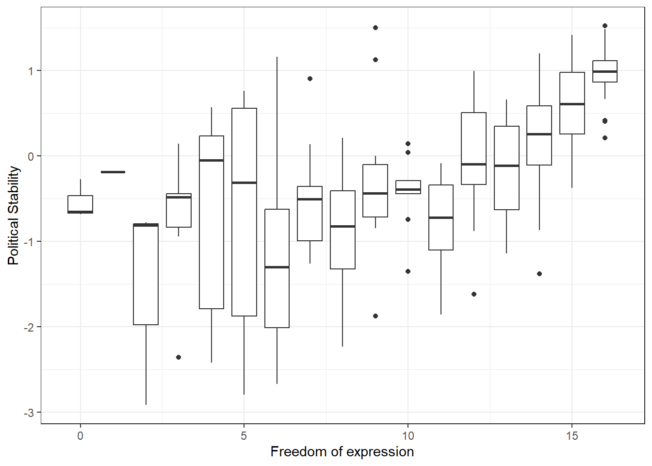
It does indeed appear that higher levels of freedom of expression are associated with higher average levels of political stability. To understand boxplots better, see [Going further with ggplot2]. We can also get a simple correlation coefficient for this relationship, and test for statistical significance.
[1] 0.6131883
    Pearson's product-moment correlation

data:  qog$free_exp and qog$political_stability
t = 10.756, df = 192, p-value < 2.2e-16
alternative hypothesis: true correlation is not equal to 0
95 percent confidence interval:
 0.5169708 0.6941044
sample estimates:
      cor
0.6131883
There does indeed appear to be a significant association. We can quantify this association more usefully using a regression model.
# regression model
exp_mod <- lm(political_stability ~ free_exp, data = qog)

# summarise results in a table
screenreg(exp_mod)
=======================
             Model 1
-----------------------
(Intercept)   -1.50 ***
              (0.14)
free_exp       0.13 ***
              (0.01)
-----------------------
R^2            0.38
Adj. R^2       0.37
Num. obs.    194
=======================
*** p < 0.001; ** p < 0.01; * p < 0.05
It looks like countries with greater freedom of expression are more politically stable. For each one unit increase in freedom of expression, we expect political stability to increase by approximately 0.13 units, and this relationship is highly statistically significant (p < 0.001). This model explains about 38% of the variance in political stability.
Yet, it could be the case that, even if freedom of expression has a causal effect on political stability, there is more to it than this. Perhaps we are not getting a good estimate of the causal relationship, because we aren’t accounting for confounding. Maybe freedom of expression is guaranteed by the rule of law, and it is the rule of law which brings about political stability. This would mean that rule of law confounds the relationship between freedom of expression and political stability. Given that political stability is defined here as the absence of political violence, the rule of law seems likely to have an effect on its prevalence. If we think that this is likely to be the case, we can run a multiple regression model to control for the rule of law in estimating the effect of freedom of expression on political stability.
# multiple regression model
confound_mod <- lm(political_stability ~ free_exp + rule_law, data = qog)

screenreg(confound_mod)
=======================
             Model 1
-----------------------
(Intercept)   -1.02 ***
              (0.13)
free_exp      -0.07 **
              (0.02)
rule_law       0.21 ***
              (0.02)
-----------------------
R^2            0.59
Adj. R^2       0.59
Num. obs.    194
=======================
*** p < 0.001; ** p < 0.01; * p < 0.05
The results of this are very interesting. First of all, we can see that in this model, both predictors are statistically significantly associated with political stability. We also account for almost 60% of the variance in political stability here.
Moving beyond this, though, we can also see that freedom of expression is now negatively associated with political stability. This tells us that when we know about a country’s degree of rule of law, greater levels of freedom of expression actually lead to less political stability. Were we to set rule of law at a fixed level, varying freedom of expression independently of this would produce a negative effect on political stability.
We can think about this in substantive terms. Imagine fixing the rule of law to a set level in all countries. The judiciaries are all of the same independence, civic control over police is even everywhere, etc. Now, if we allow some of those countries a greater level of freedom of expression than others, those with greater levels of freedom of expression might actually experience more political instability because radical political expressions are not immediately shut down and revolutionary movements are allowed to grow. Remember that in this case, those places with greater freedom of expression do not also have greater rule of law, because we are controlling for this relationship in our model.
We might, similarly, assert theoretically that the functioning of government would have a similar effect on the relationship between freedom of expression and political stability. We can control for this, too, by simply adding it in.
# regression model
confound_mod_2 <- lm(political_stability ~ free_exp + rule_law + gov_func, data = qog)

screenreg(confound_mod_2)
=======================
             Model 1
-----------------------
(Intercept)   -1.02 ***
              (0.13)
free_exp      -0.07 **
              (0.02)
rule_law       0.22 ***
              (0.03)
gov_func      -0.01
              (0.04)
-----------------------
R^2            0.59
Adj. R^2       0.59
Num. obs.    194
=======================
*** p < 0.001; ** p < 0.01; * p < 0.05
We see that this changes very little. The estimates for freedom of expression and rule of law remain unchanged, as does the amount of variance explained. (This will actually have increased very slightly, but not at the two decimal place level.) This does not mean, however, that we should remove functioning of government from our model. This depends on your goal, of course, but generally variables should be included for theoretical reasons and not because of relationships we observe empirically in the data.
What we have done here is take a principled approach to multiple regression. Unfortunately, it is fairly common to include more and more variables in regression models simply to ‘control’ for everything. But this is bad practice. We had theoretical reasons to introduce additional variables, and doing so allowed us to come up with potentially interesting, useful inferences about how political stability might vary across democracies. We could add more variables to these models, but we should not just do this for the sake of it. If nothing else, interpreting models becomes more difficult when they become more complex.
5.1.4 Joint Significance Test (F-statistic)
Whenever you add variables to your model, you will explain more of the variance in the dependent variable. That means, using your data, your model will better predict outcomes. We would like to know whether the difference (the added explanatory power) is statistically significant. The null hypothesis is that the added explanatory power is zero and the p-value gives us the probability of observing such a difference as the one we actually computed assuming that null hypothesis (no difference) is true.
The F-test is a joint hypothesis test that lets us compute that p-value. Two conditions must be fulfilled to run an F-test:
| Conditions for F-test model comparison |
|---|
Both models must be estimated from the same sample! If your added variables contain lots of missing values and therefore your n (number of observations) are reduced substantially, you are not estimating from the same sample. |
| The models must be nested. That means, the model with more variables must contain all of the variables that are also in the model with fewer variables. |
We specify two models: a restricted model and an unrestricted model. The restricted model is the one with fewer variables. The unrestricted model is the one including the extra variables. We say restricted model because we are “restricting” it to NOT depend on the extra variables. Once we estimated those two models we compare the residual sum of squares (RSS). The RSS is the sum over the squared deviations from the regression line and that is the unexplained error. The restricted model (fewer variables) is always expected to have a larger RSS than the unrestricted model. Notice that this is same as saying: the restricted model (fewer variables) has less explanatory power.
We test whether the reduction in the RSS is statistically significant using a distribution called “F distribution”. If it is, the added variables are jointly (but not necessarily individually) significant. You do not need to know how to calculate p-values from the F distribution, as we can use the anova() function in R to do this for us.
Analysis of Variance Table

Model 1: political_stability ~ free_exp
Model 2: political_stability ~ free_exp + rule_law + gov_func
  Res.Df     RSS Df Sum of Sq     F    Pr(>F)
1    192 116.324
2    190  75.623  2    40.701 51.13 < 2.2e-16 ***
---
Signif. codes:  0 '***' 0.001 '**' 0.01 '*' 0.05 '.' 0.1 ' ' 1
As we can see from the output, the p-value here is very small, which means that we can reject the null hypothesis that the unrestricted model has no more explanatory power than the restricted model.
5.1.5 Predicting outcome conditional on institutional quality
Just as we did with the simple regression model last week, we can use the fitted model object to calculate the fitted values of our dependent variable for different values of our explanatory variables. To do so, we again use the predict() function.
We proceed in three steps.
- We set the values of the covariates for which we would like to produce fitted values.
- You will need to set covariate values for every explanatory variable that you included in your model.
- As we are primarily studying the effect of freedom of expression on political stability, it is mainly the level of this variable that we are most interested in.
- Therefore, we will calculate fitted values over the range of
free_exp, while setting the values ofrule_lawandgov_functo their median values (they are ordinal so we shouldn’t use the mean).
- We calculate the fitted values.
- We report the results (here we will produce a plot).
For step one, the following code produces a data.frame of new covariate values for which we would like to calculate a fitted value from our model:
# set the values for the explanatory variables
data_for_fitted_values <- data.frame(free_exp = seq(from = 0, to = 16, by = 1),
                                     # all possible levels of freedom of expression
                                     rule_law = median(qog$rule_law),
                                     # median level of rule of law
                                     gov_func = median(qog$gov_func)
                                     # median level of functioning of govt
                                     )

head(data_for_fitted_values)
free_exp rule_law gov_func
1 0 8 7
2 1 8 7
3 2 8 7
4 3 8 7
5 4 8 7
6 5 8 7As you can see, this has produced a data.frame in which every observation has a different value of free_exp but the same value for rule_law and gov_func.
We can now calculate the fitted values for each of these combinations of our explanatory variables by passing the data_for_fitted_values object to the newdata argument of the predict() function.
# calculate the fitted values
fitted_values <- predict(confound_mod_2, # model to use
                         newdata = data_for_fitted_values) # new data with fixed variable levels

# save the fitted values as a new variable in the data_for_fitted_values object
data_for_fitted_values$fitted_values <- fitted_values

head(data_for_fitted_values)
free_exp rule_law gov_func fitted_values
1 0 8 7 0.6359869
2 1 8 7 0.5686409
3 2 8 7 0.5012949
4 3 8 7 0.4339490
5 4 8 7 0.3666030
6 5 8 7 0.2992571Now, for each of our explanatory variable combinations, we have the corresponding fitted values as calculated from our estimated regression.
Finally, we can plot these values:
p3 <- ggplot(data = data_for_fitted_values, # dataset to work from
             mapping = aes(x = free_exp, # x axis
                           y = fitted_values)) + # y axis
  geom_line() + # geom_line() will produce a line plot, rather than the scatter plot
  labs(x =  "Freedom of expression", # x axis label
       y = "Fitted value for political stability") + # y axis label
  theme_bw() # clean background

p3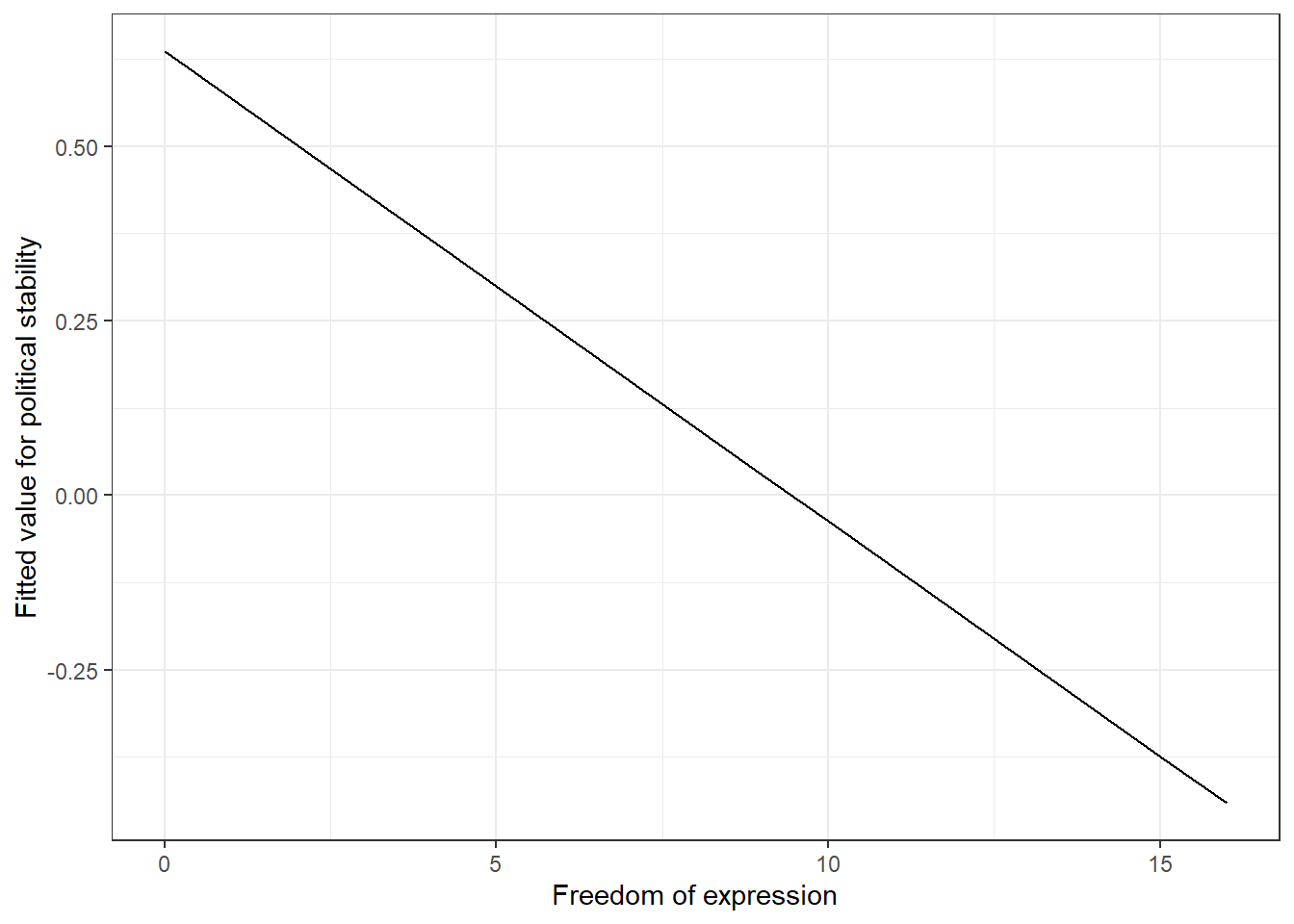
We can see here exactly what we would expect from our regression models. Once we control for the effect of the rule of law, freedom of expression actually has a negative effect on political stability. There is a clear negative relationship here.
However, our plot as it is definitely makes this relationship look a bit too clear and a bit too certain. It is better to try to show the uncertainty of analyses like this, and this is what is usually done in real quantitative research. We can do this by calculating the confidence interval for our fitted values and plotting this too.
# calculate the fitted values
fitted_values <- predict(confound_mod_2, # model to base it on
                         newdata = data_for_fitted_values, # dataset with fixed variable levels
                         interval = 'confidence' # get confidence interval
                         )

# attach the fitted values and their confidence intervals to the dataset
data_for_fitted_values <- cbind(data_for_fitted_values,
                                fitted_values) # combine original dataset with fitted values and upper and lower bounds of confidence interval

# plot
p4 <- ggplot(data_for_fitted_values, # dataset to work from
             aes(x = free_exp, # x axis
                 y = fit)) + # y axis
  geom_pointrange(aes(ymin = lwr, # add estimate and intervals for each level of free_exp
                      ymax = upr)) + # ymin is the lower bound, ymax upper bound
  geom_line() + # add line through all fitted values
  geom_ribbon(aes(ymin = lwr, # add shaded area to highlight confidence interval
                  ymax = upr), # ymin is the lower bound, ymax upper bound
                  alpha = 0.2) + # make the shaded area very transparent
  labs(title = "Fitted values and 95% CIs of political stability by freedom of expression", # plot title
       subtitle = "Estimated when controlling for functioning of government and rule of law", # plot subtitle
       x = "Freedom of expression", # x axis label
       y = "Fitted value for political stability") + # y axis label
  theme_bw() # clean background

p4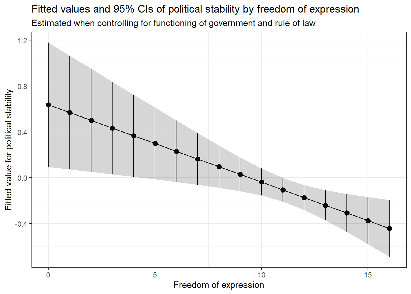
This type of plot is very common in published research, because it gives us a clear idea of the nature of the relationship and the uncertainty in our estimate of it. The points show each fitted value, and the range of the vertical lines (and the shaded area) show the uncertainty of these estimates as a 95% confidence interval.
As well as getting a full range of predictions in this way, we can also ask our model for predictions for certain specific combinations of levels of our predictors. All we have to do is change the data we pass to the predict function. Say we wanted to know what level of political stability is predicted when freedom of expression is high at 14, rule of law is low at 2, and functioning of government is also low at 2. We can simply specify this in the predict() call. The result tells us what level of political stability we would expect, based on our model, for these levels of our predictors.
# calculate the fitted values
fitted_values_2 <- predict(confound_mod_2,
                           newdata = data.frame(
                             free_exp = 14,
                             rule_law = 2,
                             gov_func = 2),
                           interval = 'confidence')

head(fitted_values_2)
fit lwr upr
1 -1.552916 -1.969072 -1.13676We see here that political stability is very low. Let’s try another combination of values.
# calculate the fitted values
fitted_values_3 <- predict(confound_mod_2,
                           newdata = data.frame(
                             free_exp = 6,
                             rule_law = 12,
                             gov_func = 8),
                           interval = 'confidence')

head(fitted_values_3)
fit lwr upr
1 1.088947 0.7074011 1.470493Here, unsurprisingly, political stability is much higher.
5.1.7 Homework exercises
- Pretend that you are writing a research paper. Select one dependent variable that you want to explain with a statistical model. You might want to consult the QoG codebook on the website. Run a simple regression (with one explanatory variable) on that dependent variable and justify your choice of explanatory variable. This will require you to think about the outcome that you are trying to explain, and what you think will be a good predictor for that outcome.
- Add an additional explanatory variable to your model and justify the choice again. See how the results change. Carry out the F-test to check whether the new model explains significantly more variance than the old model.
- Calculate fitted values for your dependent variable whilst varying at least one of your continuous explanatory variables, and plot the result.