Chapter 2 Distributions, data management and visualisation
2.1 Seminar – in class exercises
Today, we will cover distributions, as well as introducing you to basic data management and visualisation. Make sure to load the tidyverse again:
The tidyverse contains most of the functions you see when we show you alternative approaches to various tasks. At some stage, you may find it useful to learn more about this in the section Going further with the tidyverse: dplyr, magrittr and ggplot2.
2.1.1 Subsetting
When we deal with datasets and vectors, we want to be able to subset these objects. Subsetting means we access a specific part of the dataset or vector. R comes with some small datasets included. The macroecomonic dataset longley is one such dataset. Lets have a look at what the dataset contains by using the helpfiles:
A dataset is two-dimensional. Its first dimension is the rows. A 5 on the first dimension, therefore, means row 5. On the second dimension, we have columns. A 4 on the second dimension refers to column 4. We can identify each individual element in a dataset by its row and column coordinates. In R, we subset using square brackets [ row.coordinates, column.coordinates ]. In the square brackets, we place the row coordinates first, and column coordinates second. The coordinates are separated by a comma. If we want to see an entire row, we leave the column coordinate unspecified. The first row of the longley dataset is:
     GNP.deflator     GNP Unemployed Armed.Forces Population Year Employed
1947           83 234.289      235.6          159    107.608 1947   60.323
The second column is:
 [1] 234.289 259.426 258.054 284.599 328.975 346.999 365.385 363.112 397.469
[10] 419.180 442.769 444.546 482.704 502.601 518.173 554.894
The element in the first row and second column is:
[1] 234.289We can view a number of adjacent rows with the colon operator like so:
     GNP.deflator     GNP Unemployed Armed.Forces Population Year Employed
1947         83.0 234.289      235.6        159.0    107.608 1947   60.323
1948         88.5 259.426      232.5        145.6    108.632 1948   61.122
1949         88.2 258.054      368.2        161.6    109.773 1949   60.171
1950         89.5 284.599      335.1        165.0    110.929 1950   61.187
1951         96.2 328.975      209.9        309.9    112.075 1951   63.221
We can view a number of non adjacent rows using the vector function c() like so:
     GNP.deflator     GNP Unemployed Armed.Forces Population Year Employed
1947         83.0 234.289      235.6        159.0    107.608 1947   60.323
1949         88.2 258.054      368.2        161.6    109.773 1949   60.171
1951         96.2 328.975      209.9        309.9    112.075 1951   63.221
Furthermore, columns in datasets have names. These are the variable names. We can obtain a list of variable names with the names() function.
[1] "GNP.deflator" "GNP"          "Unemployed"   "Armed.Forces" "Population"
[6] "Year"         "Employed"
This returns a vector of names. You may have noticed the quotation marks. Whenever you see quotation marks in R, you know this refers to text, or ‘character’ strings.
We can use the name of a variable for subsetting a dataset. This is useful when we don’t know which column number corresponds to which variable. Suppose we want to see the population variable. We can either use 5 in square brackets because population is the 5th column or we can place the variable name within quotation marks in the brackets.
 [1] 107.608 108.632 109.773 110.929 112.075 113.270 115.094 116.219 117.388
[10] 118.734 120.445 121.950 123.366 125.368 127.852 130.081
To access multiple variable columns by the variable names, we have to use the vector function c() like so:
         GNP Armed.Forces Population
1947 234.289        159.0    107.608
1948 259.426        145.6    108.632
1949 258.054        161.6    109.773
1950 284.599        165.0    110.929
1951 328.975        309.9    112.075
1952 346.999        359.4    113.270
1953 365.385        354.7    115.094
1954 363.112        335.0    116.219
1955 397.469        304.8    117.388
1956 419.180        285.7    118.734
1957 442.769        279.8    120.445
1958 444.546        263.7    121.950
1959 482.704        255.2    123.366
1960 502.601        251.4    125.368
1961 518.173        257.2    127.852
1962 554.894        282.7    130.081
For cases where we only want to access one column, though, the most efficient way is usually to use the dollar sign ($) operator.
 [1] 107.608 108.632 109.773 110.929 112.075 113.270 115.094 116.219 117.388
[10] 118.734 120.445 121.950 123.366 125.368 127.852 130.081Alternatively, there are useful functions for subsetting datasets, which avoid the need to use square brackets and dollar signs. With these functions you don’t even need to put the column names in quotation marks. First, for subsetting columns, we can use select():
# select() subsets by column
longley_subset <- select(longley, Population)

# select() allows you to choose as many columns as you like
longley_subset <- select(longley, Population, GNP, Armed.Forces)

# you can also rename columns in the process
longley_subset <- select(longley,
                         pop = Population, # keep the population variable, but change its name
                         gnp = GNP, # keep and rename gnp variable
                         army = Armed.Forces) # keep and rename armed forces variable

# rename() allows you to rename columns without subsetting
longley_renamed <- rename(longley, # keep *all* variables, but rename some
                          pop = Population, # rename population variable
                          gnp = GNP, # rename gnp variable
                          army = Armed.Forces) # rename armed forces variable)
Sometimes, rather than subsetting a dataset to have fewer columns, you might actually want to extract a column and store it as a vector. This is done using pull().
For rows, we can subset using slice() or filter(). Note that, because rows don’t usually have names like columns do, we tend to subset rows either by their number or by their value on some column:
# slice() allows you to subset to specific rows
longley_subset <- slice(longley, 10)

# slice() allows you to select multiple rows
longley_subset <- slice(longley, 8:14)

# filter() allows you to subset only to rows that satisfy certain conditions
longley_subset <- filter(longley,
                         Population < 400) # only keep rows where the Population variable is less than 400

# note that this is also possible with square brackets
longley_subset <- longley[longley$GNP < 400, ]
Finally, two useful subsetting tricks:
- the
-operator means ‘except’ and can be used to view all elements except the one specified - with the
length()function we can find the last element of a vector
So, all rows in the longley data set execept the first 5 would be:
     GNP.deflator     GNP Unemployed Armed.Forces Population Year Employed
1952         98.1 346.999      193.2        359.4    113.270 1952   63.639
1953         99.0 365.385      187.0        354.7    115.094 1953   64.989
1954        100.0 363.112      357.8        335.0    116.219 1954   63.761
1955        101.2 397.469      290.4        304.8    117.388 1955   66.019
1956        104.6 419.180      282.2        285.7    118.734 1956   67.857
1957        108.4 442.769      293.6        279.8    120.445 1957   68.169
1958        110.8 444.546      468.1        263.7    121.950 1958   66.513
1959        112.6 482.704      381.3        255.2    123.366 1959   68.655
1960        114.2 502.601      393.1        251.4    125.368 1960   69.564
1961        115.7 518.173      480.6        257.2    127.852 1961   69.331
1962        116.9 554.894      400.7        282.7    130.081 1962   70.551
We can get the length of a vector using the length() function like so:
[1] 16That is the length of the first column in the longley dataset and because a dataset is rectangular it gives us the number of rows in the dataset as well. We get the last row in the longley dataset like so:
     GNP.deflator     GNP Unemployed Armed.Forces Population Year Employed
1962        116.9 554.894      400.7        282.7    130.081 1962   70.551
To get the last element in the population vector of the longley dataset, we would code:
[1] 130.081There are often many different approaches that will do the same thing. It does not matter how you get to a solution as long as you get there. For instance, the nrow() function returns the number of rows in a dataset or matrix object. So we could get the last element in the population vector using nrow() instead of length():
[1] 130.081These solutions are long-winded and can be confusing to read. Fortunately, again, there are alternatives:
# use tail() to get the last row
tail(longley,
     n = 1) # the n argument controls the number of rows you get
GNP.deflator GNP Unemployed Armed.Forces Population Year Employed
1962 116.9 554.894 400.7 282.7 130.081 1962 70.551# head() is the equivalent for the first rows
head(longley,
n = 3) # setting n to 3 gives first three rows GNP.deflator GNP Unemployed Armed.Forces Population Year Employed
1947 83.0 234.289 235.6 159.0 107.608 1947 60.323
1948 88.5 259.426 232.5 145.6 108.632 1948 61.122
1949 88.2 258.054 368.2 161.6 109.773 1949 60.171[1] 130.081[1] 234.289All of these alternative functions we have shown you can also be used with code the employs the ‘magrittr pipe’. To see how this works, go to Going further with the tidyverse: dplyr, magrittr and ggplot2.
2.1.2 Loading Dataset in CSV Format
We will now load a data set. Datasets come in different file formats. For instance, .tab (tabular separated files) or .csv (comma separated files) or .dta (file format of the statistical software Stata) or .xlsx (native Excel format) and many more. There is plenty of help online, if you ever have difficulties loading data into R.
Today, we load a file in comma separated format (.csv). To load our csv-file, we use the read.csv() function.
Our data comes from the Quality of Government Institute. Let’s have a look at the codebook and download the data using read.csv().
| Variable | Description |
|---|---|
| h_j | 1 if Free Judiciary |
| wdi_gdpc | Per capita wealth in US dollars |
| undp_hdi | Human development index (higher values = higher quality of life) |
| wbgi_cce | Control of corruption index (higher values = more control of corruption) |
| wbgi_pse | Political stability index (higher values = more stable) |
| former_col | 1 = country was a colony once |
| lp_lat_abst | Latitude of country’s captial divided by 90 |
world.data <- read.csv("https://raw.githubusercontent.com/QMUL-SPIR/Public_files/master/datasets/QoG2012.csv")If you want to save this file to your computer once you have downloaded it here, you can do so using write.csv().
Go ahead and (1) check the dimensions of world.data, (2) the names of the variables of the dataset, (3) print the first and last six rows of the dataset.
[1] 194 7[1] "h_j" "wdi_gdpc" "undp_hdi" "wbgi_cce" "wbgi_pse"
[6] "former_col" "lp_lat_abst" h_j wdi_gdpc undp_hdi wbgi_cce wbgi_pse former_col lp_lat_abst
1 0 628.4074 NA -1.5453584 -1.9343837 0 0.3666667
2 0 4954.1982 0.781 -0.8538115 -0.6026081 0 0.4555556
3 0 6349.7207 0.704 -0.7301510 -1.7336243 1 0.3111111
4 NA NA NA 1.3267342 1.1980436 0 0.4700000
5 0 2856.7517 0.381 -1.2065741 -1.4150945 1 0.1366667
6 NA 13981.9795 0.800 0.8624368 0.7084046 1 0.1892222 h_j wdi_gdpc undp_hdi wbgi_cce wbgi_pse former_col lp_lat_abst
189 0 1725.401 0.709 -0.99549788 -1.2074374 0 0.4555556
190 0 8688.500 0.778 -1.11006081 -1.3181511 1 0.0888889
191 NA 3516.269 0.769 0.05205211 1.0257839 1 0.1483333
192 0 2116.266 0.482 -0.77908695 -1.4510332 1 0.1666667
193 0 NA NA -0.74945450 -0.7479706 0 0.4888889
194 1 1028.642 0.389 -0.97803628 -0.4510383 1 0.16666672.1.3 Missing Values
When we are tidying and managing our data, we need to pay attention to missing values. These occur when we don’t have data on a certain variable for a certain case. Perhaps someone didn’t want to tell us which party they support, or how old they are. Perhaps there is no publicly available information on a certain demographic variable in a given state or country. It is, generally, a good idea to know how much of this ‘missingness’ there is in your data.
R has a useful package called naniar which helps you manage missingness. We install and load this package, along with some data from the Quality of Government Institute.
package 'naniar' successfully unpacked and MD5 sums checked

The downloaded binary packages are in
C:\Users\Ksenia NorthmoreBall\AppData\Local\Temp\RtmpCMJPUC\downloaded_packageslibrary(naniar)
# load in quality of government data
qog <- read.csv("https://raw.githubusercontent.com/QMUL-SPIR/Public_files/master/datasets/QoG2012.csv")The variables in this dataset are as follows.
| Variable | Description |
|---|---|
| h_j | 1 if Free Judiciary |
| wdi_gdpc | Per capita wealth in US dollars |
| undp_hdi | Human development index (higher values = higher quality of life) |
| wbgi_cce | Control of corruption index (higher values = more control of corruption) |
| wbgi_pse | Political stability index (higher values = more stable) |
| former_col | 1 = country was a colony once |
| lp_lat_abst | Latitude of country’s captial divided by 90 |
Let’s inspect the variable h_j. It is categorical, where 1 indicates that a country has a free judiciary. We use the table() function to find the frequency in each category.
  0   1
105  64
We now know that 64 countries have a free judiciary and 105 countries do not.
You will notice that these numbers do not add up to 194, the number of observations in our dataset. This is because there are missing values. We can see how many there are very easily using naniar.
[1] 25And hey presto, 64 plus 105 plus 25 equals 194, which is the number of observations in our dataset. We can also work out how much data we do have on a given variable by simply counting the number of valid entries using n_complete(). This and the number of missings can also be expressed as proportions/percentages.
[1] 169[1] 12.8866[1] 87.1134There are different ways of dealing with NAs. We will always delete missing values. Our dataset must maintain its rectangular structure. Hence, when we delete a missing value from one variable, we delete it for the entire row of the dataset. Consider the following example.
| Row | Variable1 | Variable2 | Variable3 | Variable4 |
|---|---|---|---|---|
| 1 | 15 | 22 | 100 | 65 |
| 2 | NA | 17 | 26 | 75 |
| 3 | 27 | NA | 58 | 88 |
| 4 | NA | NA | 4 | NA |
| 5 | 75 | 45 | 71 | 18 |
| 6 | 18 | 16 | 99 | 91 |
If we delete missing values from Variable1, our dataset will look like this:
| Row | Variable1 | Variable2 | Variable3 | Variable4 |
|---|---|---|---|---|
| 1 | 15 | 22 | 100 | 65 |
| 3 | 27 | NA | 58 | 88 |
| 5 | 75 | 45 | 71 | 18 |
| 6 | 18 | 16 | 99 | 91 |
The new dataset is smaller than the original one. Rows 2 and 4 have been deleted. When we drop missing values from one variable in our dataset, we lose information on other variables as well. Therefore, you only want to drop missing values on variables that you are interested in. Let’s drop the missing values on our variable h_j. We can do this very easily (and this really is much easier than it used to be!) using tidyr.
The drop_na() function from tidyr, in one line of code, removes all the rows from our dataset which have an NA value in h_j. It is no coincidence, then, that the total number of observations in our dataset, 169, is now equal to the number of valid entries in h_j.
Note that we have overwritten the original dataset. It is no longer in our working environment. We have to reload the dataset if we want to go back to square one. This is done in the same way as we did it originally:
qog <- read.csv("https://raw.githubusercontent.com/QMUL-SPIR/Public_files/master/datasets/QoG2012.csv")We now have all observations back. This is important. Let’s say we need to drop missings on a variable. If a later analysis does not involve that variable, we want all the observations back. Otherwise we would have thrown away valuable information. The smaller our dataset, the less information it contains. Less information will make it harder for us to detect systematic correlations. We have two options. Either we reload the original dataset or we create a copy of the original with a different name that we could use later on. Let’s do this.
Let’s drop missings on h_j in the qog dataset, with the code piped this time.
Now, if we want the full dataset back, we can overwrite qog with full_dataset. The code would be the following:
2.1.4 Distributions
A marginal distribution is the distribution of a variable by itself. Let’s look at the summary statistics of the United Nations Development Index undp_hdi using the summary() function.
   Min. 1st Qu.  Median    Mean 3rd Qu.    Max.    NA's
 0.2730  0.5390  0.7510  0.6982  0.8335  0.9560      19
We see the range (minimum to maximum), the interquartile range (1st quartile to 3rd quartile), the mean and median. Notice that we also see the number of NAs.
We have 19 missings on this variable. Let’s drop these and rename the variable to hdi, using the pipe to do this all in one go.
qog <- qog %>% # call dataset
  drop_na(undp_hdi) %>% # drop NAs
  rename(hdi = undp_hdi) # rename() works like select() but keeps all other variables
Let’s take the mean of hdi.
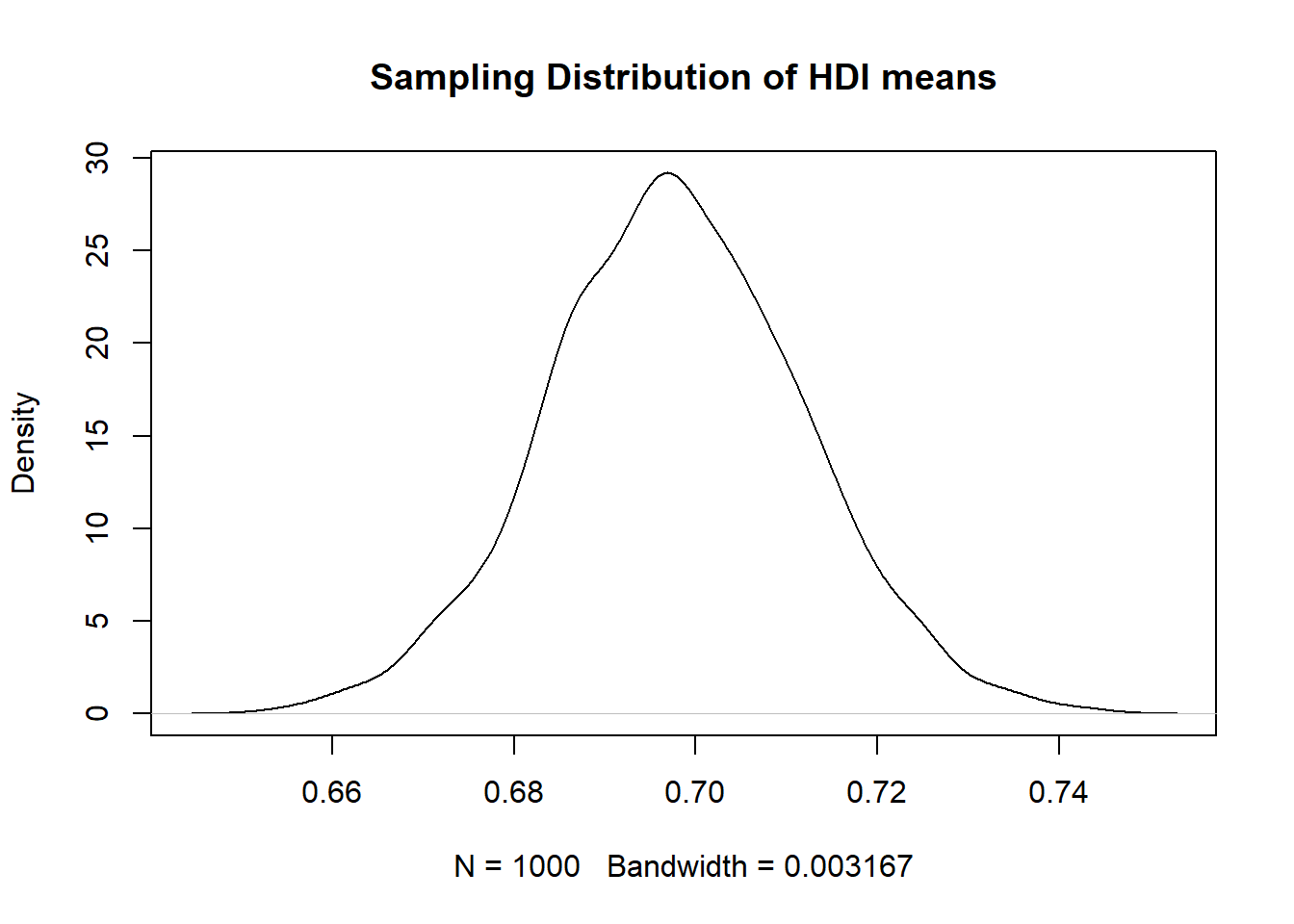
[1] 0.69824hdi_mean is the mean in the sample. We would like the mean of hdi in the population. Remember that sampling variability causes us to estimate a different mean every time we take a new sample.
We learned that the means follow a distribution if we take the mean repeatedly in different samples. In expectation the population mean is the sample mean. How certain are we about the mean? Well, we need to know what the sampling distribution looks like.
To find out we estimate the standard error of the mean. The standard error is the standard deviation of the sampling distribution. The name is not standard deviation but standard error to indicate that we are talking about the distribution of a statistic (the mean) and not a random variable.
The formula for the standard error of the mean is:
\[ s_{\bar{x}} = \frac{ \sigma }{ \sqrt(n) } \]
The \(\sigma\) is the real population standard deviation of the random variable hdi which is unknown to us. We replace the population standard deviation with our sample estimate of it.
\[ s_{\bar{x}} = \frac{ s }{ \sqrt(n) } \]
The standard error of the mean estimate is then
[1] 0.01362411So the mean is 0.69824 and the standard error of the mean is 0.0136241.
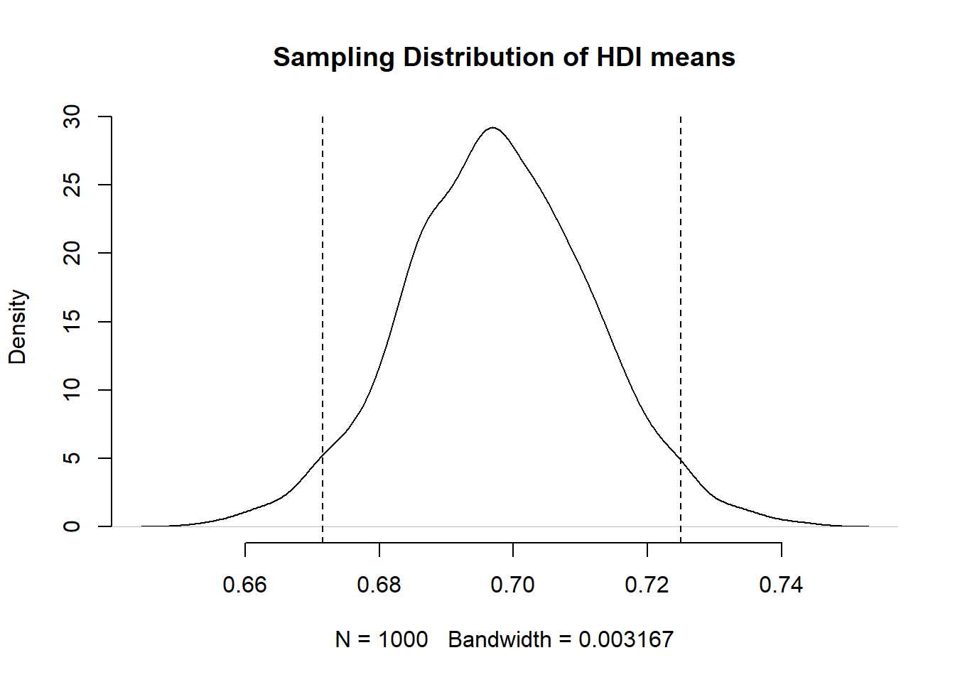
We know that the sampling distribution is approximately normal. That means that 95 percent of all observations are within 1.96 standard deviations (standard errors) of the mean.
\[ \bar{x} \pm 1.96 \times s_{\bar{x}} \]
So what is that in our case?
[1] 0.6715367[1] 0.7249432That now means the following. Were we to take samples of hdi again and again and again, then 95 percent of the time, the mean would be in the range from 0.6715367 to 0.7249432.
Now, let’s visualise our sampling distribution. We haven’t actually taken many samples, so how could we visualise the sampling distribution? We know the sampling distribution looks normal. We know that the mean is our mean estimate in the sample. And finally, we know that the standard deviation is the standard error of the mean.
We can randomly draw values from a normal distribution with mean 0.69824 and standard deviation 0.0136241. We do this with the rnorm() function. Its first argument is the number of values to draw at random from the normal distribution. The second argument is the mean and the third is the standard deviation.
Recall that a normal distribution has two parameters that characterise it completely: the mean and the standard deviation. So with those two we can draw the distribution.
hdi_mean_draws <- rnorm(1000, # 1000 random numbers
                        mean = hdi_mean, # numbers should have same mean as hdi
                        sd = se_hdi) # numebrs should have same sd as hdi
We have just drawn 1000 mean values at random from the distribution that looks like our sampling distribution.
Let’s say that we wish to know the probability that we take a sample and our estimate of the mean is greater or equal 0.74. We would need to integrate over the distribution from \(-\inf\) to 0.74. Fortunately R has a function that does that for us. We need the pnorm(). It calculates the probability of a value that is smaller or equal to the value we specify.
As the first argument pnorm() wants the value. This is 0.74 in our case. The second and third arguments are the mean and the standard deviation that characterise the normal distribution.
[1] 0.9989122This value might seem surprisingly large, but it is the cumulative probability of drawing a value that is equal to or smaller than 0.74. All probabilities sum to 1. So if we want to know the probability of drawing a value that is greater than 0.74, we subtract the probability, we just calculated, from 1.
[1] 0.001087785So the probability of getting a mean of 0.69824 or greater in a sample is 0.1 percent.
2.1.5 Visualising distributions
It can be useful to think about distributions visually. R contains powerful data visualisation features for plotting distributions, as well as more complex relationships between variables.
We can plot – that is, represent visually – this sampling distribution. R’s standard function for this is plot(). We use a density curve, which is like a smoothed histogram.
plot( # call the function
 density(hdi_mean_draws), # specify the object to plot
 main = "Sampling Distribution of HDI means" # give the plot a title
)
We can add the 95 percent confidence interval around our mean estimate. The confidence interval quantifies our uncertainty. We said 95 percent of the time the mean would be in the interval from 0.6715367 to 0.7249432.”
2.1.5.1 Visualisation using ggplot()
See also: Going further with the tidyverse: dplyr, magrittr and ggplot2
This approach works for creating most standard types of plot in a clear, presentable form. However, increasingly data scientists and R users opt for the more flexible ggplot2 for data visualisation. This is the approach we will take on this module.
ggplot2 is an implementation of the ‘Grammar of Graphics’ (Wilkinson 2005) - a general scheme for data visualisation that breaks up graphs into semantic components such as scales and layers. ggplot2 can serve as a replacement for the base graphics in R and contains a number of default options that match good visualisation practice.
The general format for plotting using ggplot2 is to pass a dataset and the variables you want to plot to its main function, ggplot(), then add layers of graphics and adjustments on top of this. ggplot() has two main arguments: data, the dataset, and mapping, the variables. In this first example we have no dataset, because we are just plotting a simple vector, so we only use the mapping argument. We call our plot p1.
p1 <- ggplot(mapping = aes(x = hdi_mean_draws)) + # run ggplot() and specify axes to plot using mapping = aes()
  geom_histogram() # add a histogram to the plot

p1
`stat_bin()` using `bins = 30`. Pick better value `binwidth`.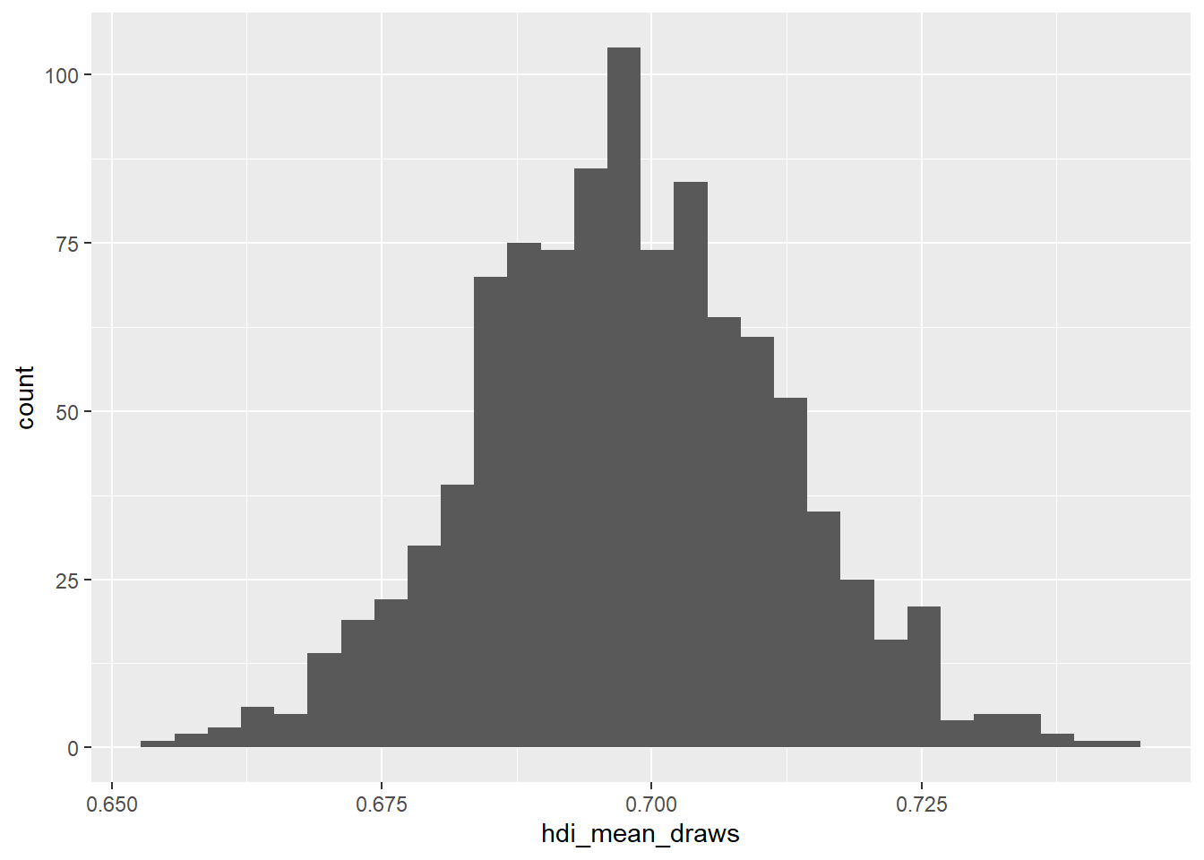
It is easy to edit this plot by simply overwriting the layers. None of these steps are strictly necessary, but they help make the plot clearer and easier to understand.
p1 + # call the plot we already created
  ggtitle("Sampling Distribution of HDI means") + # add title
  theme_minimal() + # change plot colours
  labs(x = "Plausible mean HDI levels", # change x axis label
       y = "Frequency") # change y axis label
`stat_bin()` using `bins = 30`. Pick better value `binwidth`.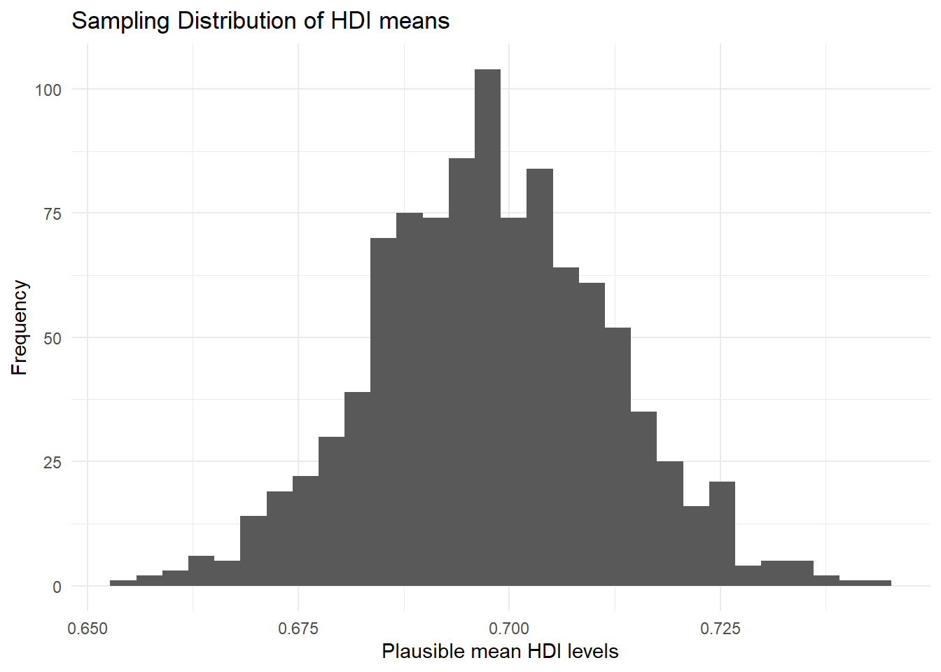
We have added the theme_minimal() layer here to get rid of the grey background that ggplot2 produces by default. labs() changes the axis labels for clearer interpretation. We can once again add the confidence intervals, with everything else, and overwrite our p1 object:
p1 <- p1 + # call the plot we already created
  geom_vline(xintercept = lower_bound, linetype = "dashed") + # add lower bound of confidence interval
  geom_vline(xintercept = upper_bound, linetype = "dashed") +
  ggtitle("Sampling Distribution of HDI means") + # add title
  theme_minimal() + # change plot colours
  labs(x = "Plausible mean HDI levels", # change x axis label
       y = "Frequency") # change y axis label

p1
`stat_bin()` using `bins = 30`. Pick better value `binwidth`.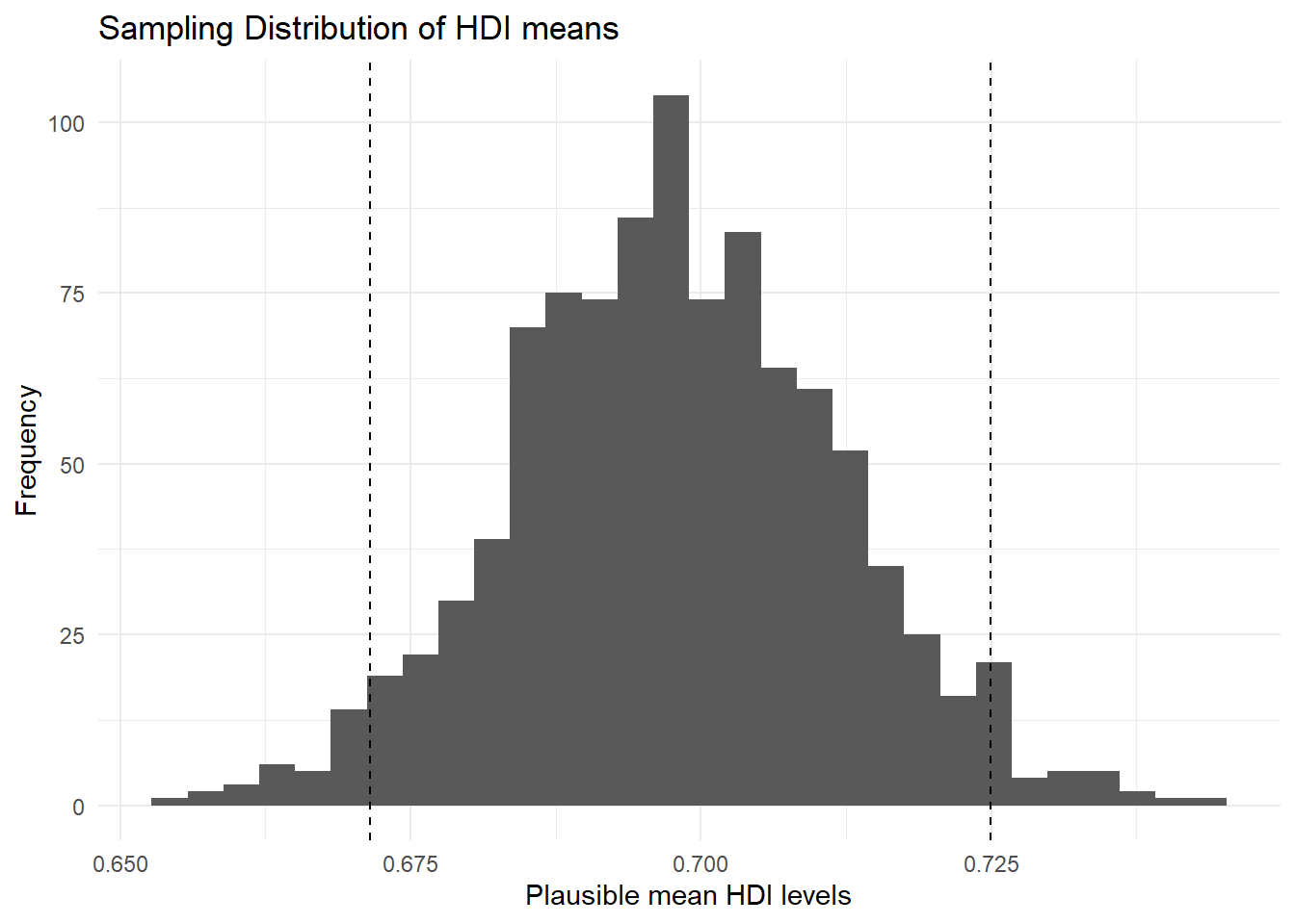
We highly recommend you consult a ggplot2 tutorial, such as this one, to get to grips with the package. Also make sure to consult the extra chapter, Going further with the tidyverse: dplyr, magrittr and ggplot2, on the website.
2.1.6 Conditional Distributions
ggplot() becomes more useful when plotting relationships between variables. For example, when considering conditional distributions – the distribution of one variable conditional on values of another.
Let’s look at hdi by former_col. The variable former_col is 1 if a country is a former colony and 0 otherwise. The variable hdi is continuous. Before we start, we plot the marginal distribution of hdi. This time, we need the data argument in our ggplot() function, so that R knows where to find the hdi variable.
p2 <- ggplot(data = qog, # tell ggplot which dataset to work from
             mapping = aes(hdi)) + # put hdi variable on the x axis
  geom_density() + # a 'density' geom (the curve, essentially a smoothed histogram)
  ggtitle("Marginal Distribution of HDI") + # a clear title for the plot
  theme_minimal() # change the colours
p2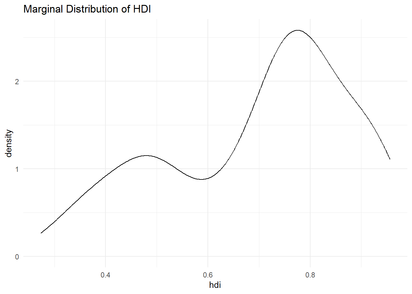
The distribution looks bimodal. There is one peak at the higher development end and one peak at the lower development end. Could it be that these two peaks are conditional on whether a country was colonised or not? Let’s plot the conditional distributions.
To do this, we should make sure that R correctly treats former_col as a nominal variable. The function factor() lets us turn a variable into a nominal data type (in R, these are called factors). The first argument is the variable itself. The second are the category labels and the third are the levels associated with the categories. To know how those correspond, we have to scroll up and look at the codebook. There, we see that 0 refers to a country that has never been colonised, whereas 1 refers to former colonies.
qog$former_col <- factor(qog$former_col, # specify the variable to make categorical
                         labels = c("never colonised", # label corresponding to 0
                                    "former colony"), # label corresponding to 1
                         levels = c(0, 1)) # previous levels of variable
Now, our variables are ready to create a conditional distribution plot.
p3 <- ggplot(data = qog, # tell R the dataset to work from
             mapping = aes(x = hdi, # put hdi on the x axis
                           group = former_col, # group observations by former colony status
                           colour = former_col)) + # allow colour to vary by former colour status
  geom_density() + # create the 'density' geom (the curve, essentially a smoothed histogram)
  ggtitle("Distribution of HDI conditional on former colony status") + # make a clearer title
  theme_minimal() # change the colours

p3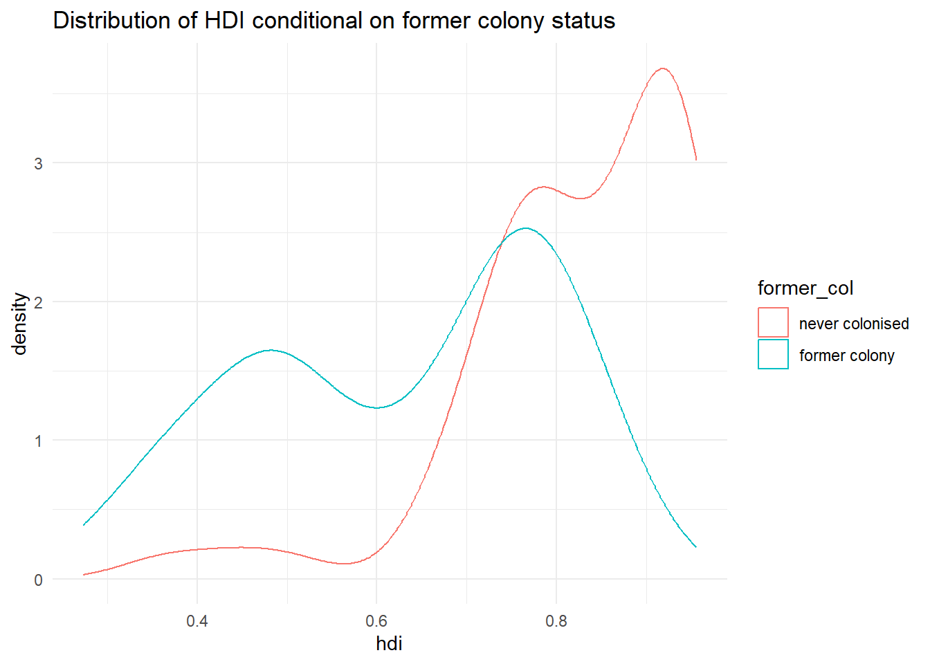
It’s not quite like we expected. The distribution of human development of not colonised countries is shifted to right of the distribution of colonised countries and it is clearly narrower. Interestingly though, the distribution of former colonies has a greater variance. Evidently, some former colonies are doing very well and some are doing very poorly. It seems like knowing whether a country was colonised or not tells us something about its likely development but not enough. We cannot, for example, say colonisation is the reason why countries do poorly. Probably, there are differences among types of colonial institutions that were set up by the colonisers.
Let’s move on and examine the probability that a country has .8 or more on hdi given that it is a former colony.
We can get the cumulative probability with the ecdf() function. It returns the empirical cumulative distribution, i.e., the cumulative distribution of our data. We can run this on hdi for only former colonies, by first creating a vector of these, using filter() and pull().
former_colonies <- filter(qog, former_col == "former colony") # subset to only former colonies

former_col_hdi <- pull(former_colonies, hdi) # extract the hdi variable as its own vector

cumulative_p <- ecdf(former_col_hdi) # run ecdf on former colonies' hdi

1 - cumulative_p(.8)
[1] 0.1666667The probability that a former colony has .8 or larger on the hdi is 16.7 percent. Go ahead figure out the probability for non-former colonies on your own.
2.1.7 Homework exercises
Create a script for these exercises and save it to your folder containing your R Project.
- Load the quality of government dataset.
qog <- read.csv("https://raw.githubusercontent.com/QMUL-SPIR/Public_files/master/datasets/QoG2012.csv")- Rename the variable
wdi_gdpctogdpcusingrename()from thetidyverse. - Delete all rows with missing values on
gdpc. - Inspect
former_coland delete rows with missing values on it. - Turn
former_colinto a factor variable with appropriate labels. - Subset the dataset so that it only has the
gdpc,undp_hdi, andformer_colvariables. - Plot the distribution of
gdpcconditional on former colony status, usingtheme_minimal(),labs()andscale_colour_discrete()to make sure your plot is clear and easy to understand. See [Going further withggplot2] if you need help with this. - Compute the probability that a country is richer than 55,000 per capita.
- Compute the conditional expectation of wealth for a country that is not a former colony.
- What is the probability that a former colony is 2 standard deviations below the mean wealth level?
- Compute the probability that any country is in the wealth interval from 20,000 to 50,000.