3.2 Solutions
- Load the ambulance_assault dataset.
- Use the
facet_wrap()help file to learn how to create the plots with facets by Borough, this time with the graphs arranged into 4 columns. - Add a title to the grahps using the
ggtitle()layer. If you need help, try?ggtitle. - Save your graphs using the
ggsave()function. - Now, using the
census-historic-population-borough.csvdataset used to produce the scatter plots of London’s population, create boxplots for the years 1801 to 1851. You will have to subset your data for these years and create a new object that can be used to plot. Hint:filter()will be useful here. - What do you observe? Describe your findings.
3.2.0.1 Exercise 1
Load the ambulance_assault dataset.
assaults <- read.csv("https://raw.githubusercontent.com/QMUL-SPIR/Public_files/master/datasets/ambulance_assault.csv")3.2.0.2 Exercise 2
Use the facet_wrap() help file to learn how to create the plots with facets by Borough, this time with the graphs arranged into 4 columns.
?facet_wrap

gg_facet <- ggplot(assaults, aes(x = assault_09_11))

gg_facet <- gg_facet + geom_histogram() + facet_wrap(~ Bor_Code, ncol = 4) # Note that Bor_Code refers to the Boroughs

gg_facet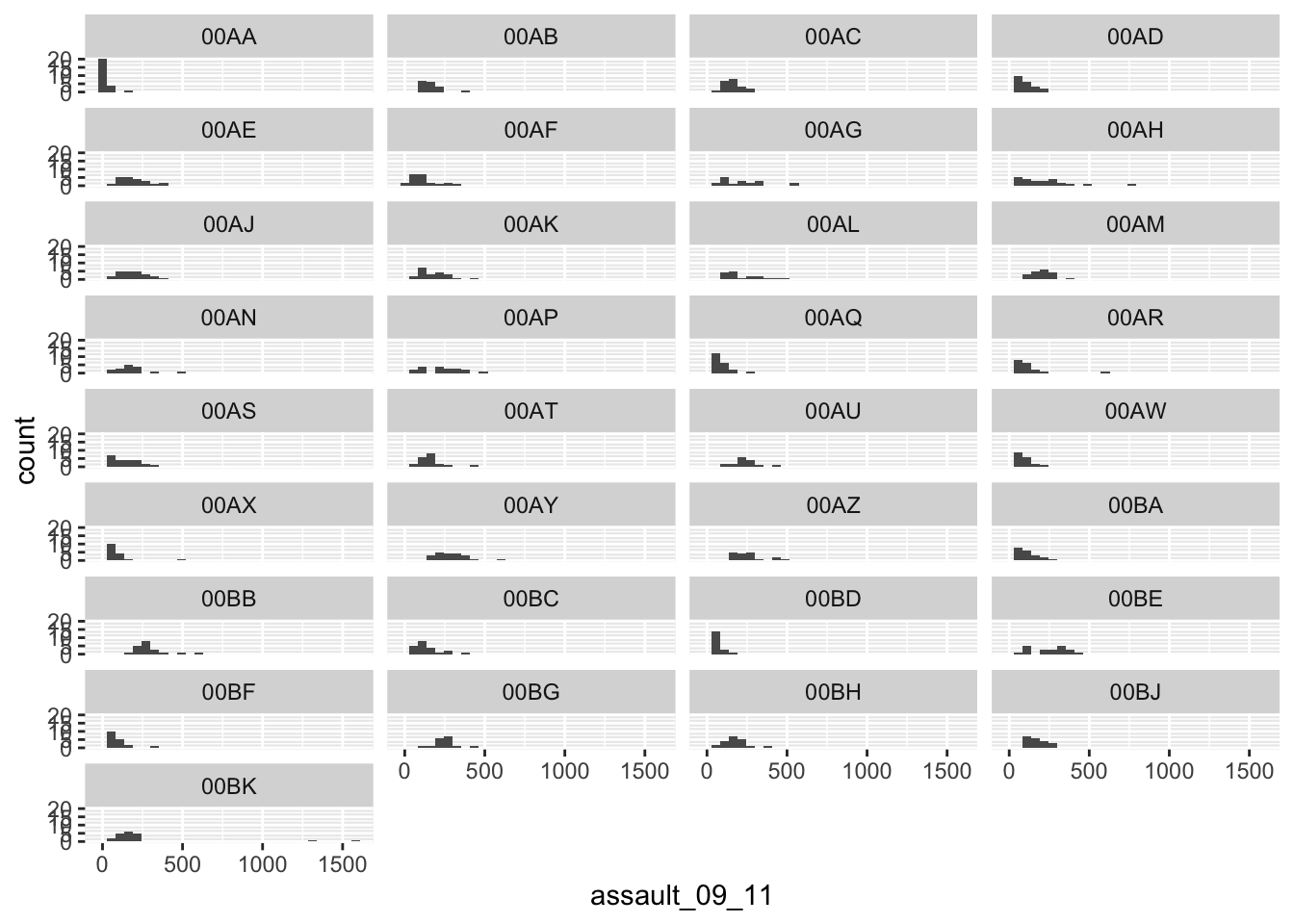
3.2.0.3 Exercise 3
- Add a title to the grahps using the
ggtitle()layer. If you need help, try?ggtitle.
gg_facet + ggtitle("Histograms of Assaults by Borough")`stat_bin()` using `bins = 30`. Pick better value with `binwidth`.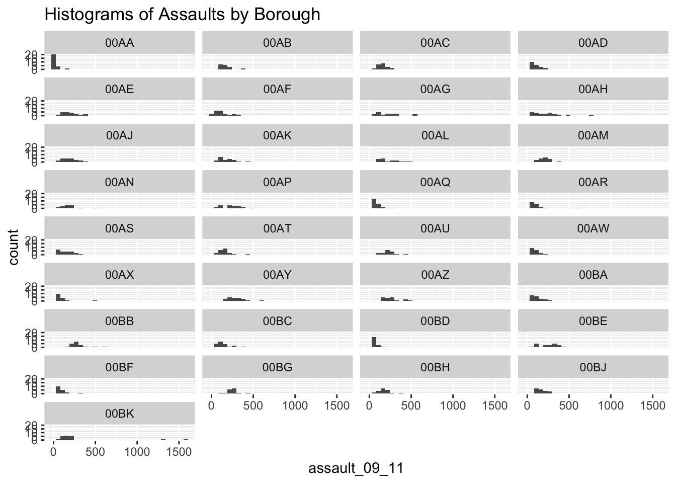
3.2.0.4 Exercise 4
Save your graphs using the ggsave() function.
ggsave("Histograms_per_borough.pdf", gg_facet)3.2.0.5 Exercise 5
Now, using the census-historic-population-borough.csv dataset used to produce the scatter plots of London’s population, create boxplots for the years 1801 to 1851. You will have to subset your data for these years and create a new object that can be used to plot
# load the data and assign to an object
pop <- read.csv("https://raw.githubusercontent.com/QMUL-SPIR/Public_files/master/datasets/census-historic-population-borough.csv")

# Now we subset the dataset to include only
# the years from 1801 to 1851

pop2 <- pop[c("Area.Code", "Area.Name", "Persons.1801", "Persons.1811", "Persons.1821", "Persons.1831", "Persons.1841", "Persons.1851")]

# Another tidyverse function, `select()`, can also be used here. We will talk about these more in week 4!

pop2 <- select(pop, Area.Code, Area.Name, Persons.1801, Persons.1811, Persons.1821, Persons.1831, Persons.1841, Persons.1851)

# Finally, we use the ggplot2 package
# to create the boxplots
ggplot(pop2, aes(x = 1, y = Persons.1801)) + geom_boxplot()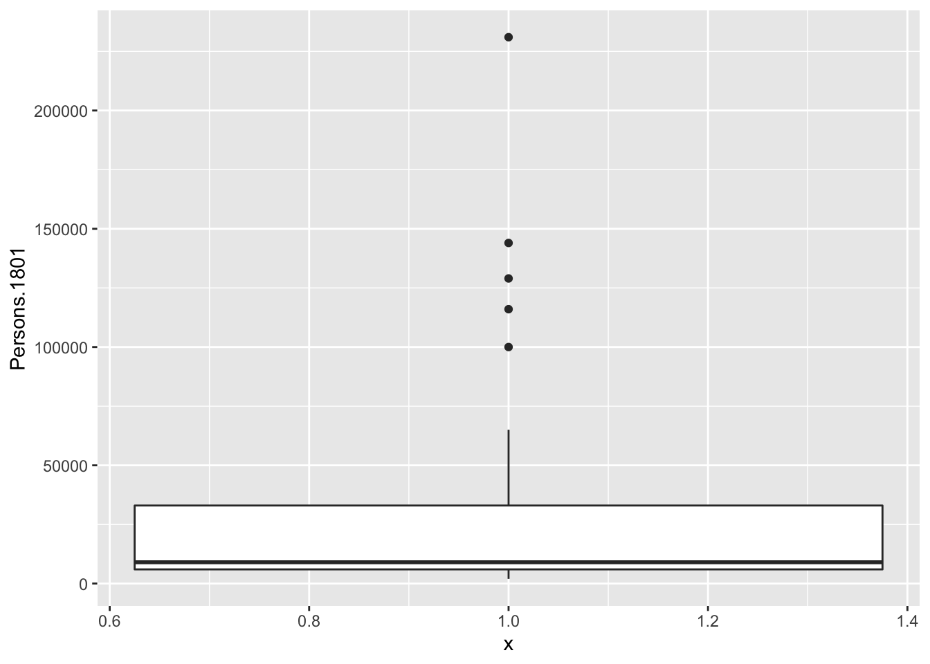
ggplot(pop2, aes(x = 1, y = Persons.1811)) + geom_boxplot()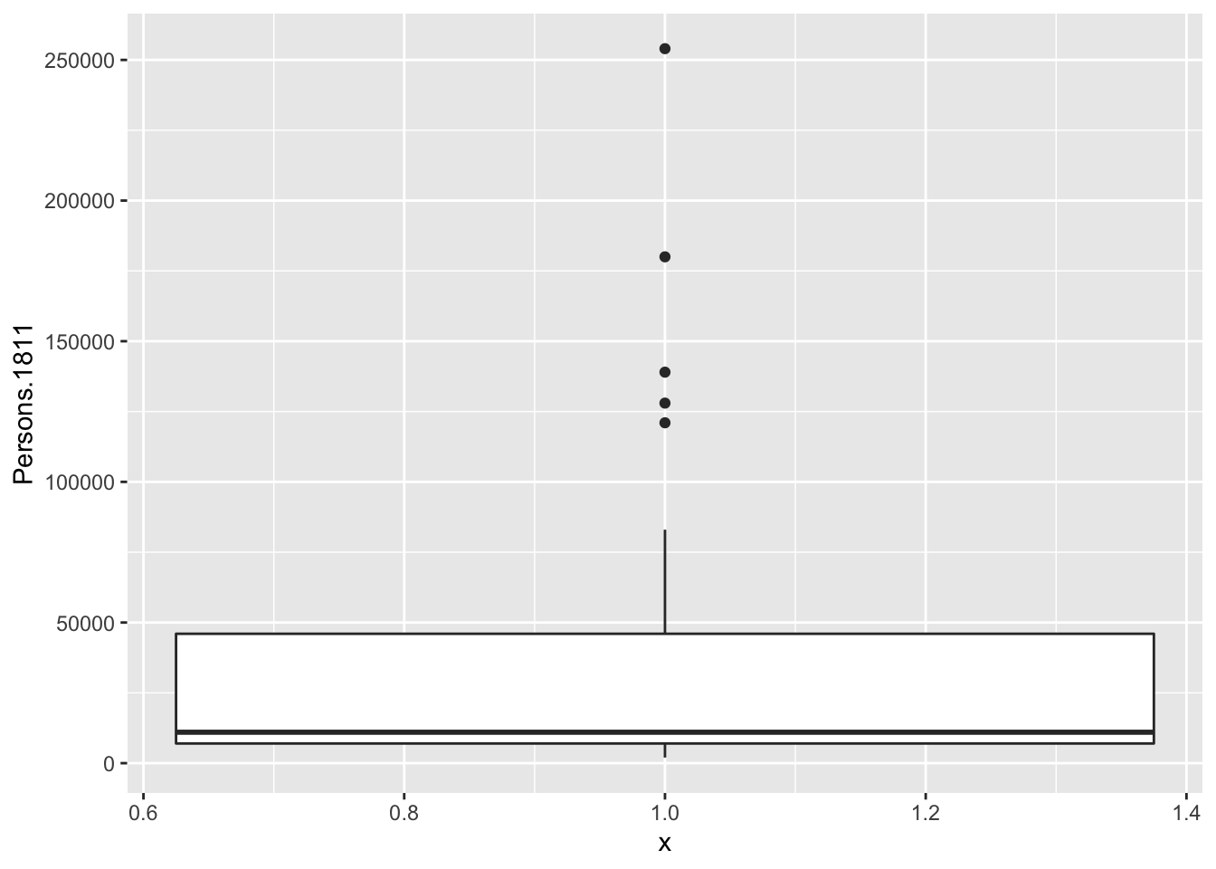
ggplot(pop2, aes(x = 1, y = Persons.1821)) + geom_boxplot()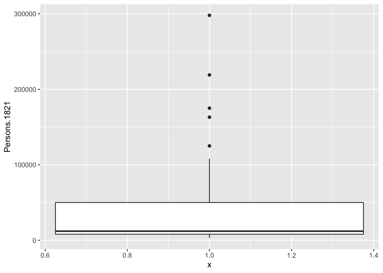
ggplot(pop2, aes(x = 1, y = Persons.1831)) + geom_boxplot()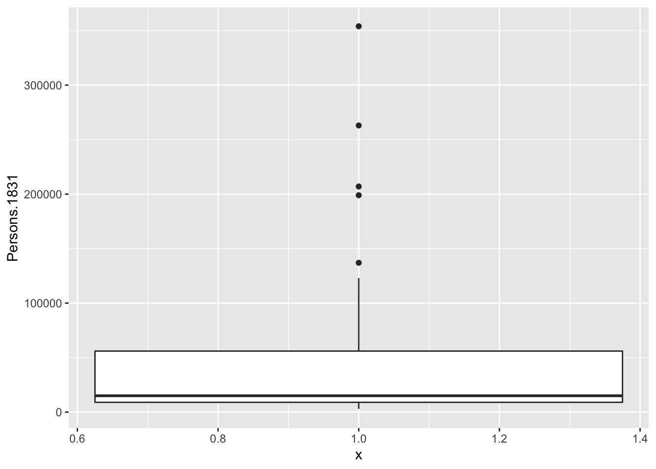
ggplot(pop2, aes(x = 1, y = Persons.1841)) + geom_boxplot()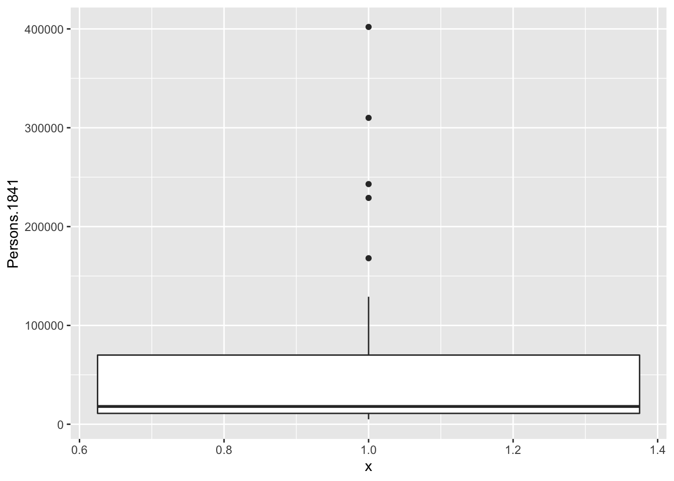
ggplot(pop2, aes(x = 1, y = Persons.1851)) + geom_boxplot()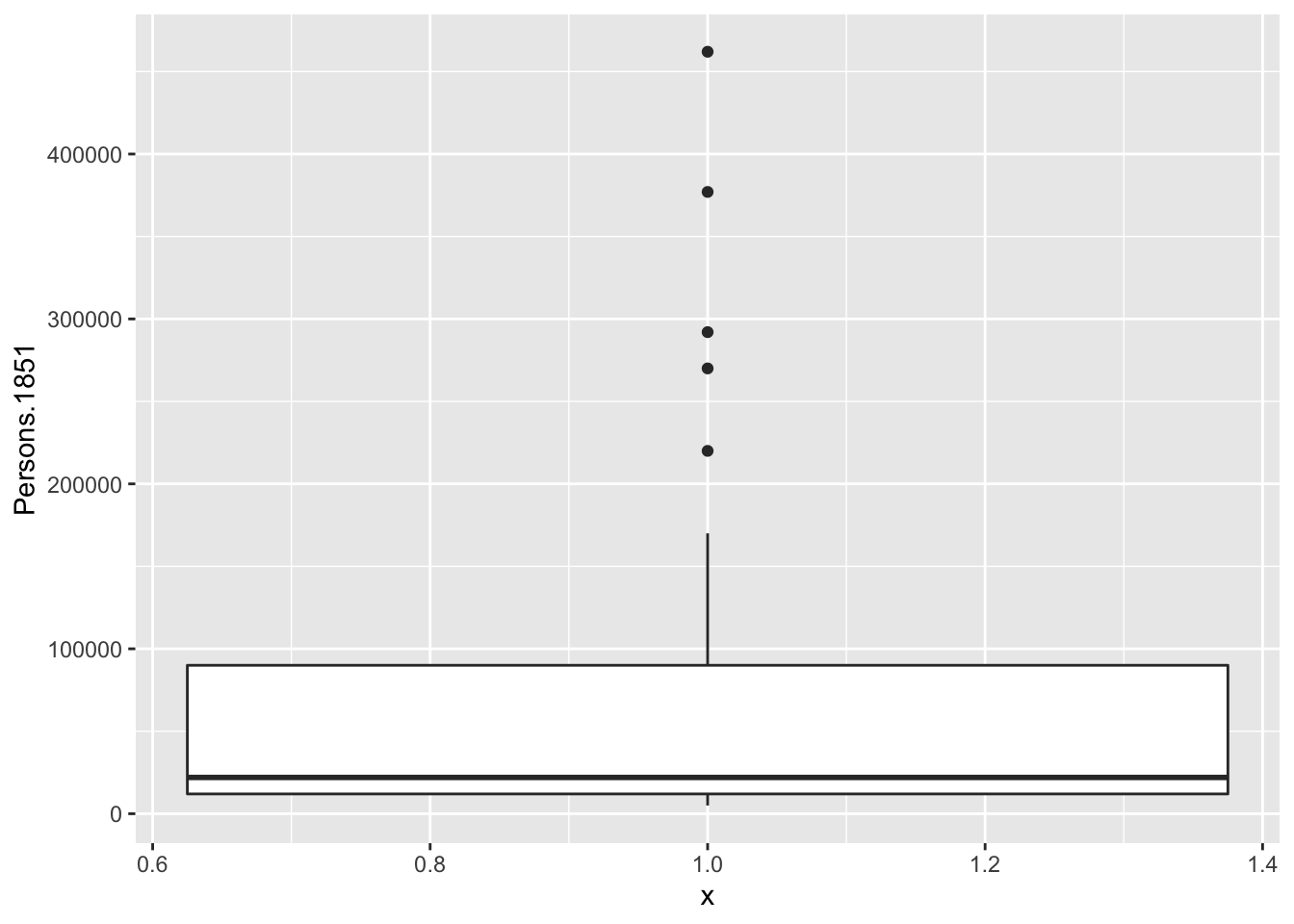
# Note that we need to enter x = 1 to the aes()
# parameter because ggplot needs you to specify
# both axis. By entering 1, we are simply overriding that.
Are boxplots the right type of graph for these data? Why?
You will notice that we do not get much information due to the presence of big outliers. In the future we might want to use logarithms for scales like these.