Chapter 3 Describing Data using plots
3.1 Seminar
In the last seminar, we looked at getting to know our data with simple descriptors of central tendency and dispersion. We then started to see how plots, through visualisation, can take data description further. This week, we continue talking about plots and get to grips with how to create them in R using ggplot().
3.1.1 Loading Dataset in CSV Format
In this seminar, we load a file in comma separated format (.csv). The load() function from last week works only for the native R file format. To load our csv-file, we use the read.csv() function.
Our dataset is the same one we used in the first week, containing data about London Boroughs:
#Load a dataset in a csv file
pop <- read.csv("https://raw.githubusercontent.com/QMUL-SPIR/Public_files/master/datasets/census-historic-population-borough.csv")
Go ahead and (1) check the dimensions of pop, (2) the names of the variables of the dataset, (3) print the first six rows of the dataset.
# the dimensions: rows (observations) and columns (variables)
dim(pop)
[1] 33 24# the variable names
names(pop) [1] "Area.Code" "Area.Name" "Persons.1801" "Persons.1811" "Persons.1821"
[6] "Persons.1831" "Persons.1841" "Persons.1851" "Persons.1861" "Persons.1871"
[11] "Persons.1881" "Persons.1891" "Persons.1901" "Persons.1911" "Persons.1921"
[16] "Persons.1931" "Persons.1939" "Persons.1951" "Persons.1961" "Persons.1971"
[21] "Persons.1981" "Persons.1991" "Persons.2001" "Persons.2011"# top 6 rows of the data
head(pop) Area.Code Area.Name Persons.1801 Persons.1811 Persons.1821
1 00AA City of London 129000 121000 125000
2 00AB Barking and Dagenham 3000 4000 5000
3 00AC Barnet 8000 9000 11000
4 00AD Bexley 5000 6000 7000
5 00AE Brent 2000 2000 3000
6 00AF Bromley 8000 9000 11000
Persons.1831 Persons.1841 Persons.1851 Persons.1861 Persons.1871 Persons.1881
1 123000 124000 128000 112000 75000 51000
2 6000 7000 8000 8000 10000 13000
3 13000 14000 15000 20000 29000 41000
4 9000 11000 12000 15000 22000 29000
5 3000 5000 5000 6000 19000 31000
6 12000 14000 16000 22000 42000 62000
Persons.1891 Persons.1901 Persons.1911 Persons.1921 Persons.1931 Persons.1939
1 38000 27000 20000 14000 11000 9000
2 19000 27000 39000 44000 138000 184000
3 58000 76000 118000 147000 231000 296000
4 37000 54000 60000 76000 95000 179000
5 65000 120000 166000 184000 251000 310000
6 83000 100000 116000 127000 165000 237000
Persons.1951 Persons.1961 Persons.1971 Persons.1981 Persons.1991 Persons.2001
1 5000 4767 4000 5864 4230 7181
2 189000 177092 161000 149786 140728 163944
3 320000 318373 307000 293436 284106 314565
4 205000 209893 217000 215233 211404 218301
5 311000 295893 281000 253275 227903 263466
6 268000 294440 305000 296539 282920 295535
Persons.2011
1 7375
2 185911
3 356386
4 231997
5 311215
6 3093923.1.2 Plotting data with R
Tools to create high quality plots have become one of R’s greatest assets. This is a relatively recent development since the software has traditionally been focused on the statistics rather than visualisation. The standard installation of R has base graphic functionality built in to produce very simple plots. For example we can plot the relationship between the London population in 1811 and 1911
# left of the comma is the x-axis, right is the y-axis. Also note how we  are using the $ command to select the columns of the data frame we want.

plot(pop$Persons.1811,pop$Persons.1911)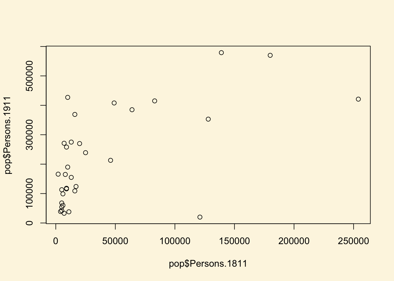
You should see a very simple scatter graph.
3.1.3 ggplot2
A different method of creating plots in R requires the ggplot2 package, from the tidyverse. There are many hundreds of packages in R each designed for a specific purpose. These are not installed automatically, so each one has to be downloaded and then we need to tell R to use it.
We need to use ggplot2, but we will also want to use some functions from other parts of the tidyverse (such as the filter() function you have used before). So, we need to make sure tidyverse is installed:
#When you hit enter R will ask you to select a mirror to download the package contents from. It doesn't really matter which one you choose, I tend to pick the UK based ones.

install.packages("tidyverse")
The install.packages step only needs to be performed once. You don’t need to install a package every time you want to use it. However, each time you open R and wish to use a package you need to use the library() command to tell R that it will be required.
library("tidyverse")ggplot2 is an implementation of the ‘Grammar of Graphics’ (Wilkinson 2005) - a general scheme for data visualisation that breaks up graphs into semantic components such as scales and layers. ggplot2 can serve as a replacement for the base graphics in R and contains a number of default options that match good visualisation practice. This is an increasingly popular way to visualise data in R, because it is both more flexible and more powerful than the base plot approach.
While the instructions below take you through the approach step-by-step, you are encouraged to deviate from them (trying different colours for example) to get a better understanding of what we are doing. For further help, ggplot2 is one of the best documented packages in R and has an extensive website. Good examples of graphs can also be found on the R Cookbook website. We’ll name our graphs using ‘gg’ plus some word indicating their content, but remember that these names are arbitrary.
gg_pops <- ggplot(data = pop, mapping = aes(Persons.1811, Persons.1911))What you have just done is set up a ggplot object where you say where you want the input data to come from (the data = argument -– in this case it is the pop object. The column headings within the aes() brackets refer to the parts of that data frame you wish to use (the variables Persons.1811 and Persons.1911), specified by the mapping = argument. aes is short for ‘aesthetics that vary’ – this is a complicated way of saying the data variables used in the plot. In practice, these arguments are used so frequently that it is quite rare to see data = and mapping = typed out like this. As so many people use ggplot, and essentially every ggplot starts with a first line like this, the code p <- ggplot(pop, aes(Persons.1811, Persons.1911)) is perfectly clear and legible to most R users.
If you just type gg_pops and hit enter, R will not plot any data, just axes. This is because you have not told ggplot what you want to do with the data. We do this by adding so-called ‘geoms’, in this case geom_point(), to create a scatter plot.
gg_pops + geom_point()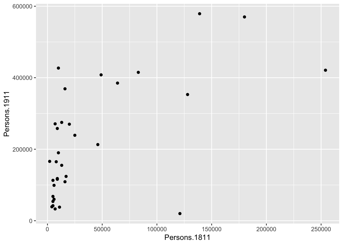
You can already see that this plot is looking a bit nicer than the one we created with the base plot() function used above. Within the geom_point() brackets you can alter the appearance of the points in the plot. Try something like gg_pops + geom_point(colour = "red", size=2) and also experiment with your own colours/sizes. If you want to colour the points according to another variable it is possible to do this by adding the desired variable into the aes() section after geom_point(). Here will indicate the size of the population in 2011 as well as the relationship between in the size of the population in 19811 and 1911.
gg_pops + geom_point(aes(colour = Persons.2011, size = 2))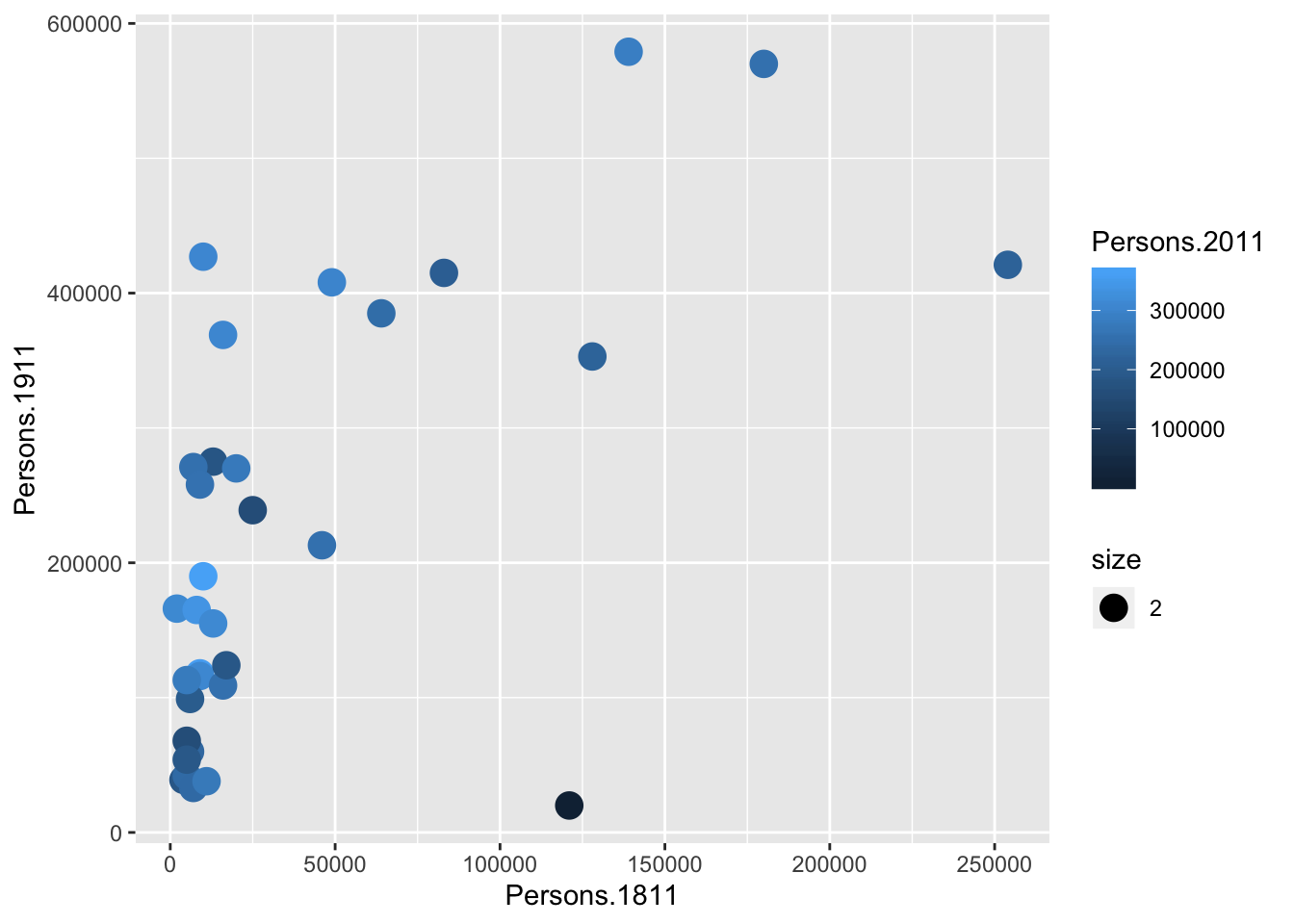
You will notice that ggplot has also created a key that shows the values associated with each colour. In this slightly contrived example it is also possible to resize each of the points according to the Persons.2011 variable.
gg_pops + geom_point(aes(size = Persons.2011))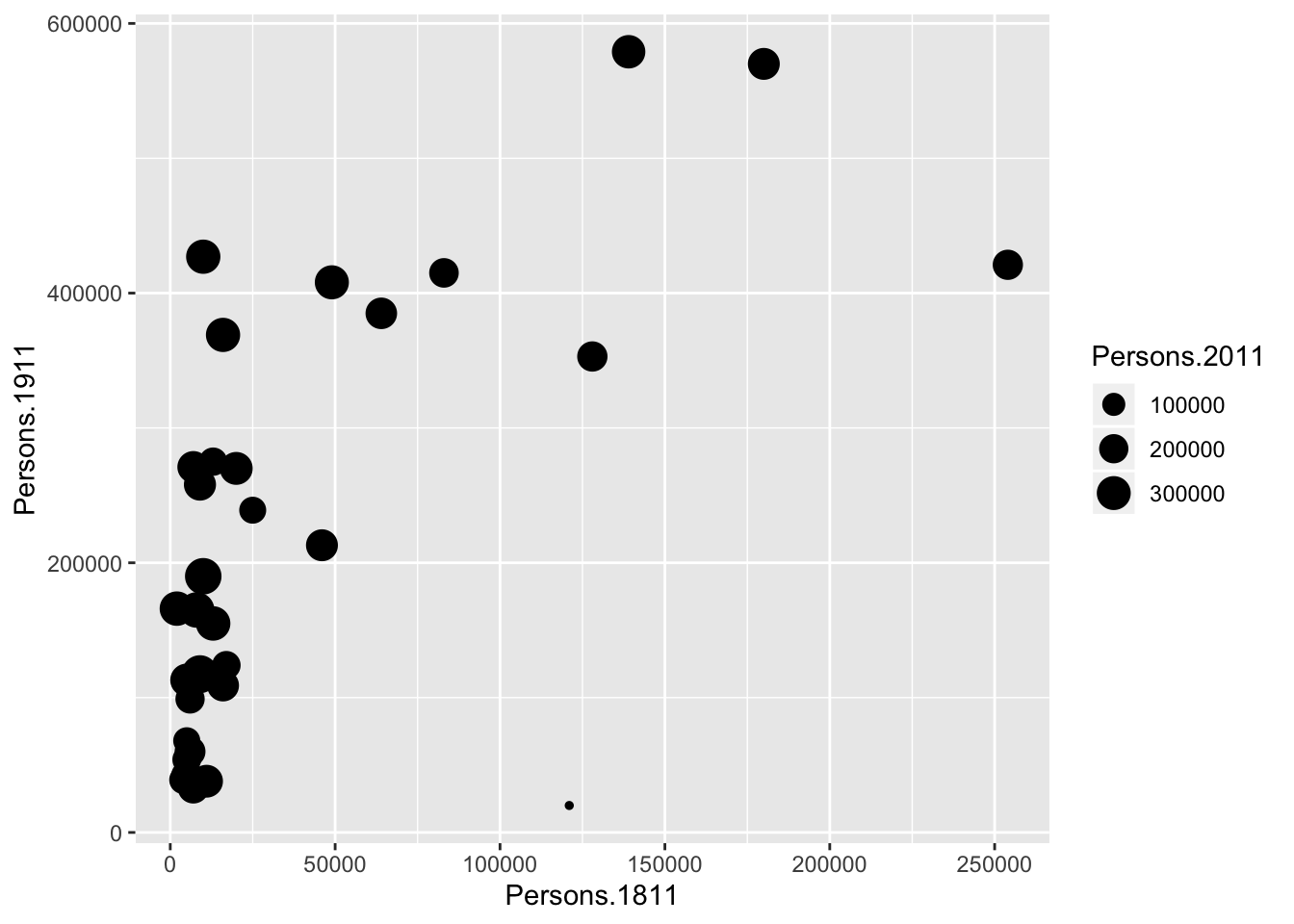
The real power of ggplot2 lies in its ability build a plot up as a series of layers. This is done by stringing plot functions (geoms) together with the + sign. In this case we can add a text layer to the plot using geom_text().
gg_pops + geom_point(aes(size = Persons.2011)) + geom_text(size = 2,
   colour = "red", aes(label = Area.Name))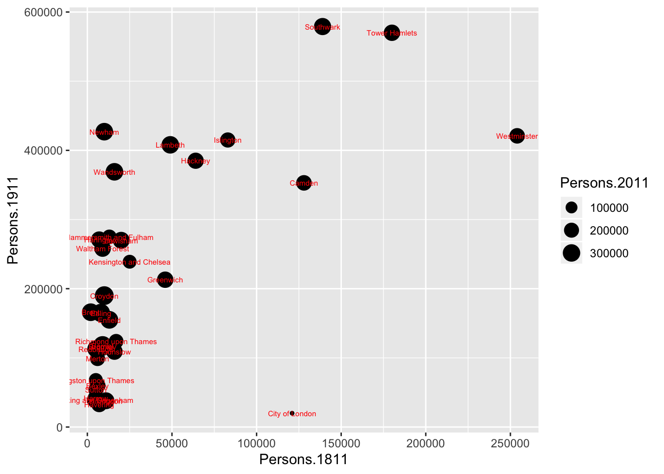
This idea of layers (or geoms) is quite different from the standard plot functions in R, but you will find that each of the functions does a lot of clever stuff to make plotting much easier (see the ggplot2 documentation for a full list). The above code adds London Borough labels to the plot over the points they correspond to. This isn’t perfect since many of the labels overlap but they serve as a useful illustration of the layers. To make things a little easier the plot can be saved as a PDF using the ggsave() command. When saving the plot can be enlarged to help make the labels more legible.
ggsave("first.ggplot.pdf", scale=2)ggsave only works with plots that were created with ggplot. Within the brackets you should create a file name for the plot - this needs to include the file format (in this case .pdf you could also save the plot as a .jpg file). The file will be saved to your working directory (or, in Rstudio cloud, your project). The scale controls how many times bigger you want the exported plot to be than it currently is in the plot window. Once executed you should be able to see a PDF file in your working directory.
3.1.4 Histograms
For the rest of this tutorial we will change our dataset to one containing the number of assault incidents that ambulances have been called to in London between 2009 and 2011. It is in the same data format (CSV) as our London population file so we use the read.csv() command.
#read in the ambulance_assault datafile

assaults <- read.csv("https://raw.githubusercontent.com/QMUL-SPIR/Public_files/master/datasets/ambulance_assault.csv")
#Check that the data have been loaded in correctly by viewing the top 6 rows with the head() command.
head(assaults) Bor_Code WardName WardCode assault_09_11
1 00AA Aldersgate 00AAFA 10
2 00AA Aldgate 00AAFB 0
3 00AA Bassishaw 00AAFC 0
4 00AA Billingsgate 00AAFD 0
5 00AA Bishopsgate 00AAFE 188
6 00AA Bread Street 00AAFF 0#To get a sense of how large the data frame is, look at how many rows you have
nrow(assaults)[1] 649You will notice that the data table has 4 columns and 649 rows. The column headings are abbreviations of the following:
Bor_Code: Borough Code. London has 32 Boroughs (such as Camden, Islington, Westminster etc) plus the City of London at the centre. These codes are used as a quick way of referring to them from official data sources.WardName: Boroughs can be broken into much smaller areas known as Wards. These are electoral districts and have existed in London for centuries.WardCode: A statistical code for the Wards above. WardType: a classification that groups wards based on similar characteristics.assault_09_11: The number of assault incidents requiring an ambulance between 2009 and 2011 for each Ward.
Through plotting we can provide graphical representations of the data to support the statistics above. A frequency distribution plot in the form of a histogram could be informative here. This can be done very easily in ggplot.
gg_assaults <- ggplot(assaults, aes(x = assault_09_11))The ggplot(input, aes(x=assault_09_11)) section means create a generic plot object (called gg_assaults) from the assaults object using the assault_09_11 column as the data for the x axis. Remember the data variables are required as aesthetics parameters so the assault_09_11 appears in the aes() brackets.
Histograms provide a nice way of graphically summarising a dataset. To create the histogram you need to add the relevant ggplot2 command (geom).
gg_assaults + geom_histogram()`stat_bin()` using `bins = 30`. Pick better value with `binwidth`.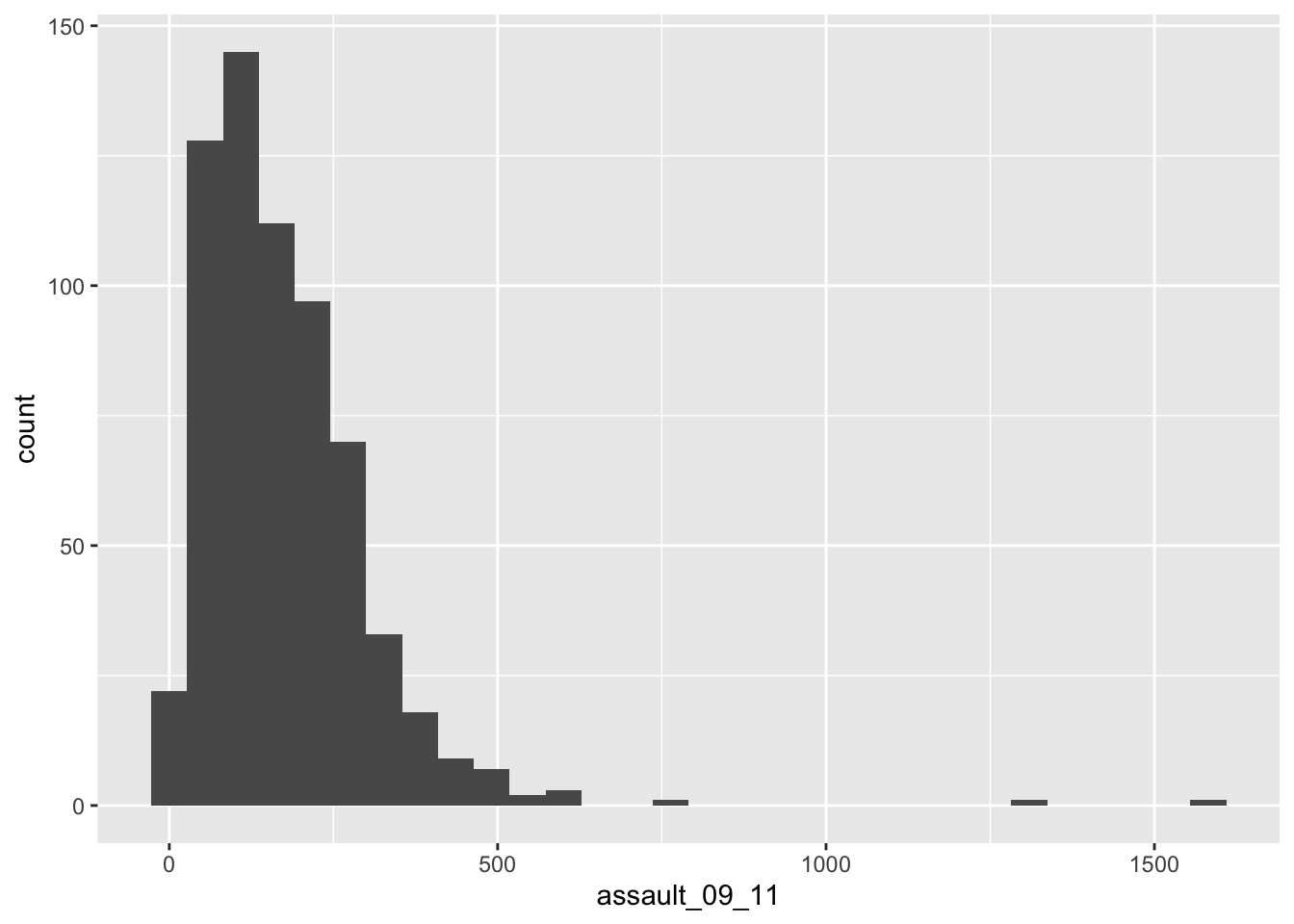
The height of each bar (the x-axis) shows the count of the datapoints and the width of each bar is the value range of datapoints included. If you want the bars to be thinner (to represent a narrower range of values and capture some more of the variation in the distribution) you can adjust the binwidth. Binwidth controls the size of ‘bins’ that the data are split up into. We will discuss this in more detail later in the course, but put simply, the bigger the bin (larger binwidth) the more data it can hold. Try:
gg_assaults + geom_histogram(binwidth = 10)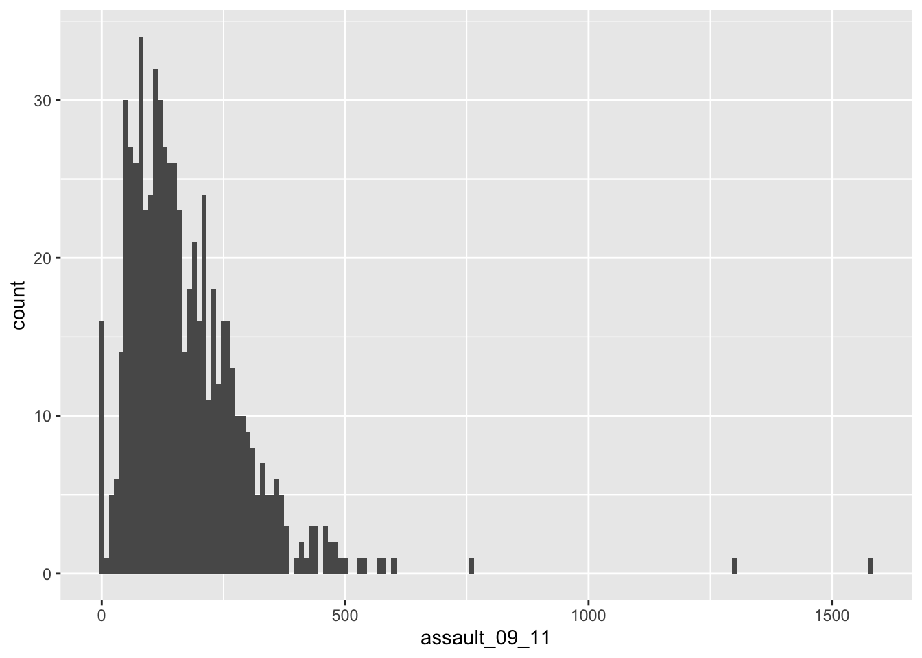
You can also overlay a density distribution over the top of the histogram. This will be discussed in more detail later in the term, but think of the plotted line as a summary of the underlying histogram. For this we need to produce a second plot object that says we wish to use the density distribution as the y variable.
gg_assaults_dens <- ggplot(assaults, aes(x = assault_09_11, y = ..density..))

gg_assaults_dens + geom_histogram() + geom_density(fill = NA, colour = "red")
`stat_bin()` using `bins = 30`. Pick better value with `binwidth`.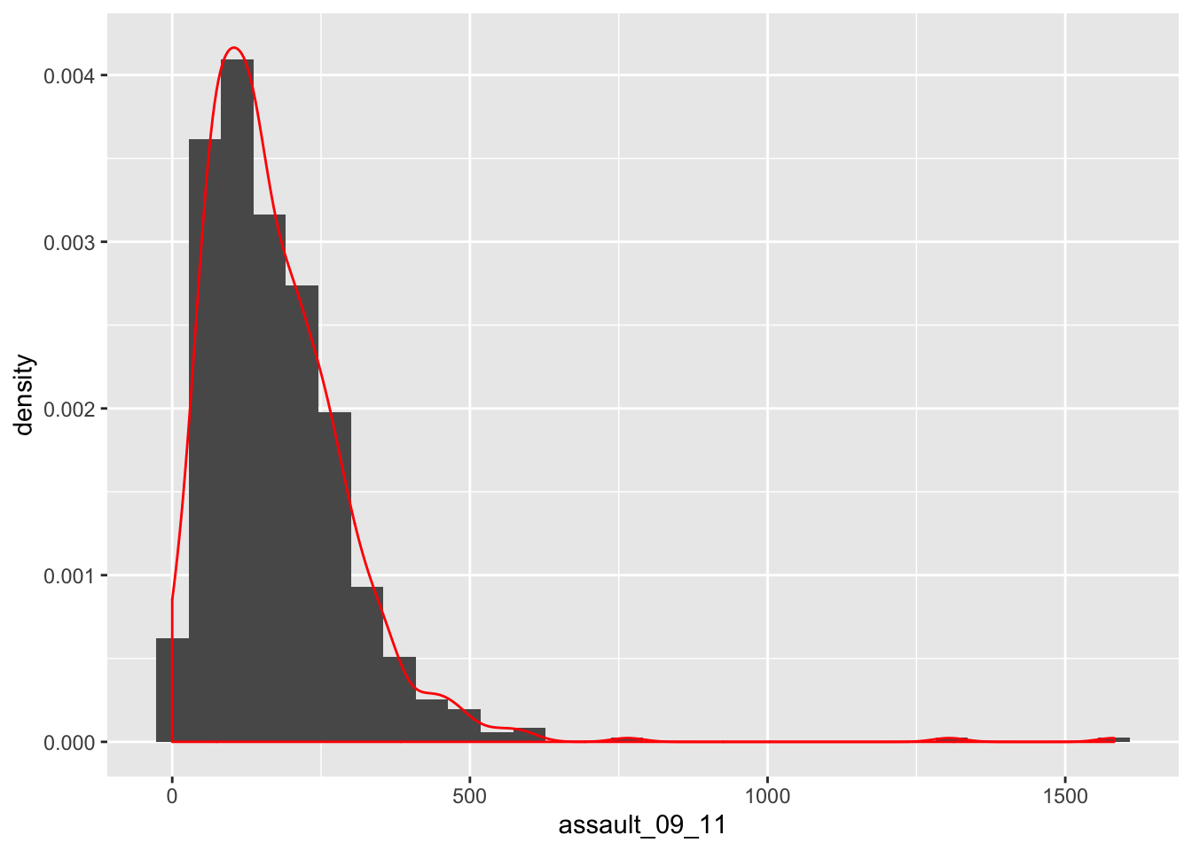
This plot has provided a good impression of the overall distribution, but it would be interesting to see characteristics of the data within each of the Boroughs. We can do this since each Borough in the input object is made up of multiple wards. To see what I mean, we can select all the wards that fall within the Borough of Camden, which has the code 00AG (if you want to see what each Borough the code corresponds to, and learn a little more about the statistical geography of England and Wales, then see here).
camden <- filter(assaults, Bor_Code == "00AG")We are subsetting the input object, but instead of telling R what column names or numbers we require, we are requesting all rows in the Bor_Code column that contain 00AG. 00AG is a text string so it needs to go in speech marks “” and we need to use two equals signs == in R to mean “equals to”. A single equals sign = is another way of assigning objects (it works the same way as <- but is much less widely used for this purpose because it is also used when paramaterising functions/assigning arguments).
What we are doing here, then, is telling filter() the dataset we want to filter, and then the variable we want it to filter by, and the particular value of that variable we want it to keep. The camden object therefore only includes assaults that happened in Camden, indicated by its borough code.
So to produce Camden’s frequency distribution the code above needs to be replicated using the camden object in the place of assaults.
gg_camden <- ggplot(camden, aes(x = assault_09_11))

gg_camden + geom_histogram()
`stat_bin()` using `bins = 30`. Pick better value with `binwidth`.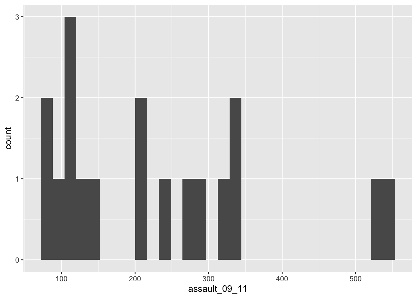
#We can also add a title using the ggtitle() option

gg_camden + geom_histogram() + ggtitle("Camden Assaults")
`stat_bin()` using `bins = 30`. Pick better value with `binwidth`.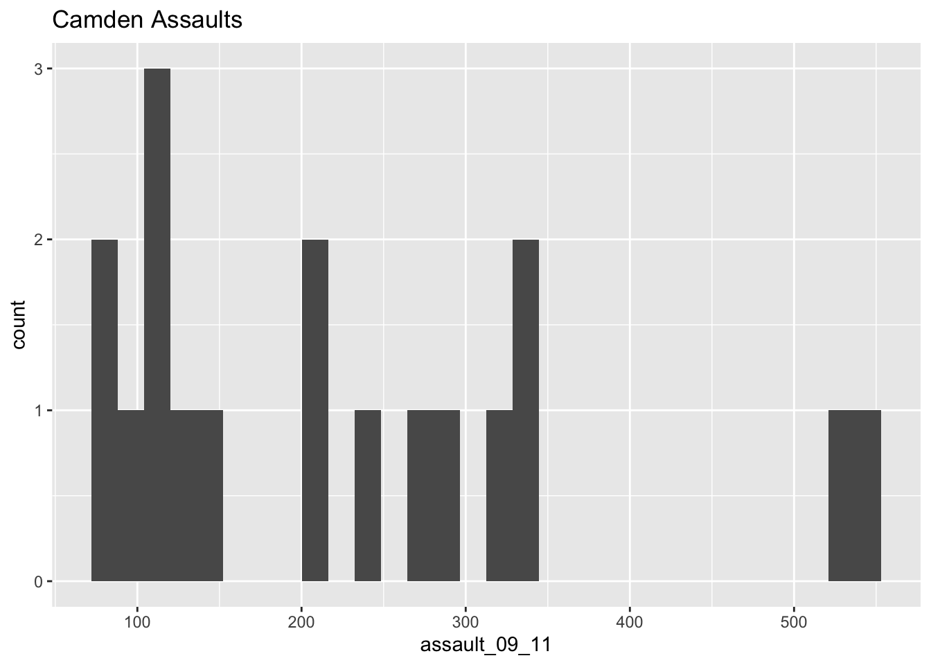
As you can see this looks a little different from the density of the entire dataset. This is largely becasue we have relatively few rows of data in the camden object (use nrow(camden) to find out just how many). Nevertheless it would be interesting to see the data distributions for each of the London Boroughs. It is a chance to use the facet_wrap() function in R. This brilliant function lets you create a whole load of graphs at once.
#note that we are back to using the p.ass ggplot object since we need all our data for this. This code may generate a large number of warning messages relating to the plot binwidth, don't worry about them.

gg_assaults + geom_histogram() + facet_wrap(~ Bor_Code)
`stat_bin()` using `bins = 30`. Pick better value with `binwidth`.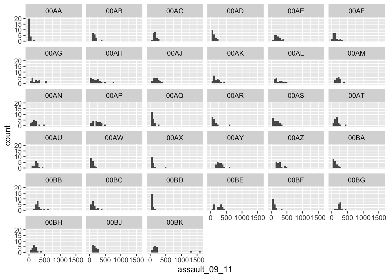
The facet_wrap() part of the code simply needs the name of the column you would like to use to subset the data into individual plots. Before the column name a tilde ~ is used as shorthand for “by” - so using the function we are asking R to facet the input object into lots of smaller plots based on the Bor_Code column.
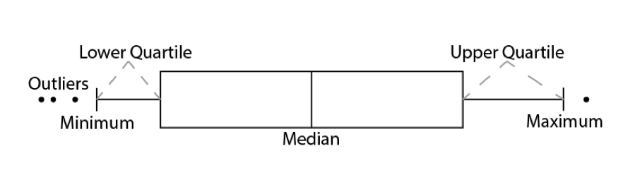
3.1.5 Box and Whisker plots
In addition to histograms, a type of plot that shows the core characteristics of the distribution of values within a dataset, and includes some of the summary() information we generated earlier, is a box and whisker plot (boxplot for short). These too can be easily produced in R.
The diagram below illustrates the components of a box and whisker plot.
We can create a third plot object for this from the input object:
#note that the `assault_09_11` column is now y and not x and that we have specified x=1. This aligns the plot to the x-axis (any single number would work)

gg_box <- ggplot(assaults, aes(x = 1, y = assault_09_11))
And then convert it to a boxplot using the geom_boxplot() command.
gg_box + geom_boxplot()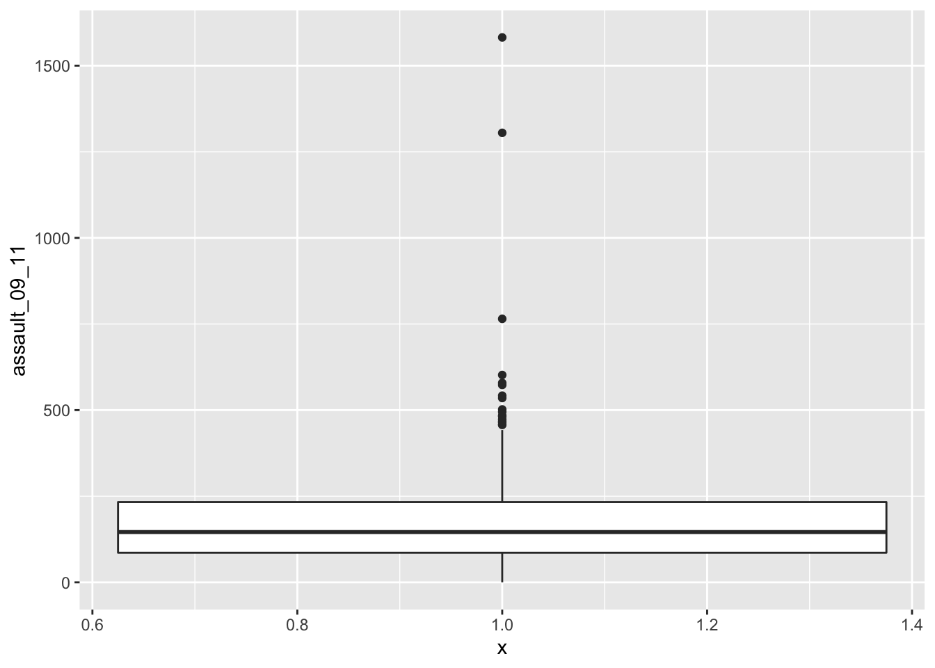
If we are just interested in Camden then we can use the camden object created above in the code.
gg_camden_box <- ggplot(camden, aes(x = 1, y = assault_09_11))
gg_camden_box + geom_boxplot()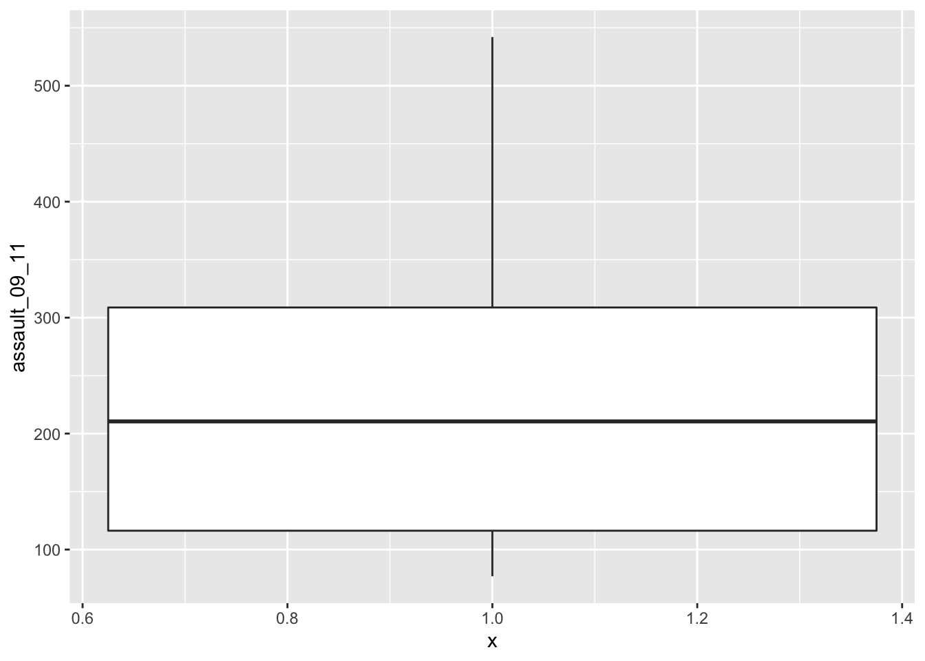
#If you prefer you can flip the plot 90 degrees so that it reads from left to right.

gg_camden_box + geom_boxplot() + coord_flip()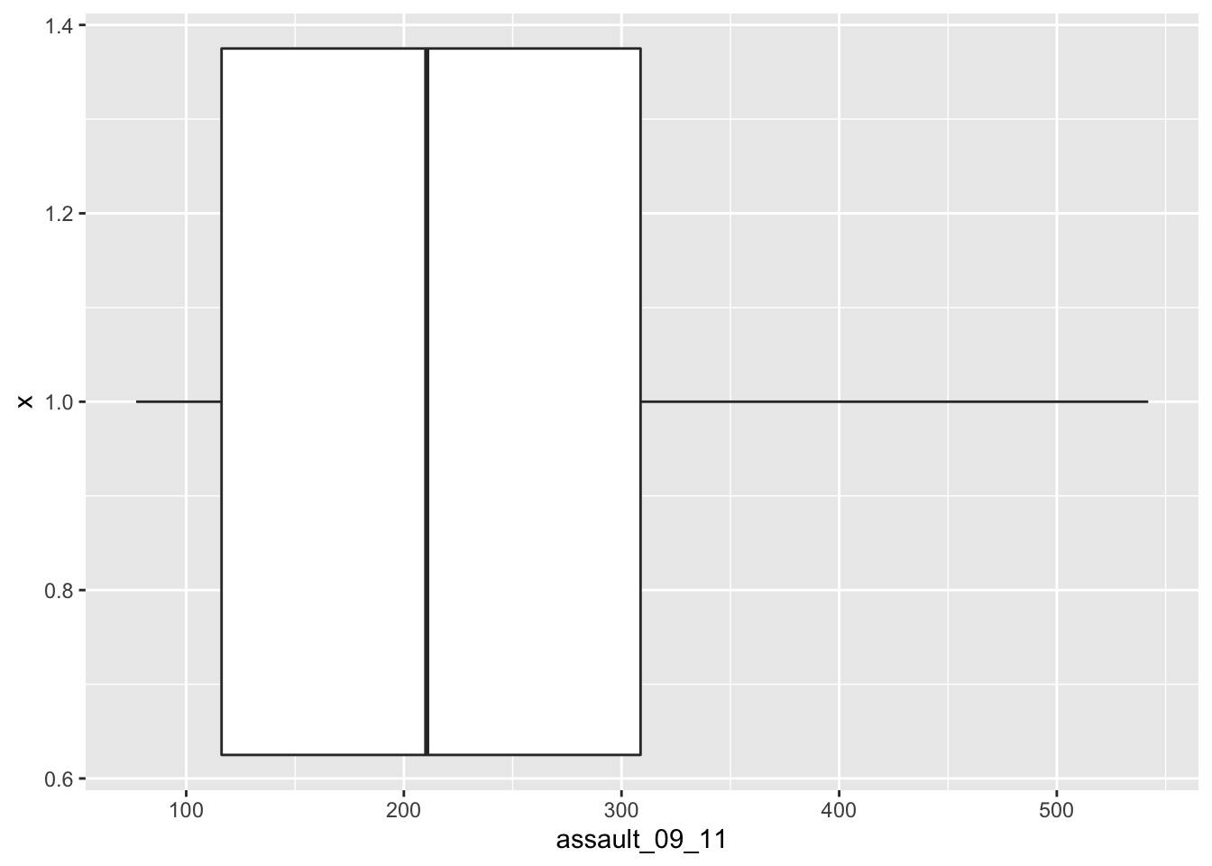
You can see that Camden looks a little different from the boxplot of the entire dataset. It would therefore be useful to compare the distributions of data within each of the Boroughs in a single plot as we did with the frequency distributions above. ggplot makes this very easy, we just need to change the x = parameter to the Borough code column (Bor_Code).
gg_compare <- ggplot(assaults, aes(x = Bor_Code, y = assault_09_11))

gg_compare + geom_boxplot() + coord_flip()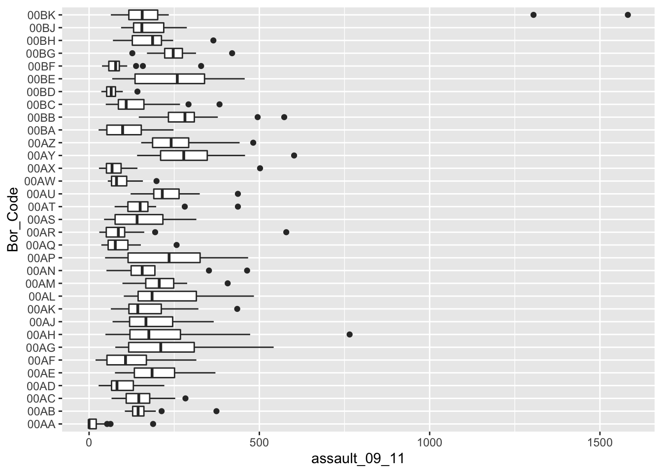
3.1.6 Exercises
- Load the ambulance_assault dataset.
- Use the
facet_wrap()help file to learn how to create the plots with facets by Borough, this time with the graphs arranged into 4 columns. - Add a title to the grahps using the
ggtitle()layer. If you need help, try?ggtitle. - Save your graphs using the
ggsave()function. - Now, using the
census-historic-population-borough.csvdataset used to produce the scatter plots of London’s population, create boxplots for the years 1801 to 1851. You will have to subset your data for these years and create a new object that can be used to plot. - What do you observe? Describe your findings.