Chapter 2 Getting to Know Your Data: Descriptive Statistics and Plots
2.1 Seminar
In today’s seminar, we work with measures of central tendency and dispersion. We will also work with data, covering some of the topics from the lecture.
2.1.1 Central Tendency
The appropriate measure of central tendency depends on the level of measurement of the variable. To recap:
| Level of measurement | Appropriate measure of central tendency |
|---|---|
| Continuous | arithmetic mean (or average) |
| Ordinal | median (or the central observation) |
| Nominal | mode (the most frequent value) |
2.1.1.1 Mean
We calculate the average grade on eleven homework assignments on a hypothetical university module, Statistics 1. R, as a coding language, is what is called ‘vectorised’. This means that often, rather than dealing with individual values or data points, we deal with a series of data points that all belong to one ‘vector’ based on some connection. For example, we could create a vector of all the grades a class of students got on their homework. We create our vector of 11 (fake) grades using the c() function, where c stands for ‘collect’ or ‘concatenate’:
hw.grades <- c(80, 90, 85, 71, 69, 85, 83, 88, 99, 81, 92)We can then do things to this vector as a whole, rather than to its individual components. R will do this automatically when we pass the vector to a function, because it is a vectorised coding language. All ‘vector’ means is a series of connected values like this. (A ‘list’ of values, if you like, but ‘list’ has a different, specific meaning in R, so we should really avoid that word here.) We now take the sum of the grades.
sum.hw.grades <- sum(hw.grades)We also take the number of grades
number.hw.grades <- length(hw.grades) The mean is the sum of grades over the number of grades.
sum.hw.grades / number.hw.grades[1] 83.90909R provides us with an even easier way to do the same with a function called mean().
mean(hw.grades)[1] 83.909092.1.1.2 Median
The median is the appropriate measure of central tendency for ordinal variables. Ordinal means that there is a rank ordering but not equally spaced intervals between values of the variable. Education is a common example. In education, more education is better. But the difference between primary school and secondary school is not the same as the difference between secondary school and an undergraduate degree.
Let’s generate a fake example with 100 people. We use numbers to code different levels of education.
| Code | Meaning | Frequency in our data |
| 0 | no education | 1 |
| 1 | primary school | 5 |
| 2 | secondary school | 55 |
| 3 | undergraduate degree | 20 |
| 4 | postgraduate degree | 10 |
| 5 | doctorate | 9 |
We introduce a new function to create a vector. The function rep() replicates elements of a vector. Its arguments are the item x to be replicated and the number of times to replicate. Below, we create the variable education with the frequency of education level indicated above. Note that the arguments x = and times = do not have to be written out, but it is often a good idea to do this anyway, to make your code clear and unambiguous.
edu <- c( rep(x = 0, times = 1),
          rep(x = 1, times = 5),
          rep(x = 2, times = 55),
          rep(x = 3, times = 20),
          rep(4, 10), rep(5, 9)) # works without 'x =', 'times ='
The median level of education is the level where 50 percent of the observations have a lower or equal level of education and 50 percent have a higher or equal level of education. That means that the median splits the data in half.
We use the median() function for finding the median.
median(edu)[1] 2The median level of education is secondary school.
2.1.1.3 Mode
The mode is the appropriate measure of central tendency if the level of measurement is nominal. Nominal means that there is no ordering implicit in the values that a variable takes on. We create data from 1000 (fake) voters in the United Kingdom who each express their preference on remaining in or leaving the European Union. The options are leave or stay. Leaving is not greater than staying and vice versa (even though we all order the two options normatively).
| Code | Meaning | Frequency in our data |
| 0 | leave | 509 |
| 1 | stay | 491 |
stay <- c(rep(0, 509), rep(1, 491))The mode is the most common value in the data. There is no mode function in R. The most straightforward way to determine the mode is to use the table() function. It returns a frequency table. We can easily see the mode in the table. As your coding skills increase, you will see other ways of recovering the mode from a vector.
table(stay)stay
0 1
509 491 The mode is leaving the EU because the number of ‘leavers’ (0) is greater than the number of ‘remainers’ (1).
2.1.2 Dispersion
The appropriate measure of dispersion depends on the level of measurement of the variable we wish to describe.
| Level of measurement | Appropriate measure of dispersion |
|---|---|
| Continuous | variance and/or standard deviation |
| Ordered | range or interquartile range |
| Nominal | proportion in each category |
2.1.2.1 Variance and standard deviation
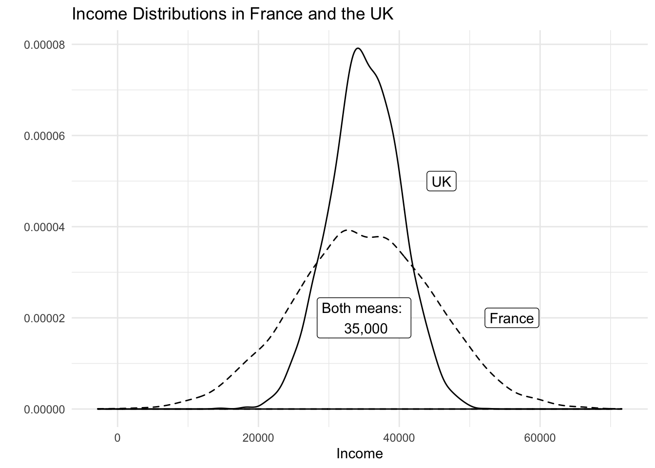
Both the variance and the standard deviation tell us how much an average realisation of a variable differs from the mean of that variable. So, they essentially tell us how much, on average, our observations differ from the average observation. Let’s assume that our variable is income in the UK. Let’s assume that its mean is 35 000 per year. We also assume that the average deviation from 35 000 is 5 000. If we ask 100 people in the UK at random about their income, we get 100 different answers. If we average the differences betweeen the 100 answers and 35 000, we would get 5 000. Suppose that the average income in France is also 35 000 per year but the average deviation is 10 000 instead. This would imply that income is more equally distributed in the UK than in France.
Dispersion is important to describe data as this example illustrates. Although, mean income in our hypothetical example is the same in France and the UK, the distribution is tighter in the UK. The figure below illustrates our example:
The variance gives us an idea about the variability of the data. The formula for the variance in the population is \[ \frac{\sum_{i=1}^n(x_i - \mu_x)^2}{n}\]
The formula for the variance in a sample adjusts for sampling variability, i.e., uncertainty about how well our sample reflects the population by subtracting 1 in the denominator. Subtracting 1 will have next to no effect if n is large but the effect increases the smaller \(n\) is. The smaller \(n\) is, the larger the sample variance. The intuition is, that in smaller samples, we are less certain that our sample reflects the population. We, therefore, adjust variability of the data upwards. The formula is
\[ \frac{\sum_{i=1}^n(x_i - \bar{x})^2}{n-1}\]
Notice the different notation for the mean in the two formulas. We write \(\mu_x\) for the mean of x in the population and \(\bar{x}\) for the mean of x in the sample. Notation is, however, unfortunately not always consistent.
Take a minute to consider the formula. There are four steps: (1) in the numerator - the top part, above the horizontal line - we subtract the mean of all the different values of x from each individual value of x. (2) We square each of the results of this. (3) We add up all these squared numbers. (4) We divide the result by the number of values (n) minus 1.
| Obs | Var | Dev. from mean | Squared dev. from mean |
|---|---|---|---|
| i | grade | \(x_i-\bar{x}\) | \((x_i-\bar{x})^2\) |
| 1 | 80 | -3.9090909 | 15.2809917 |
| 2 | 90 | 6.0909091 | 37.0991736 |
| 3 | 85 | 1.0909091 | 1.1900826 |
| 4 | 71 | -12.9090909 | 166.6446281 |
| 5 | 69 | -14.9090909 | 222.2809917 |
| 6 | 85 | 1.0909091 | 1.1900826 |
| 7 | 83 | -0.9090909 | 0.8264463 |
| 8 | 88 | 4.0909091 | 16.7355372 |
| 9 | 99 | 15.0909091 | 227.7355372 |
| 10 | 81 | -2.9090909 | 8.4628099 |
| 11 | 92 | 8.0909091 | 65.4628099 |
| \(\sum_{i=1}^n\) | 762.9090909 | ||
| \(\div n-1\) | 76.2909091 | ||
| \(\sqrt{}\) | 8.7344667 |
Our first grade (80) is below the mean (83.9090909). The result of \(x_i - \bar{x}\) is, thus, negative. Our second grade (90) is above the mean, so that the result of \(x_i - \bar{x}\) is positive. Both are deviations from the mean (think of them as distances). Our sum shall reflect the total sum of these distances, which need to be positive. Hence, we square these distances from the mean. Recall that any number, multiplied by itself (i.e. squared) results in a positive number – even when the original number is negative. Having done this for all eleven observations, we sum the squared distances. Dividing by 10 (with the sample adjustment), gives us the average squared deviation. This is the variance, or the average sum of squares. The units of the variance — squared deviations — are somewhat awkward. We return to this in a moment.
With R at our disposal, we have no need to carry out these cumbersome calculations. We simply take the variance in R by using the var() function. By default var() takes the sample variance.
var(hw.grades)[1] 76.29091The average squared difference form our mean grade is 76.2909091. But what does that mean? We would like to get rid of the square in our units. That’s what the standard deviation does. The standard deviation is the square root of the variance.
\[ \sqrt{\frac{\sum_{i=1}^n(x_i - \bar{x})^2}{n-1}}\]
Note that this formula is, accordingly, just the variance formula above, all within a square root. Again, this is made very simple by R. We get this standard deviation — that is, the average deviation from our mean grade (83.9090909) — with the sd() function.
sd(hw.grades)[1] 8.734467The standard deviation is much more intuitive than the variance because its units are the same as the units of the variable we are interested in. “Why teach us about this awful variance then?”, you ask. Mathematically, we have to compute the variance before getting the standard deviation. We recommend that you use the standard deviation to describe the variability of your continuous data.
Note: We used the sample variance and sample standard deviation formulas. If the eleven assignments represent the population, we would use the population variance formula. Whether the 11 cases represent a sample or the population depends on what we want to know. If we want learn about all students’ assignments or future assignments, the 11 cases are a sample.
2.1.2.2 Range and interquartile range
The proper measure of dispersion of an ordinal variable is the range or the interquartile range. The interquartile range is usually the preferred measure because the range is strongly affected by outlying cases.
Let’s take the range first. We get back to our education example. In R, we use the range() function to compute the range.
range(edu)[1] 0 5Our data ranges from no education all the way to those with a doctorate. However, no education is not a common value. Only one person in our sample did not have any education. The interquartile range is the range from the 25th to the 75th percentiles, i.e., it contains the central 50 percent of the distribution.
The 25th percentile is the value of education that 25 percent or fewer people have (when we order education from lowest to highest). We use the quantile() function in R to get percentiles. The function takes two arguments: x is the data vector and probs is the percentile.
quantile(edu, 0.25) # 25th percentile25%
2 quantile(edu, 0.75) # 75th percentile75%
3 Therefore, the interquartile range is from 2, secondary school to 3, undergraduate degree.
2.1.2.3 Proportion in each category
To describe the distribution of our nominal variable, support for remaining in the European Union, we use the proportions in each category.
Recall, that we looked at the frequency table to determine the mode:
table(stay)stay
0 1
509 491 To get the proportions in each category, we divide the values in the table, i.e., 509 and 491, by the sum of the table, i.e., 1000.
table(stay) / sum(table(stay))stay
0 1
0.509 0.491 # R also has a built in function for this, simply pass the table to `prop.table()`
prop.table(table(stay))stay
0 1
0.509 0.491 2.1.3 Vectors and subsetting
Last week we have already worked with vectors. We created a sequence for example. This week, we learn about subsetting (accessing specific elements of our vector).
We create a vector using the c() function, where c stands for collect (or concatenate).
# Create a vector
my.vector <- c(10,7,99,34,0,5) # a vector
my.vector
[1] 10 7 99 34 0 5Let’s see how many elements our vector contains using the length() function.
length(my.vector) # how many elements?[1] 6Next, we access the first element in our vector. We use square brackets to access a specific element. The number in the square brackets is the vector element that we access
# subsetting
my.vector[1] # 1st vector element
[1] 10To access all elements except the first element, we use the - operator.
my.vector[-1] # all elements but the 1st[1] 7 99 34 0 5We can access elements 2 to 4 by using the colon.
my.vector[2:4] # the 2nd to the 4th elements[1] 7 99 34We can access two specific non-adjacent elements, by using the collect function c().
my.vector[c(2,5)] # 2nd and 5th element[1] 7 0No, we combine the length() function with the square brackets to access the last element in our vector.
my.vector[length(my.vector)] # the last element[1] 52.1.4 Data frames
A data frame is an object that holds data in a tabular format similar to how spreadsheets work. Variables are generally kept in columns and observations are in rows.
Before we work with ready-made data, we create a small dataset ourselves. It contains the populations of the sixteen German states. We start with a vector that contains the names of those states. We call the variable state. Our variable shall contain text instead of numbers. In R jargon, this is a character variable, sometimes referred to as a string. Using quotes, we indicate that the variable type is character. We use the c() function to create the vector.
# create a character vector containing state names
state <- c(
  "North Rhine-Westphalia",
  "Bavaria",
  "Baden-Wurttemberg",
  "Lower Saxony",
  "Hesse",
  "Saxony",
  "Rhineland-Palatinate",
  "Berlin",
  "Schleswig-Holstein",
  "Brandenburg",
  "Saxony-Anhalt",
  "Thuringia",
  "Hamburg",
  "Mecklenburg-Vorpommern",
  "Saarland",
  "Bremen"
  )
Now, we create a second variable for the populations. This is a numeric vector, so we do not use the quotes.
population <- c(
  17865516,
  12843514,
  10879618,
  7926599,
  6176172,
  4084851,
  4052803,
  3670622,
  2858714,
  2484826,
  2245470,
  2170714,
  1787408,
  1612362,
  995597,
  671489
)
Now with both vectors created, we combine them into a dataframe. We put our vectors in and give them names. In this case the variable names in the dataset correspond to our vector names. The name goes in front of the equal sign and the vector object name, after.
popdata <- data.frame(
  state = state,
  population = population
  )
You should see the new data frame object in your global environment window. You can view the dataset in the spreadsheet form that we are all used to by clicking on the object name.
We can see the names of variables in our dataset with the names() function:
names(popdata)[1] "state" "population"Let’s check the variable types in our data using the str() function.
str(popdata)'data.frame': 16 obs. of 2 variables:
$ state : Factor w/ 16 levels "Baden-Wurttemberg",..: 10 2 1 8 7 13 11 3 15 4 ...
$ population: num 17865516 12843514 10879618 7926599 6176172 ...The variable state is a factor variable. R has turned the character variable into a categorical variable automatically. The variable population is numeric. These variable types differ. We can calculate with numeric variables only.
Often we want to access certain observations (rows) or certain columns (variables) or a combination of the two without looking at the entire dataset all at once. We can use square brackets to subset data frames. In square brackets we put a row and a column coordinate separated by a comma. The row coordinate goes first and the column coordinate second. So popdata[10, 2] returns the 10th row and second column of the data frame. If we leave the column coordinate empty this means we would like all columns. So, popdata[10,] returns the 10th row of the dataset. If we leave the row coordinate empty, R returns the entire column. popdata[,2] returns the second column of the dataset.
We can look at the first five rows of a dataset to get a better understanding of it with the colon in brackets like so: popdata[1:5,]. We could display the second and fifth columns of the dataset by using the c() function in brackets like so: popdata[, c(2,5)].
It’s your turn. Display all columns of the popdata dataset and show rows 10 to 15. Next display all columns of the dataset and rows 4 and 7.
popdata[10:15, ] # elements in 10th to 15th row, all columns state population
10 Brandenburg 2484826
11 Saxony-Anhalt 2245470
12 Thuringia 2170714
13 Hamburg 1787408
14 Mecklenburg-Vorpommern 1612362
15 Saarland 995597popdata[c(4, 7), ] # elements in 4th and 7th row, all column state population
4 Lower Saxony 7926599
7 Rhineland-Palatinate 4052803In order to access individual columns of a data frame we can also use the dollar sign $. For example, let’s see how to access the population column.
popdata$population [1] 17865516 12843514 10879618 7926599 6176172 4084851 4052803 3670622
[9] 2858714 2484826 2245470 2170714 1787408 1612362 995597 671489Now, access the state column.
popdata$state [1] North Rhine-Westphalia Bavaria Baden-Wurttemberg
[4] Lower Saxony Hesse Saxony
[7] Rhineland-Palatinate Berlin Schleswig-Holstein
[10] Brandenburg Saxony-Anhalt Thuringia
[13] Hamburg Mecklenburg-Vorpommern Saarland
[16] Bremen
16 Levels: Baden-Wurttemberg Bavaria Berlin Brandenburg Bremen ... Thuringia2.1.5 Loading data
We often load existing data sets into R for analysis. Data come in many different file formats such as .csv, .tab, .dta, etc. Today we will load a dataset which is stored in R’s native file format: .RData. The function to load data from this file format is called: load(). If using standard RStudio locally on your computer, you would need to make sure you have your working directory set up correctly, then you should just be able to run the line of code below. In RStudio Cloud, this line of code works fine without any need to set or change the directory.
In this case we load the dataset directly from a website URL with the load() and url() functions:
# load perception of non-western foreigners data
load(url("https://github.com/QMUL-SPIR/Public_files/raw/master/datasets/BSAS_manip.RData"))
The non-western foreigners data is about the subjective perception of immigrants from non-western countries. The perception of immigrants from a context that is not similar to the one’s own ,is often used as a proxy for racism. Whether this is a fair measure or not is debatable but let’s examine the data from a survey carried out in Britain.
Let’s check the codebook of our data.
| Variable | Description |
|---|---|
| IMMBRIT | Out of every 100 people in Britain, how many do you think are immigrants from non-western countries? |
| over.estimate | 1 if estimate is higher than 10.7%. |
| RSex | 1 = male, 2 = female |
| RAge | Age of respondent |
| Househld | Number of people living in respondent’s household |
| party identification | 1 = Conservatives, 2 = Labour, 3 = SNP, 4 = Greens, 5 = Ukip, 6 = BNP, 7 = other |
| paper | Do you normally read any daily morning newspaper 3+ times/week? |
| WWWhourspW | How many hours WWW per week? |
| religious | Do you regard yourself as belonging to any particular religion? |
| employMonths | How many mnths w. present employer? |
| urban | Population density, 4 categories (highest density is 4, lowest is 1) |
| health.good | How is your health in general for someone of your age? (0: bad, 1: fair, 2: fairly good, 3: good) |
| HHInc | Income bands for household, high number = high HH income |
We can look at the variable names in our data with the names() function.
The dim() function can be used to find out the dimensions of the dataset (dimension 1 = rows, dimension 2 = columns).
dim(data2)[1] 1049 19So, the dim() function tells us that we have data from 1049 respondents with 19 variables for each respondent.
Let’s take a quick peek at the first 10 observations to see what the dataset looks like. By default the head() function returns the first 6 rows, but let’s tell it to return the first 10 rows instead.
head(data2, n = 10) IMMBRIT over.estimate RSex RAge Househld Cons Lab SNP Ukip BNP GP
1 1 0 1 50 2 0 1 0 0 0 0
2 50 1 2 18 3 0 0 0 0 0 0
3 50 1 2 60 1 0 0 0 0 0 0
4 15 1 2 77 2 0 0 0 0 0 0
5 20 1 2 67 1 0 0 0 0 0 0
6 30 1 1 30 4 0 0 0 0 0 0
7 60 1 2 56 2 0 0 1 0 0 0
8 7 0 1 49 1 0 0 0 0 0 0
9 30 1 1 40 4 0 0 1 0 0 0
10 2 0 1 61 3 1 0 0 0 0 0
party.other paper WWWhourspW religious employMonths urban health.good HHInc
1 0 0 1 0 72 4 1 13
2 1 0 4 0 72 4 2 3
3 1 0 1 0 456 3 3 9
4 1 1 2 1 72 1 3 8
5 1 0 1 1 72 3 3 9
6 1 1 14 0 72 1 2 9
7 0 0 5 1 180 1 2 13
8 1 1 8 0 156 4 2 14
9 0 0 3 1 264 2 2 11
10 0 1 0 1 72 1 3 82.1.6 Plots
Often, it is more useful to us to be able to visualise our data. This can make things clearer, and help us understand our data better. We do this by creating ‘plots’, which can be anything from a simple bar chart, to scatterplots, to highly sophisticated infographics which combine complex data visualisation with graphic design.
2.1.6.1 ggplot2
In R, an increasingly popular way to create plots is using ggplot2. This package is part of the tidyverse, a new way of writing R code to which you will be introduced in due course. We use ggplot2 from the beginning, though, because it is simply more powerful and capable than standard, ‘base R’ plotting functions. Next session, we will focus more on plots and provide a full introduction to ggplot2, so don’t worry if the code below is confusing.
We can visualize the data with the help of a boxplot, so let’s see how the perception of the number of immigrants is distributed.
# load whole 'tidyverse'
library(tidyverse)

# how good are we at guessing immigration
g1 <- ggplot(data = data2, mapping = aes(y = IMMBRIT)) + # 'data ='/'mapping =' etc can be dropped for simplicity
  geom_boxplot() +
  labs(y = "Subjective number of immigrants per 100 British",
       title = "Perception of Immigration from Non-Western Countries") +
  theme_minimal()

g1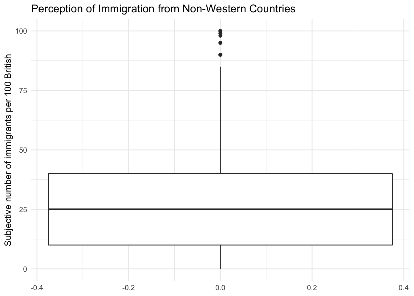
Notice how the lower whisker is much shorter than the upper one. The distribution is right skewed. The right tail (higher values) is a lot longer. We can see this beter using a density plot. To do this we can use geom_density() rather than geom_boxplot, with a couple of other changes.
# Density plot

g2 <- ggplot(data2, aes(x = IMMBRIT)) + # dropped 'data =', 'mapping ='
  geom_density() +
  labs(x = "Subjective number of immigrants per 100 British",
       y = "Density",
       title = "Perception of Immigration from Non-Western Countries") +
  theme_grey() # different theme changes how the plot looks

g2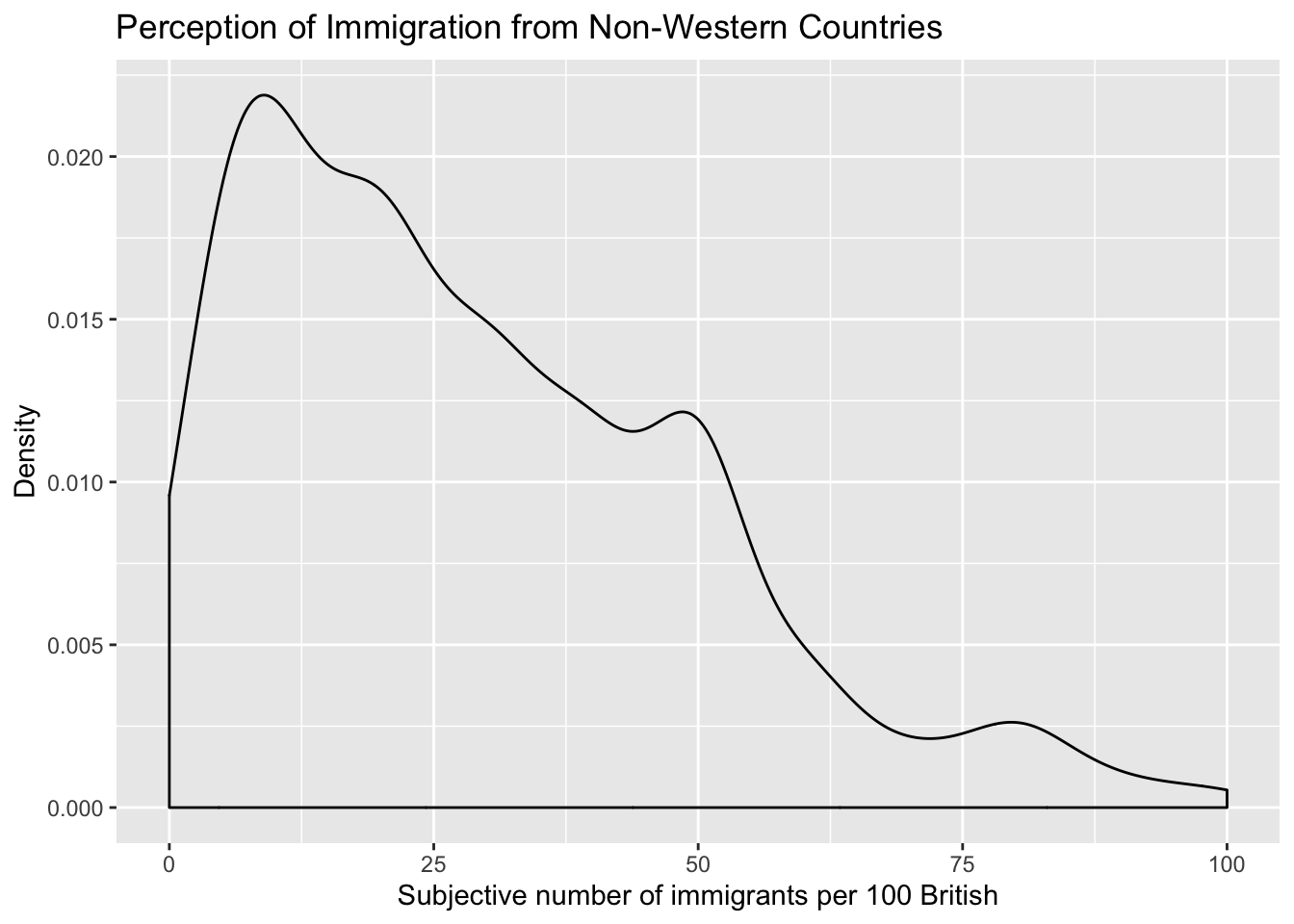
We can also plot histograms using geom_histogram():
# Histogram

g3 <- ggplot(data2, aes(x = employMonths)) +
  geom_histogram(binwidth = 50, colour = "black", fill = "white") +
  labs(x = "Months with present employer",
       y = "Frequency",
       title = "Histogram") +
  theme_light() # again another slightly different 'theme'

g3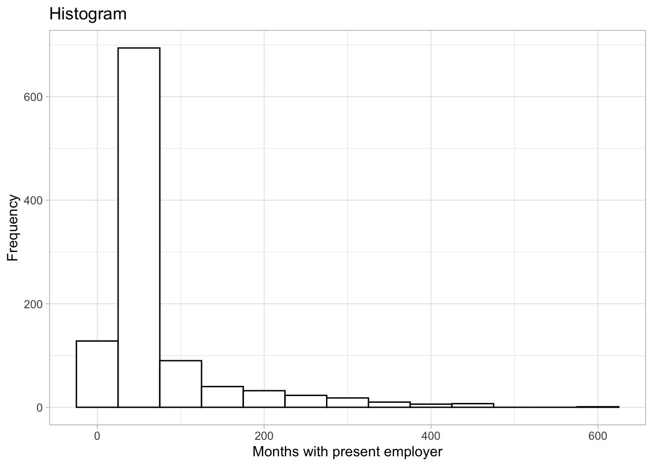
It is plausible that perception of immigration from Non-Western countries is related to party affiliation. In our dataset, we have a some party affiliation dummies (binary variables). We can use square brackets to subset our data such that we produce a boxplot only for members of the Conservative Party. We have a look at the variable Cons using the table() function first.
table(data2$Cons)
  0   1
765 284
In our data, 284 respondents associate with the Conservative party and 765 do not. We create a boxplot of IMMBRIT but only for members of the Conservative Party. We do so by subsetting our data using square brackets.
# create data, filtering only Conservative respondents
data2_cons <- filter(data2, Cons == 1)

# tory boxplot
g4 <- ggplot(data2_cons, aes(y = IMMBRIT)) +
  geom_boxplot(fill = "blue") +
  labs(y = "Subjective number of immigrants per 100 British",
       title = "Perception of Immigration from Non-Western Countries, among Conservatives",
       x = "Conservatives") +
  theme_minimal()

g4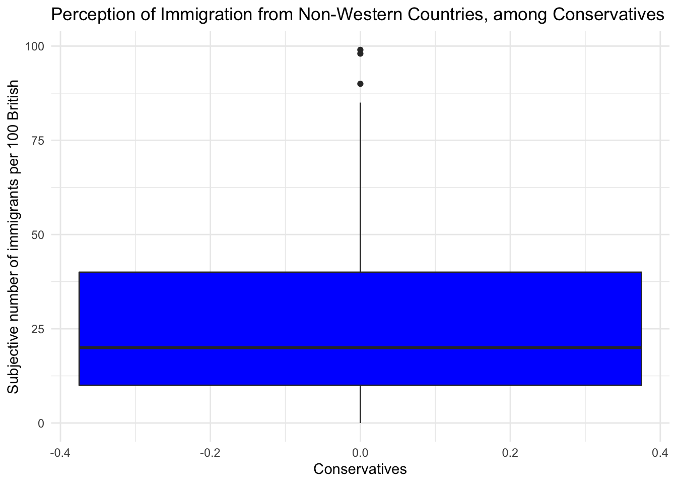
We would now like to compare the distribution of the perception fo Conservatives to the distribution among Labour respondents. We can subset the data just like we did for the Conservative Party. In addtion, we want to plot the two plots next to each other, i.e., they should be in the same plot. We can achieve this with the facet_grid() function. This will spilt the plot window into a grid of as many ‘facets’ as are implied by the variable we facet by. In this case, we are facetting by a variable with two levels – ‘Con’ and ‘Lab’. We can create this variable using case_when(). This checks whether the thing to the left of the \(\sim\) is true, for each observation, and if so gives the new variable the value after the \(\sim\) symbol, and if not, it looks to the next condition. If no conditions are true, the function will apply the value after TRUE =.
# create Tory/Labour indicator
data2$con_lab <- case_when(
  data2$Cons == 1 ~ "Con", # are they Conservative
  data2$Lab == 1 ~ "Lab", # are they Labour
  TRUE ~ "Other") # are they neither

# subset again using filter
data2_conlab <- filter(data2,
                       con_lab == "Con" | # vertical bar means 'or'
                         con_lab == "Lab")

# plot

g5 <- ggplot(data2_conlab, aes(y = IMMBRIT)) +
  geom_boxplot() +
  labs(y = "Subjective number of immigrants per 100 British",
       title = "Perception of Immigration from Non-Western Countries, among Conservatives and Labour") +
  theme_minimal() +
  facet_grid(~ con_lab)

g5 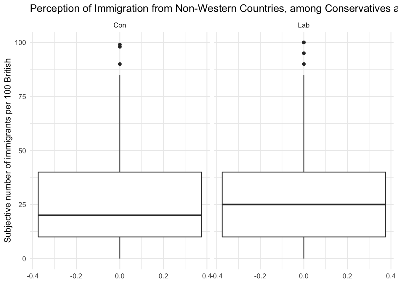
It is very hard to spot differences. The distributions are similar. The median for Labour respondents is larger which mean that the central Labour respondent over-estimates immigration more than the central Conservative respondent.
You can play around with the non-western foreigners data on your own time. We now turn to a dataset that is integrated in R already. It is called longley. Use the help() function to see what this dataset is about.
help(longley)Let’s create a scatterplot with the Year variable on the x-axis and Employed on the y-axis.
# scatterplot of longley data
g6 <- ggplot(longley, aes(x = Year, y = Employed)) +
  geom_point() +
  labs(x = "Year",
       y = "Number of people employed",
       title = "Scatterplot") +
  theme_minimal()

g6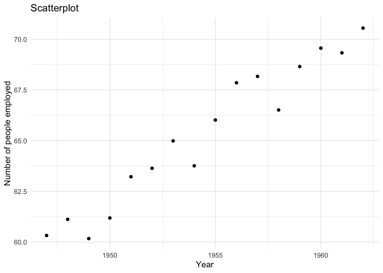
To create a line plot instead, we use the same code with one slight adjustment – we use geom_line instead of geom_point.
# line plot of longley data
g6 <- ggplot(longley, aes(x = Year, y = Employed)) +
  geom_line() +
  labs(x = "Year",
       y = "Number of people employed",
       title = "Line plot") +
  theme_minimal()

g6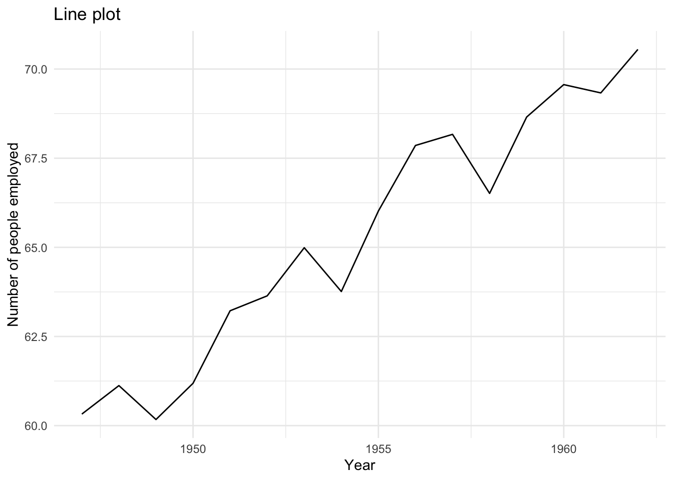
It’s possible to display both of these ‘geoms’ at the same time. Try to create a plot that includes both points and lines.
g7 <- ggplot(longley, aes(x = Year, y = Employed)) +
  geom_line(linetype = "dashed") + # see how 'linetype' changes the appearance of the line
  geom_point() +
  labs(x = "Year",
       y = "Number of people employed",
       title = "Scatterplot with lines") +
  theme_minimal()

g7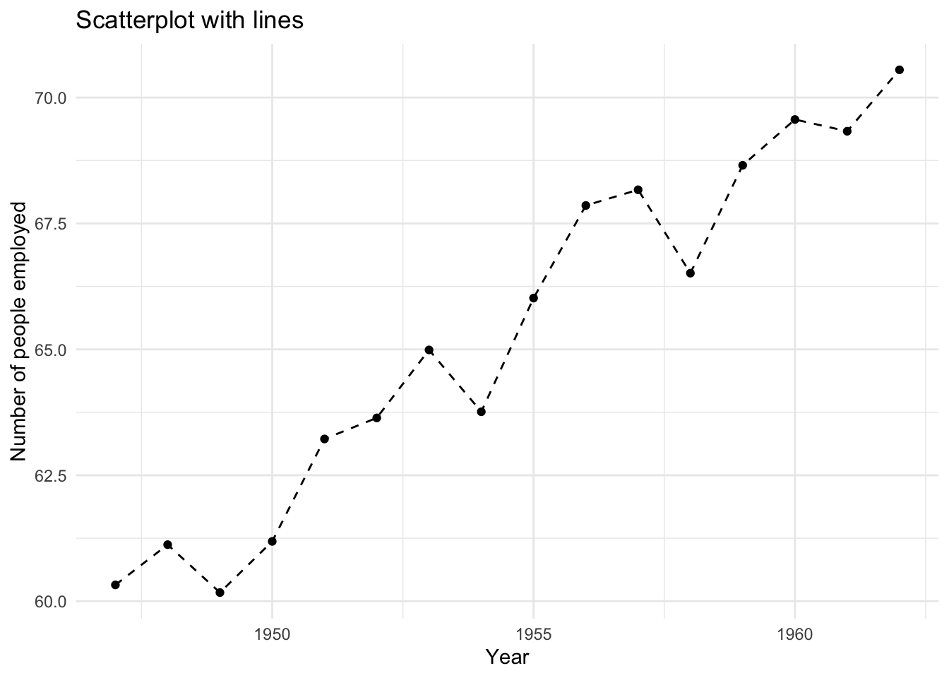
2.1.7 Exercises
Note: it is a good idea to run library(tidyverse) at the start of your code for this week’s exercises. We will come back to this in future sessions. tidyverse contains the ggplot and filter functions you might want to use here.
- Use the
names()function to display the variable names of thelongleydataset. - Use square brackets to access the 4th column of the dataset.
- Use the dollar sign to access the 4th column of the dataset.
- Access the two cells from row 4 and column 1 and row 6 and column 3.
- Using the
longleydata produce a line plot with GNP on the y-axis and population on the x-axis. - Use the
labs()function to change the axis labels to “Population older than 14 years of age” and “Gross national product”. - Create a boxplot showing the distribution of IMMBRIT by each party in the data and plot these in one plot next to each other. (It might help to filter the dataset beforehand – see the creation of
data2$con_lababove!) - Is there a difference between women and men in terms of their subjective estimation of foreigners? (Again,
filter()could be useful here!) - What is the difference between women and men?